Statistics: Difference between revisions
| Line 3: | Line 3: | ||
== Principal component analysis == | == Principal component analysis == | ||
=== Visualization based on simulated data === | |||
http://oracledmt.blogspot.com/2007/06/way-cooler-pca-and-visualization-linear.html | |||
=== What does it do if we choose center=FALSE in prcomp()? === | |||
In USArrests data, use center=FALSE gives a better scatter plot of the first 2 PCA components. | In USArrests data, use center=FALSE gives a better scatter plot of the first 2 PCA components. | ||
Revision as of 14:36, 8 August 2013
BoxCox transformation
Finding transformation for normal distribution
Principal component analysis
Visualization based on simulated data
http://oracledmt.blogspot.com/2007/06/way-cooler-pca-and-visualization-linear.html
What does it do if we choose center=FALSE in prcomp()?
In USArrests data, use center=FALSE gives a better scatter plot of the first 2 PCA components.
x1 = prcomp(USArrests)
x2 = prcomp(USArrests, center=F)
plot(x1$x[,1], x1$x[,2])  # looks random
windows(); plot(x2$x[,1], x2$x[,2]) # looks good in some sense
Visualize the random effects
http://www.quantumforest.com/2012/11/more-sense-of-random-effects/
Sensitivity/Specificity/Accuracy
| Predict | ||||
| 1 | 0 | |||
| True | 1 | TP | FN | Sens=TP/(TP+FN) |
| 0 | FP | TN | Spec=TN/(FP+TN) | |
| N = TP + FP + FN + TN | ||||
- Sensitivity = TP / (TP + FN)
- Specificity = TN / (TN + FP)
- Accuracy = (TP + TN) / N
ROC curve and Brier score
Elements of Statistical Learning
Bagging
Chapter 8 of the book.
- Bootstrap mean is approximately a posterior average.
- Bootstrap aggregation or bagging average: Average the prediction over a collection of bootstrap samples, thereby reducing its variance. The bagging estimate is defined by
- [math]\displaystyle{ \hat{f}_{bag}(x) = \frac{1}{B}\sum_{b=1}^B \hat{f}^{*b}(x). }[/math]
Boosting
AdaBoost.M1 by Freund and Schapire (1997):
The error rate on the training sample is [math]\displaystyle{ \bar{err} = \frac{1}{N} \sum_{i=1}^N I(y_i \neq G(x_i)), }[/math]
Sequentially apply the weak classification algorithm to repeatedly modified versions of the data, thereby producing a sequence of weak classifiers [math]\displaystyle{ G_m(x), m=1,2,\dots,M. }[/math]
The predictions from all of them are combined through a weighted majority vote to produce the final prediction: [math]\displaystyle{ G(x) = sign[\sum_{m=1}^M \alpha_m G_m(x)]. }[/math] Here [math]\displaystyle{ \alpha_1,\alpha_2,\dots,\alpha_M }[/math] are computed by the boosting algorithm and weight the contribution of each respective [math]\displaystyle{ G_m(x) }[/math]. Their effect is to give higher influence to the more accurate classifiers in the sequence.
Classification and Regression Trees (CART)
Construction of the tree classifier
- Node proportion
- [math]\displaystyle{ p(1|t) + \dots + p(6|t) =1 }[/math] where [math]\displaystyle{ p(j|t) }[/math] define the node proportions (class proportion of class j on node t. Here we assume there are 6 classes.
- Impurity of node t
- [math]\displaystyle{ i(t) }[/math] is a nonnegative function [math]\displaystyle{ \phi }[/math] of the [math]\displaystyle{ p(1|t), \dots, p(6|t) }[/math] such that [math]\displaystyle{ \phi(1/6,1/6,\dots,1/6) }[/math] = maximumm [math]\displaystyle{ \phi(1,0,\dots,0)=0, \phi(0,1,0,\dots,0)=0, \dots, \phi(0,0,0,0,0,1)=0 }[/math]. That is, the node impurity is largest when all classes are equally mixed together in it, and smallest when the node contains only one class.
- Gini index of impurity
- [math]\displaystyle{ i(t) = - \sum_{j=1}^6 p(j|t) \log p(j|t). }[/math]
- Goodness of the split s on node t
- [math]\displaystyle{ \Delta i(s, t) = i(t) -p_Li(t_L) - p_Ri(t_R). }[/math] where [math]\displaystyle{ p_R }[/math] are the proportion of the cases in t go into the left node [math]\displaystyle{ t_L }[/math] and a proportion [math]\displaystyle{ p_R }[/math] go into right node [math]\displaystyle{ t_R }[/math].
A tree was grown in the following way: At the root node [math]\displaystyle{ t_1 }[/math], a search was made through all candidate splits to find that split [math]\displaystyle{ s^* }[/math] which gave the largest decrease in impurity;
- [math]\displaystyle{ \Delta i(s^*, t_1) = \max_{s} \Delta i(s, t_1). }[/math]
- Class character of a terminal node was determined by the plurality rule. Specifically, if [math]\displaystyle{ p(j_0|t)=\max_j p(j|t) }[/math], then t was designated as a class [math]\displaystyle{ j_0 }[/math] terminal node.
R packages
Hierarchical clustering
For the kth cluster, define the Error Sum of Squares as [math]\displaystyle{ ESS_m = }[/math] sum of squared deviations (squared Euclidean distance) from the cluster centroid. [math]\displaystyle{ ESS_m = \sum_{l=1}^{n_m}\sum_{k=1}^p (x_{ml,k} - \bar{x}_{m,k})^2 }[/math] in which [math]\displaystyle{ \bar{x}_{m,k} = (1/n_m) \sum_{l=1}^{n_m} x_{ml,k} }[/math] the mean of the mth cluster for the kth variable, [math]\displaystyle{ x_{ml,k} }[/math] being the score on the kth variable [math]\displaystyle{ (k=1,\dots,p) }[/math] for the lth object [math]\displaystyle{ (l=1,\dots,n_m) }[/math] in the mth cluster [math]\displaystyle{ (m=1,\dots,g) }[/math].
If there are C clusters, define the Total Error Sum of Squares as Sum of Squares as [math]\displaystyle{ ESS = \sum_m ESS_m, m=1,\dots,C }[/math]
Consider the union of every possible pair of clusters.
Combine the 2 clusters whose combination combination results in the smallest increase in ESS.
Comments:
- Ward's method tends to join clusters with a small number of observations, and it is strongly biased toward producing clusters with the same shape and with roughly the same number of observations.
- It is also very sensitive to outliers. See Milligan (1980).
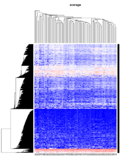
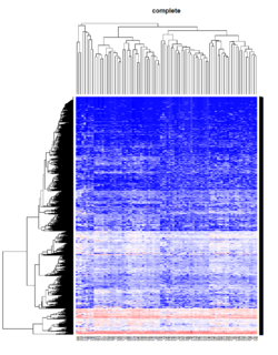
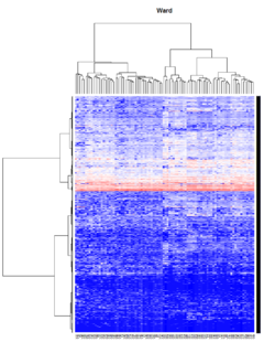
Take pomeroy data (7129 x 90) for an example:
library(gplots)

lr = read.table("C:/ArrayTools/Sample datasets/Pomeroy/Pomeroy -Project/NORMALIZEDLOGINTENSITY.txt")
lr = as.matrix(lr)
method = "average" # method <- "complete"; method <- "ward"
hclust1 <- function(x) hclust(x, method= method)
heatmap.2(lr, col=bluered(75), hclustfun = hclust1, distfun = dist,
              density.info="density", scale = "none",
              key=FALSE, symkey=FALSE, trace="none",
              main = method)
Mixed Effect Model
- Paper by Laird and Ware 1982
- John Fox's Linear Mixed Models Appendix to An R and S-PLUS Companion to Applied Regression. Very clear. It provides 2 typical examples (hierarchical data and longitudinal data) of using the mixed effects model. It also uses Trellis plots to examine the data.
- Chapter 10 Random and Mixed Effects from Modern Applied Statistics with S by Venables and Ripley.
- (Book) lme4: Mixed-effects modeling with R by Douglas Bates.
- (Book) Mixed-effects modeling in S and S-Plus by José Pinheiro and Douglas Bates.


