Statistics: Difference between revisions
| Line 352: | Line 352: | ||
* [http://freakonometrics.hypotheses.org/19874 An Attempt To Understand Boosting Algorithm] | * [http://freakonometrics.hypotheses.org/19874 An Attempt To Understand Boosting Algorithm] | ||
* [http://cran.r-project.org/web/packages/gbm/index.html gbm] package. An implementation of extensions to Freund and Schapire's '''AdaBoost algorithm''' and Friedman's '''gradient boosting machine'''. Includes regression methods for least squares, absolute loss, t-distribution loss, quantile regression, logistic, multinomial logistic, Poisson, Cox proportional hazards partial likelihood, AdaBoost exponential loss, Huberized hinge loss, and Learning to Rank measures (LambdaMart). | * [http://cran.r-project.org/web/packages/gbm/index.html gbm] package. An implementation of extensions to Freund and Schapire's '''AdaBoost algorithm''' and Friedman's '''gradient boosting machine'''. Includes regression methods for least squares, absolute loss, t-distribution loss, quantile regression, logistic, multinomial logistic, Poisson, Cox proportional hazards partial likelihood, AdaBoost exponential loss, Huberized hinge loss, and Learning to Rank measures (LambdaMart). | ||
* https://www.biostat.wisc.edu/~kendzior/STAT877/illustration.pdf | |||
==== AdaBoost ==== | ==== AdaBoost ==== | ||
Revision as of 05:12, 28 June 2015
Box plot in R
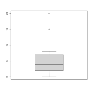
See http://msenux.redwoods.edu/math/R/boxplot.php for a numerical explanation how boxplot() in R works.
> x=c(0,4,15, 1, 6, 3, 20, 5, 8, 1, 3)
> summary(x)
   Min. 1st Qu.  Median    Mean 3rd Qu.    Max.
      0       2       4       6       7      20
> sort(x)
 [1]  0  1  1  3  3  4  5  6  8 15 20
- The lower and upper edges of box is determined by the first and 3rd quartiles (2 and 7 in the above example).
- The thick dark horizon line is the median (4 in the example).
- Outliers are defined by observations larger than 3rd quartile + 1.5 * IQR (7+1.5*5=14.5) and smaller than 1st quartile - 1.5 * IQR (2-1.5*5=-5.5). See the empty circles in the plot.
- Upper whisker is defined by the largest data below 3rd quartile + 1.5 * IQR (8 in this example), and the lower whisker is defined by the smallest data greater than 1st quartile - 1.5 * IQR (0 in this example).
Note the wikipedia lists several possible definitions of a whisker. R uses the 2nd method (Tukey boxplot) to define whiskers.
BoxCox transformation
Finding transformation for normal distribution
the Holy Trinity (LRT, Wald, Score tests)
Contrasts in linear regression
- Page 147 of Modern Applied Statistics with S (4th ed)
- https://biologyforfun.wordpress.com/2015/01/13/using-and-interpreting-different-contrasts-in-linear-models-in-r/ This explains the meanings of 'treatment', 'helmert' and 'sum' contrasts.
Principal component analysis
R source code
> stats:::prcomp.default
function (x, retx = TRUE, center = TRUE, scale. = FALSE, tol = NULL,
    ...)
{
    x <- as.matrix(x)
    x <- scale(x, center = center, scale = scale.)
    cen <- attr(x, "scaled:center")
    sc <- attr(x, "scaled:scale")
    if (any(sc == 0))
        stop("cannot rescale a constant/zero column to unit variance")
    s <- svd(x, nu = 0)
    s$d <- s$d/sqrt(max(1, nrow(x) - 1))
    if (!is.null(tol)) {
        rank <- sum(s$d > (s$d[1L] * tol))
        if (rank < ncol(x)) {
            s$v <- s$v[, 1L:rank, drop = FALSE]
            s$d <- s$d[1L:rank]
        }
    }
    dimnames(s$v) <- list(colnames(x), paste0("PC", seq_len(ncol(s$v))))
    r <- list(sdev = s$d, rotation = s$v, center = if (is.null(cen)) FALSE else cen,
        scale = if (is.null(sc)) FALSE else sc)
    if (retx)
        r$x <- x %*% s$v
    class(r) <- "prcomp"
    r
}
<bytecode: 0x000000003296c7d8>
<environment: namespace:stats>
Related to SVD
Uusing the SVD to perform PCA makes much better sense numerically than forming the covariance matrix to begin with, since the formation of XX⊤ can cause loss of precision.
http://math.stackexchange.com/questions/3869/what-is-the-intuitive-relationship-between-svd-and-pca
Calculated by Hand
http://strata.uga.edu/software/pdf/pcaTutorial.pdf
Visualization based on simulated data
http://oracledmt.blogspot.com/2007/06/way-cooler-pca-and-visualization-linear.html
What does it do if we choose center=FALSE in prcomp()?
In USArrests data, use center=FALSE gives a better scatter plot of the first 2 PCA components.
x1 = prcomp(USArrests)
x2 = prcomp(USArrests, center=F)
plot(x1$x[,1], x1$x[,2])  # looks random
windows(); plot(x2$x[,1], x2$x[,2]) # looks good in some sense
Relation to Multidimensional scaling/MDS
With no missing data, classical MDS (Euclidean distance metric) is the same as PCA.
Comparisons are here.
Differences are asked/answered on stackexchange.com. The post also answered the question when these two are the same.
Visualize the random effects
http://www.quantumforest.com/2012/11/more-sense-of-random-effects/
Sensitivity/Specificity/Accuracy
| Predict | ||||
| 1 | 0 | |||
| True | 1 | TP | FN | Sens=TP/(TP+FN) |
| 0 | FP | TN | Spec=TN/(FP+TN) | |
| N = TP + FP + FN + TN | ||||
- Sensitivity = TP / (TP + FN)
- Specificity = TN / (TN + FP)
- Accuracy = (TP + TN) / N
ROC curve and Brier score
- Introduction to the ROCR package.
- http://freakonometrics.hypotheses.org/9066
- Illustrated Guide to ROC and AUC
genefilter package and rowpAUCs function
- rowpAUCs function in genefilter package. The aim is to find potential biomarkers whose expression level is able to distinguish between two groups.
# source("http://www.bioconductor.org/biocLite.R")
# biocLite("genefilter")
library(Biobase) # sample.ExpressionSet data
data(sample.ExpressionSet)

library(genefilter)
r2 = rowpAUCs(sample.ExpressionSet, "sex", p=0.1)
plot(r2[1]) # first gene, asking specificity = .9

r2 = rowpAUCs(sample.ExpressionSet, "sex", p=1.0)
plot(r2[1]) # it won't show pAUC

r2 = rowpAUCs(sample.ExpressionSet, "sex", p=.999)
plot(r2[1]) # pAUC is very close to AUC now
Generalized Linear Model
Lectures from a course in Simon Fraser University Statistics.
Quasi Likelihood
Quasi-likelihood is like log-likelihood. The quasi-score function (first derivative of quasi-likelihood function) is the estimating equation.
- Original paper by Peter McCullagh.
- Lecture 20 from SFU.
- U. Washington and another lecture focuses on overdispersion.
- This lecture contains a table of quasi likelihood from common distributions.
Plot
Simulate data from a specified density
Multiple comparisons
- Book 'Multiple Comparison Using R' by Bretz, Hothorn and Westfall, 2011.
- Plot a histogram of p-values, a post from varianceexplained.org.
- Comparison of different ways of multiple-comparison in R.
False Discovery Rate
- Definition by Benjamini and Hochberg in JRSS B 1995.
- A comic
- Statistical significance for genomewide studies by Storey and Tibshirani.
SAM/Significance Analysis of Microarrays
The percentile option is used to define the number of falsely called genes based on 'B' permutations. If we use the 90-th percentile, the number of significant genes will be less than if we use the 50-th percentile/median.
In BRCA dataset, using the 90-th percentile will get 29 genes vs 183 genes if we use median.
Multivariate permutation test
In BRCA dataset, using 80% confidence gives 116 genes vs 237 genes if we use 50% confidence (assuming maximum proportion of false discoveries is 10%). The method is published on EL Korn, JF Troendle, LM McShane and R Simon, Controlling the number of false discoveries: Application to high dimensional genomic data, Journal of Statistical Planning and Inference, vol 124, 379-398 (2004).
Bayes
Bayes factor
Empirical Bayes method
Overdispersion
Cox Regression
Let Yi denote the observed time (either censoring time or event time) for subject i, and let Ci be the indicator that the time corresponds to an event (i.e. if Ci = 1 the event occurred and if Ci = 0 the time is a censoring time). The hazard function for the Cox proportional hazard model has the form
[math]\displaystyle{ \lambda(t|X) = \lambda_0(t)\exp(\beta_1X_1 + \cdots + \beta_pX_p) = \lambda_0(t)\exp(X \beta^\prime). }[/math]
This expression gives the hazard at time t for an individual with covariate vector (explanatory variables) X. Based on this hazard function, a partial likelihood can be constructed from the datasets as
[math]\displaystyle{ L(\beta) = \prod_{i:C_i=1}\frac{\theta_i}{\sum_{j:Y_j\ge Y_i}\theta_j}, }[/math]
where θj = exp(Xj β′) and X1, ..., Xn are the covariate vectors for the n independently sampled individuals in the dataset (treated here as column vectors).
The corresponding log partial likelihood is
[math]\displaystyle{ \ell(\beta) = \sum_{i:C_i=1} \left(X_i \beta^\prime - \log \sum_{j:Y_j\ge Y_i}\theta_j\right). }[/math]
This function can be maximized over β to produce maximum partial likelihood estimates of the model parameters.
The partial score function is [math]\displaystyle{ \ell^\prime(\beta) = \sum_{i:C_i=1} \left(X_i - \frac{\sum_{j:Y_j\ge Y_i}\theta_jX_j}{\sum_{j:Y_j\ge Y_i}\theta_j}\right), }[/math]
and the Hessian matrix of the partial log likelihood is
[math]\displaystyle{ \ell^{\prime\prime}(\beta) = -\sum_{i:C_i=1} \left(\frac{\sum_{j:Y_j\ge Y_i}\theta_jX_jX_j^\prime}{\sum_{j:Y_j\ge Y_i}\theta_j} - \frac{\sum_{j:Y_j\ge Y_i}\theta_jX_j\times \sum_{j:Y_j\ge Y_i}\theta_jX_j^\prime}{[\sum_{j:Y_j\ge Y_i}\theta_j]^2}\right). }[/math]
Using this score function and Hessian matrix, the partial likelihood can be maximized using the Newton-Raphson algorithm. The inverse of the Hessian matrix, evaluated at the estimate of β, can be used as an approximate variance-covariance matrix for the estimate, and used to produce approximate standard errors for the regression coefficients.
Hazard
A hazard is the rate at which events happen, so that the probability of an event happening in a short time interval is the length of time multiplied by the hazard.
[math]\displaystyle{ h(t) = \lim_{\Delta t \to 0} \frac{P(t \leq T \lt t+\Delta t|T \geq t)}{\Delta t} = \frac{f(t)}{S(t)} }[/math]
Hazards (or probability of hazards) may vary with time, while the assumption in proportional hazard models for survival is that the hazard is a constant proportion.
If h(t)=c, S(t) is exponential. If [math]\displaystyle{ \log h(t) = c + \rho t }[/math], S(t) is Gompertz distribution. If [math]\displaystyle{ \log h(t)=c + \rho \log (t) }[/math], S(t) is Weibull distribution.
For Cox regression, the survival function can be shown to be [math]\displaystyle{ S(t|X) = S_0(t) ^ {\exp(X\beta)} }[/math].
Hazard Ratio
A hazard ratio is often reported as a “reduction in risk of death or progression” – This reduction is calculated as 1 minus the Hazard Ratio, e.g., HR of 0.84 is equal to a 16% reduction in risk. See www.time4epi.com and stackexchange.com.
Hazard ratio is not the same as the relative risk ratio. See medicine.ox.ac.uk.
Interpreting risks and ratios in therapy trials from australianprescriber.com is useful too.
Compute ratio ratios from coxph() in R (Hint: exp(beta)).
Hazard Ratio Forest Plot
The forest plot quickly summarizes the hazard ratio data across multiple variables –If the line crosses the 1.0 value, the hazard ratio is not significant and there is no clear advantage for either arm.
Estimate baseline hazard
Google: how to estimate baseline hazard rate
- stackexchange.com
- ?basehaz from stackexchange.com
predict.coxph
- http://stats.stackexchange.com/questions/44896/how-to-interpret-the-output-of-predict-coxph
- http://www.togaware.com/datamining/survivor/Lung1.html
library(coxph)
fit <- coxph(Surv(time, status) ~ age , lung)
fit
#  Call:
#  coxph(formula = Surv(time, status) ~ age, data = lung)
#       coef exp(coef) se(coef)    z     p
# age 0.0187      1.02   0.0092 2.03 0.042
#
# Likelihood ratio test=4.24  on 1 df, p=0.0395  n= 228, number of events= 165

# type = "lr" (Linear predictor)
as.numeric(predict(fit,type="lp"))[1:10]
# [1]  0.21626733  0.10394626 -0.12069589 -0.10197571 -0.04581518  0.21626733
# [7]  0.10394626  0.16010680 -0.17685643 -0.02709500
0.0187 * (lung$age[1:10] - fit$means)
# [1]  0.21603421  0.10383421 -0.12056579 -0.10186579 -0.04576579  0.21603421
# [7]  0.10383421  0.15993421 -0.17666579 -0.02706579

# type = "risk" (Risk score)
> as.numeric(predict(fit,type="risk"))[1:10]
 [1] 1.2414342 1.1095408 0.8863035 0.9030515 0.9552185 1.2414342 1.1095408
 [8] 1.1736362 0.8379001 0.9732688
> (exp(lung$age * 0.0187) / exp(mean(lung$age) * 0.0187))[1:10]
 [1] 1.2411448 1.1094165 0.8864188 0.9031508 0.9552657 1.2411448 1.1094165
 [8] 1.1734337 0.8380598 0.9732972
More
- This pdf file from data.princeton.edu contains estimation, hypothesis testing, time varying covariates and baseline survival estimation.
- Survival analysis: basic terms, the exponential model, censoring, examples in R and JAGS
Kaplan–Meier curve
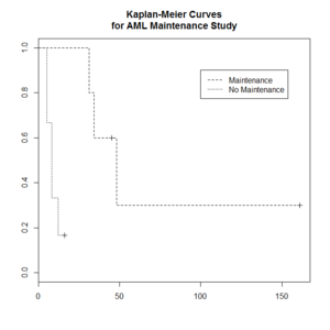
The Kaplan–Meier estimator (the product limit estimator) is an estimator for estimating the survival function from lifetime data. In medical research, it is often used to measure the fraction of patients living for a certain amount of time after treatment.
The "+" sign means censored observations and a long vertical line (not '+') means there is a dead observation at that time.
Usually the KM curve of treatment group is higher than that of the control group.
The Y-axis (the probability that a member from a given population will have a lifetime exceeding time) is often called
- Cumulative probability
- Cumulative survival
- Percent survival
- Probability without event
- Proportion alive/surviving
- Survival
- Survival probability
> library(survival)
> plot(leukemia.surv <- survfit(Surv(time, status) ~ x, data = aml[7:17,] ) , lty=2:3) # a (small) subset
> aml[7:17,]
   time status             x
7    31      1    Maintained
8    34      1    Maintained
9    45      0    Maintained
10   48      1    Maintained
11  161      0    Maintained
12    5      1 Nonmaintained
13    5      1 Nonmaintained
14    8      1 Nonmaintained
15    8      1 Nonmaintained
16   12      1 Nonmaintained
17   16      0 Nonmaintained
> legend(100, .9, c("Maintenance", "No Maintenance"), lty = 2:3)
> title("Kaplan-Meier Curves\nfor AML Maintenance Study")
- Kaplan-Meier estimator from the wikipedia.
- Two papers this and this to describe steps to calculate the KM estimate.
Estimate survival probability
See this post.
km <- survfit(Surv(time, status)~1, data=veteran)
survest <- stepfun(km$time, c(1, km$surv))
# Now survest is a function that can be evaluated at any time.
survest(0:100)
# try plot.stepfun()?
We can also use the plot() function to visual the plot.
# Assume x and y have the same length.
plot(y ~ x, type = "s")
Elements of Statistical Learning
Bagging
Chapter 8 of the book.
- Bootstrap mean is approximately a posterior average.
- Bootstrap aggregation or bagging average: Average the prediction over a collection of bootstrap samples, thereby reducing its variance. The bagging estimate is defined by
- [math]\displaystyle{ \hat{f}_{bag}(x) = \frac{1}{B}\sum_{b=1}^B \hat{f}^{*b}(x). }[/math]
Boosting
- Ch8.2 Bagging, Random Forests and Boosting of An Introduction to Statistical Learning and the code.
- An Attempt To Understand Boosting Algorithm
- gbm package. An implementation of extensions to Freund and Schapire's AdaBoost algorithm and Friedman's gradient boosting machine. Includes regression methods for least squares, absolute loss, t-distribution loss, quantile regression, logistic, multinomial logistic, Poisson, Cox proportional hazards partial likelihood, AdaBoost exponential loss, Huberized hinge loss, and Learning to Rank measures (LambdaMart).
- https://www.biostat.wisc.edu/~kendzior/STAT877/illustration.pdf
AdaBoost
AdaBoost.M1 by Freund and Schapire (1997):
The error rate on the training sample is [math]\displaystyle{ \bar{err} = \frac{1}{N} \sum_{i=1}^N I(y_i \neq G(x_i)), }[/math]
Sequentially apply the weak classification algorithm to repeatedly modified versions of the data, thereby producing a sequence of weak classifiers [math]\displaystyle{ G_m(x), m=1,2,\dots,M. }[/math]
The predictions from all of them are combined through a weighted majority vote to produce the final prediction: [math]\displaystyle{ G(x) = sign[\sum_{m=1}^M \alpha_m G_m(x)]. }[/math] Here [math]\displaystyle{ \alpha_1,\alpha_2,\dots,\alpha_M }[/math] are computed by the boosting algorithm and weight the contribution of each respective [math]\displaystyle{ G_m(x) }[/math]. Their effect is to give higher influence to the more accurate classifiers in the sequence.
Classification and Regression Trees (CART)
Construction of the tree classifier
- Node proportion
- [math]\displaystyle{ p(1|t) + \dots + p(6|t) =1 }[/math] where [math]\displaystyle{ p(j|t) }[/math] define the node proportions (class proportion of class j on node t. Here we assume there are 6 classes.
- Impurity of node t
- [math]\displaystyle{ i(t) }[/math] is a nonnegative function [math]\displaystyle{ \phi }[/math] of the [math]\displaystyle{ p(1|t), \dots, p(6|t) }[/math] such that [math]\displaystyle{ \phi(1/6,1/6,\dots,1/6) }[/math] = maximumm [math]\displaystyle{ \phi(1,0,\dots,0)=0, \phi(0,1,0,\dots,0)=0, \dots, \phi(0,0,0,0,0,1)=0 }[/math]. That is, the node impurity is largest when all classes are equally mixed together in it, and smallest when the node contains only one class.
- Gini index of impurity
- [math]\displaystyle{ i(t) = - \sum_{j=1}^6 p(j|t) \log p(j|t). }[/math]
- Goodness of the split s on node t
- [math]\displaystyle{ \Delta i(s, t) = i(t) -p_Li(t_L) - p_Ri(t_R). }[/math] where [math]\displaystyle{ p_R }[/math] are the proportion of the cases in t go into the left node [math]\displaystyle{ t_L }[/math] and a proportion [math]\displaystyle{ p_R }[/math] go into right node [math]\displaystyle{ t_R }[/math].
A tree was grown in the following way: At the root node [math]\displaystyle{ t_1 }[/math], a search was made through all candidate splits to find that split [math]\displaystyle{ s^* }[/math] which gave the largest decrease in impurity;
- [math]\displaystyle{ \Delta i(s^*, t_1) = \max_{s} \Delta i(s, t_1). }[/math]
- Class character of a terminal node was determined by the plurality rule. Specifically, if [math]\displaystyle{ p(j_0|t)=\max_j p(j|t) }[/math], then t was designated as a class [math]\displaystyle{ j_0 }[/math] terminal node.
R packages
Supervised Classification, Logistic and Multinomial
Variable selection and variable importance plot
Clustering
k-means clustering
- Assumptions, a post from varianceexplained.org.
Hierarchical clustering
For the kth cluster, define the Error Sum of Squares as [math]\displaystyle{ ESS_m = }[/math] sum of squared deviations (squared Euclidean distance) from the cluster centroid. [math]\displaystyle{ ESS_m = \sum_{l=1}^{n_m}\sum_{k=1}^p (x_{ml,k} - \bar{x}_{m,k})^2 }[/math] in which [math]\displaystyle{ \bar{x}_{m,k} = (1/n_m) \sum_{l=1}^{n_m} x_{ml,k} }[/math] the mean of the mth cluster for the kth variable, [math]\displaystyle{ x_{ml,k} }[/math] being the score on the kth variable [math]\displaystyle{ (k=1,\dots,p) }[/math] for the lth object [math]\displaystyle{ (l=1,\dots,n_m) }[/math] in the mth cluster [math]\displaystyle{ (m=1,\dots,g) }[/math].
If there are C clusters, define the Total Error Sum of Squares as Sum of Squares as [math]\displaystyle{ ESS = \sum_m ESS_m, m=1,\dots,C }[/math]
Consider the union of every possible pair of clusters.
Combine the 2 clusters whose combination combination results in the smallest increase in ESS.
Comments:
- Ward's method tends to join clusters with a small number of observations, and it is strongly biased toward producing clusters with the same shape and with roughly the same number of observations.
- It is also very sensitive to outliers. See Milligan (1980).
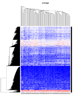
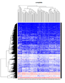
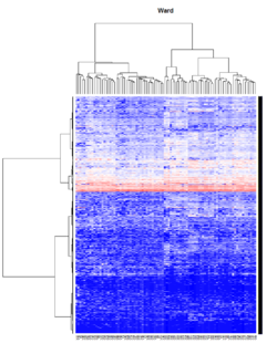
Take pomeroy data (7129 x 90) for an example:
library(gplots)

lr = read.table("C:/ArrayTools/Sample datasets/Pomeroy/Pomeroy -Project/NORMALIZEDLOGINTENSITY.txt")
lr = as.matrix(lr)
method = "average" # method <- "complete"; method <- "ward"
hclust1 <- function(x) hclust(x, method= method)
heatmap.2(lr, col=bluered(75), hclustfun = hclust1, distfun = dist,
              density.info="density", scale = "none",
              key=FALSE, symkey=FALSE, trace="none",
              main = method)
Mixed Effect Model
- Paper by Laird and Ware 1982
- John Fox's Linear Mixed Models Appendix to An R and S-PLUS Companion to Applied Regression. Very clear. It provides 2 typical examples (hierarchical data and longitudinal data) of using the mixed effects model. It also uses Trellis plots to examine the data.
- Chapter 10 Random and Mixed Effects from Modern Applied Statistics with S by Venables and Ripley.
- (Book) lme4: Mixed-effects modeling with R by Douglas Bates.
- (Book) Mixed-effects modeling in S and S-Plus by José Pinheiro and Douglas Bates.
Entropy
Definition
Entropy is defined by -log2(p) where p is a probability. Higher entropy represents higher unpredictable of an event.
Some examples:
- Fair 2-side die: Entropy = -.5*log2(.5) - .5*log2(.5) = 1.
- Fair 6-side die: Entropy = -6*1/6*log2(1/6) = 2.58
- Weighted 6-side die: Consider pi=.1 for i=1,..,5 and p6=.5. Entropy = -5*.1*log2(.1) - .5*log2(.5) = 2.16 (less unpredictable than a fair 6-side die).
Use
When entropy was applied to the variable selection, we want to select a class variable which gives a largest entropy difference between without any class variable (compute entropy using response only) and with that class variable (entropy is computed by adding entropy in each class level) because this variable is most discriminative and it gives most information gain. For example,
- entropy (without any class)=.94,
- entropy(var 1) = .69,
- entropy(var 2)=.91,
- entropy(var 3)=.725.
We will choose variable 1 since it gives the largest gain (.94 - .69) compared to the other variables (.94 -.91, .94 -.725).
Why is picking the attribute with the most information gain beneficial? It reduces entropy, which increases predictability. A decrease in entropy signifies an decrease in unpredictability, which also means an increase in predictability.
Consider a split of a continuous variable. Where should we cut the continuous variable to create a binary partition with the highest gain? Suppose cut point c1 creates an entropy .9 and another cut point c2 creates an entropy .1. We should choose c2.
Related
In addition to information gain, gini (dʒiːni) index is another metric used in decision tree. See wikipedia page about decision tree learning.
Ensembles
Combining classifiers. Pro: better classification performance. Con: time consuming.
Bagging
Draw N bootstrap samples and summary the results (averaging for regression problem, majority vote for classification problem). Decrease variance without changing bias. Not help much with underfit or high bias models.
Random forest
Variance importance: if you scramble the values of a variable, and the accuracy of your tree does not change much, then the variable is not very important.
Why is it useful to compute variance importance? So the model's predictions are easier to interpret (not improve the prediction performance).
Random forest has advantages of easier to run in parallel and suitable for small n large p problems.
Boosting
Instead of selecting data points randomly with the boostrap, it favors the misclassified points.
Algorithm:
- Initialize the weights
- Repeat
- resample with respect to weights
- retrain the model
- recompute weights
Since boosting requires computation in iterative and bagging can be run in parallel, bagging has an advantage over boosting when the data is very large.
T-statistic
Let [math]\displaystyle{ \scriptstyle\hat\beta }[/math] be an estimator of parameter β in some statistical model. Then a t-statistic for this parameter is any quantity of the form
- [math]\displaystyle{ t_{\hat{\beta}} = \frac{\hat\beta - \beta_0}{\mathrm{s.e.}(\hat\beta)}, }[/math]
where β0 is a non-random, known constant, and [math]\displaystyle{ \scriptstyle s.e.(\hat\beta) }[/math] is the standard error of the estimator [math]\displaystyle{ \scriptstyle\hat\beta }[/math].
Two sample test assuming equal variance
The t statistic to test whether the means are different can be calculated as follows:
- [math]\displaystyle{ t = \frac{\bar {X}_1 - \bar{X}_2}{s_{X_1X_2} \cdot \sqrt{\frac{1}{n_1}+\frac{1}{n_2}}} }[/math]
where
- [math]\displaystyle{ s_{X_1X_2} = \sqrt{\frac{(n_1-1)s_{X_1}^2+(n_2-1)s_{X_2}^2}{n_1+n_2-2}}. }[/math]
[math]\displaystyle{ s_{X_1X_2} }[/math] is an estimator of the common/pooled standard deviation of the two samples. The square-root of a pooled variance estimator is known as a pooled standard deviation.
The degrees of freedom is :[math]\displaystyle{ n_1 + n_2 - 2. }[/math]
Two sample test assuming unequal variance
The t statistic (Behrens-Welch test statistic) to test whether the population means are different is calculated as:
- [math]\displaystyle{ t = {\overline{X}_1 - \overline{X}_2 \over s_{\overline{X}_1 - \overline{X}_2}} }[/math]
where
- [math]\displaystyle{ s_{\overline{X}_1 - \overline{X}_2} = \sqrt{{s_1^2 \over n_1} + {s_2^2 \over n_2}}. }[/math]
Here s2 is the unbiased estimator of the variance of the two samples.
The degrees of freedom is evaluated using the Satterthwaite's approximation
- [math]\displaystyle{ df = { ({s_1^2 \over n_1} + {s_2^2 \over n_2})^2 \over {({s_1^2 \over n_1})^2 \over n_1-1} + {({s_2^2 \over n_2})^2 \over n_2-1} }. }[/math]
Unpooled vs pooled methods
Z-value/Z-score
If the population parameters are known, then rather than computing the t-statistic, one can compute the z-score.
Confidence vs Credibility Intervals
http://freakonometrics.hypotheses.org/18117
Confidence interval vs prediction interval
Confidence intervals tell you about how well you have determined the mean E(Y). Prediction intervals tell you where you can expect to see the next data point sampled. That is, CI is computed using Var(E(Y|X)) and PI is computed using Var(E(Y|X) + e).
- http://www.graphpad.com/support/faqid/1506/
- http://en.wikipedia.org/wiki/Prediction_interval
- http://robjhyndman.com/hyndsight/intervals/
- https://stat.duke.edu/courses/Fall13/sta101/slides/unit7lec3H.pdf
Counter Examples
Suppose X is a normally-distributed random variable with zero mean. Let Y = X^2. Clearly X and Y are not independent: if you know X, you also know Y. And if you know Y, you know the absolute value of X.
The covariance of X and Y is
  Cov(X,Y) = E(XY) - E(X)E(Y) = E(X^3) - 0*E(Y) = E(X^3)
           = 0,
because the distribution of X is symmetric around zero. Thus the correlation r(X,Y) = Cov(X,Y)/Sqrt[Var(X)Var(Y)] = 0, and we have a situation where the variables are not independent, yet have (linear) correlation r(X,Y) = 0.
This example shows how a linear correlation coefficient does not encapsulate anything about the quadratic dependence of Y upon X.
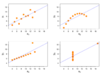
Anscombe quartet
Four datasets have almost same properties: same mean in X, same mean in Y, same variance in X, (almost) same variance in Y, same correlation in X and Y, same linear regression.
Dictionary
- Prognosis is the probability that an event or diagnosis will result in a particular outcome.
