GSEA
Basic
https://en.wikipedia.org/wiki/Gene_set_enrichment_analysis
Determines whether an a priori defined set of genes shows statistically significant, concordant differences between two biological states
- https://www.bioconductor.org/help/course-materials/2015/SeattleApr2015/E_GeneSetEnrichment.html, https://www.bioconductor.org/help/course-materials/2009/SeattleApr09/gsea/HyperG_Lecture.pdf. For hypergeometric test, it is
- finding Biocarta or KEGG pathways significantly enriched in the user's gene list
- Are DE genes in the set more common than DE genes not in the set?.
- Are selected genes more often in the GO category than expected by chance? (one-tailed)
We can draw a 2x2 table or a venn diagram to see the diagram.
In gene set Yes No DE Yes No
- Gene List Enrichment Analysis dhyper(), binom.test(), fisher.test().
- Pathway Commons
- Gene set analysis methods: statistical models and methodological differences 2014
- http://software.broadinstitute.org/gsea/index.jsp, Subramanian, et al 2005 paper
- HOW TO PERFORM GSEA - A tutorial on gene set enrichment analysis for RNA-seq (video)
- Algorithm. GSEA walks down the ranked list of genes, increasing a running-sum statistic when a gene belongs to the set and decreasing it when the gene does not.
- Interpretation of 3 enrichment plots. The 1st plot (ES on y-axis) tells you how over or under expressed is your gene respect to the ranked list. The 2nd part of the graph (barcode-like) shows where the members of the gene set appear in the ranked list of genes. The 3rd graph (y=ranked list metric, x=rank) shows how your metric is distributed along the list.
- slides with formulas.
- What does a negative enrichment score mean? A negative NES will indicate that the genes in the set S will be mostly at the bottom of your list L.
- GSEA R Implementation from GSEA-MSigDB.
- READMe.
- Using GSEA.1.0.R
- Statistical power of gene-set enrichment analysis is a function of gene set correlation structure by SWANSON 2017
- Towards a gold standard for benchmarking gene set enrichment analysis, GSEABenchmarkeR package
- piano package
- clusterProfiler package and the online book.
- Gene-set Enrichment with Regularized Regression Fang 2019
- msigdbr package. MSigDB Gene Sets for Multiple Organisms in a Tidy Data Format.
- Best method/package for Gene Set Enrichment Analysis in R? and the gage package
- ES could be negative; see Genome 559: Introduction to Statistical and Computational Genomics
- multiGSEA: a GSEA-based pathway enrichment analysis for multi-omics data
- How to use DAVID for functional annotation of genes, Using DAVID for Functional Enrichment Analysis in a Set of Genes (Part 1), (Part 2) (video)
Two categories of GSEA procedures:
- Competitive: compare genes in the test set relative to all other genes.
- Self-contained: whether the gene-set is more DE than one were to expect under the null of no association between two phenotype conditions (without reference to other genes in the genome). For example the method by Jiang & Gentleman Bioinformatics 2007
See also BRB-ArrayTools -> GSEA.
Interpretation
- XXX class is associated with the XXX gene sets (GSVA vignette)
- XXX subtype is characterized by the expression of XXX markers, thus we expect it to correlate with the XXX gene set (GSVA vignette)
- The XXX subtype shows high expression of XXX genes, thus the XXX gene sets is highly enriched for this group (GSVA vignette)
Calculation
FDR cutoff
Why does GSEA use a false discovery rate (FDR) of 0.25 rather than the more classic 0.05?
fgsea
fgsea package and download stat
- ?exampleRanks gives a hint about how it was obtained. It is actually the t-statistic, not logFC.
... fit2 <- eBayes(fit2) de <- data.table(topTable(fit2, adjust.method="BH", number=12000, sort.by = "B"), keep.rownames = TRUE) colnames(de) plot(de$t, exampleRanks[match(de$rn, names(exampleRanks))]) # 45 degrees straight line range(de$t) # [1] -62.22877 52.59930 range(exampleRanks) # [1] -63.33703 53.28400 range(de$logFC) # [1] -11.56067 12.57562 - vignette
- ?collapsePathways. Collapse list of enriched pathways to independent ones.
- DESeq results to pathways in 60 Seconds with the fgsea package
- Performing GSEA using MSigDB gene sets in R
library(fgsea)
library(ggplot2)
data(examplePathways) # a list of length 1457 (pathways)
data(exampleRanks)    # a vector of length 12000 (genes)
set.seed(42)
plotEnrichment(examplePathways[["5991130_Programmed_Cell_Death"]],
               exampleRanks) + labs(title="Programmed Cell Death")
Note that shifting exampleRanks values to positive will change the enrichment score.
plotEnrichment(examplePathways[[1]],
                exampleRanks) + labs(title="Programmed Cell Death")
            # like sin() with one period
range(exampleRanks)
# [1] -63.33703  53.28400
plotEnrichment(examplePathways[[1]],
                exampleRanks+64) + labs(title="Programmed Cell Death")
            # like a time series plot
plotEnrichment(examplePathways[[1]],
                exampleRanks-54) + labs(title="Programmed Cell Death")
            # same problem if we shift exampleRanks to all negative
Subramanian algorithm
In the plot, (x-axis) genes are sorted by their expression across all samples. Y-axis represents enrichment score. See HOW TO PERFORM GSEA - A tutorial on gene set enrichment analysis for RNA-seq. Bars represents genes being in the gene set. Genes on the LHS/RHS are more highly expressed in the experimental/control group. Small p means this gene set is enriched in this experimental sample.
Plot
Chapter 12 Visualization of Functional Enrichment Result, enrichplot package from Bioconductor
Single sample
singscore
ssGSEA
- https://github.com/broadinstitute/ssGSEA2.0
- ssGSEAProjection (v9.1.2). Each ssGSEA enrichment score represents the degree to which the genes in a particular gene set are coordinately up- or down-regulated within a sample.
- single sample GSEA (ssGSEA) from http://baderlab.org/
- How single sample GSEA works
- Data formats gct (expression data format), gmt (gene set database format).
- GSVA and SSGSEA for RNA-Seq TPM data.
- Generally, negative enrichment values imply down-regulation of a signature / pathway; whereas, positive values imply up-regulation.
- The idea is to then conduct a differential signature / pathway analysis (using, for example, limma) so that you can have, in addition to differentially expressed genes, differentially expressed signatures / pathways.
- GSVA vignette. In GSEA Subramanian et al. (2005) it is also observed that the empirical null distribution obtained by permuting phenotypes is bimodal and, for this reason, significance is determined independently using the positive and negative sides of the null distribution.
- 纯R代码实现ssGSEA算法评估肿瘤免疫浸润程度. The pheatmap package was used to draw the heatmap.
- gsva() from the GSVA package has an option to compute ssGSEA. 单样本基因集富集分析 --- ssGSEA. The output of gsva() is a matrix of ES (# gene sets x # samples). It does not produce plots nor running the permutation tests. Notice the option ssgsea.norm. Note ssgsea.norm = TRUE (default) option will scale ES by the absolute difference of the max and min ES; Unscaled ES / (abs(max(unscaled ES) - min(unscaled ES)). So the scaled ES values depends on the included samples. But it seems the impact of the included samples is small from some real data. See the source code on github and on how to debug an S4 function.
library(GSVA) library(heatmaply) p <- 10 ## number of genes n <- 30 ## number of samples nGrp1 <- 15 ## number of samples in group 1 nGrp2 <- n - nGrp1 ## number of samples in group 2 ## consider three disjoint gene sets geneSets <- list(set1=paste("g", 1:3, sep=""), set2=paste("g", 4:6, sep=""), set3=paste("g", 7:10, sep="")) ## sample data from a normal distribution with mean 0 and st.dev. 1 set.seed(1234) y <- matrix(rnorm(n*p), nrow=p, ncol=n, dimnames=list(paste("g", 1:p, sep="") , paste("s", 1:n, sep=""))) ## genes in set1 are expressed at higher levels in the last 'nGrp1+1' to 'n' samples y[geneSets$set1, (nGrp1+1):n] <- y[geneSets$set1, (nGrp1+1):n] + 2 gsva_es <- gsva(y, geneSets, method="ssgsea") dim(gsva_es) # 3 x 30 hist(gsva_es) # bi-modal range(gsva_es) # [1] -0.4390651 0.5609349 ## build design matrix design <- cbind(sampleGroup1=1, sampleGroup2vs1=c(rep(0, nGrp1), rep(1, nGrp2))) ## fit the same linear model now to the GSVA enrichment scores fit <- lmFit(gsva_es, design) ## estimate moderated t-statistics fit <- eBayes(fit) ## set1 is differentially expressed topTable(fit, coef="sampleGroup2vs1") # logFC AveExpr t P.Value adj.P.Val B # set1 0.5045008 0.272674410 8.065096 4.493289e-12 1.347987e-11 17.067380 # set2 -0.1474396 0.029578749 -2.315576 2.301957e-02 3.452935e-02 -4.461466 # set3 -0.1266808 0.001380826 -2.060323 4.246231e-02 4.246231e-02 -4.992049 heatmaply(gsva_es) # easy to see a pattern # samples' clusters are not perfect heatmaply(gsva_es, scale = "none") # 'scale' is not working? heatmaply(y, Colv = F, Rowv= F, scale = "none") # not easy to see a pattern - A simple implementation of ssGSEA (single sample gene set enrichment analysis)
- Use "ssgsea-gui.R". The first question is a folder containing input files GCT. The 2nd question is about gene set database in GMT format. This has to be very restrict. For example, "ptm.sig.db.all.uniprot.human.v1.9.0.gmt" and "ptm.sig.db.all.sitegrpid.human.v1.9.0.gmt" provided in github won't work with the example GCT file.
setwd("~/github/ssGSEA2.0/")
source("ssgsea-gui.R")
# select a folder containing gct files; e.g. PI3K_pert_logP_n2x23936.gct
# select a gene set file; e.g. <ptm.sig.db.all.flanking.human.v1.8.1.gmt>
A new folder (e.g. 2021-03-01) will be created under the same parent folder as the gct file folder.
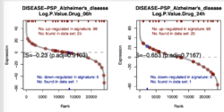
tree -L 1 ~/github/ssGSEA2.0/example/gct/2021-03-20/

├── PI3K_pert_logP_n2x23936_ssGSEA-combined.gct
├── PI3K_pert_logP_n2x23936_ssGSEA-fdr-pvalues.gct
├── PI3K_pert_logP_n2x23936_ssGSEA-pvalues.gct
├── PI3K_pert_logP_n2x23936_ssGSEA-scores.gct
├── PI3K_pert_logP_n2x23936_ssGSEA.RData
├── parameters.txt
├── rank-plots
├── run.log
└── signature_gct

tree ~/github/ssGSEA2.0/example/gct/2021-03-20/rank-plots | head -3
# 102 files. One file per matched gene set
├── DISEASE.PSP_Alzheime_2.pdf
├── DISEASE.PSP_breast_c_2.pdf

tree ~/github/ssGSEA2.0/example/gct/2021-03-20/signature_gct | head -3
# 102 files. One file per matched gene set
├── DISEASE.PSP_Alzheimer.s_disease_n2x23.gct
├── DISEASE.PSP_breast_cancer_n2x14.gct
Since the GCT file contains 2 samples (the last 2 columns), ssGSEA produces one rank plot for each gene set (with adjusted p-value & the plot could contain multiple samples). The ES scores are saved in <PI3K_pert_logP_n2x23936_ssGSEA-scores> and adjust p-values are saved in <PI3K_pert_logP_n2x23936_ssGSEA-fdr-pvalues>.
- Some discussions from biostars.org. Find -> "ssgsea"
- Some papers.
- 【生信分析 3】教你看懂GSEA和ssGSEA分析结果. No groups/classes in the data (6:33). Output is a heatmap. Each value is computed sample by sample. Rows = gene set. Columns = (sorted by the 1st gene set) samples.

phantasus
- phantasus Visual and interactive gene expression analysis. read.gct(), write.gct(), getGSE(), loadGEO(), gseaPlot().
- Using Phantasus application
Selected papers
Popularity and performance of bioinformatics software: the case of gene set analysis Xie 2021
GSDA
Gene-set distance analysis (GSDA): a powerful tool for gene-set association analysis