Ggplot2
Books
- R for Data Science Chapter 28 Graphics for communication
- R Graphics Cookbook by Winston Chang. Lots of recipes. For example, the Axes chapter talks how to set/hide tick marks.
- The Hitchhiker's Guide to Ggplot2 in R
- ggplot2 book and its source code. Before I build the (pdf version) of the book, I need to follow this suggestion by running the following in R before calling make.
- Data Visualization for Social Science
- R Graph Essentials Essentials by David Lillis. Chapters 3 and 4.
Some examples
- Top 50 ggplot2 Visualizations - The Master List
- http://blog.diegovalle.net/2015/01/the-74-most-violent-cities-in-mexico.html
- R Graph Catalog
Examples from 'R for Data Science' book - Aesthetic mappings
ggplot(data = mpg) +
  geom_point(mapping = aes(x = displ, y = hwy))

# template
ggplot(data = <DATA>) +
  <GEOM_FUNCTION>(mapping = aes(<MAPPINGS>))

# add another variable through color, size, alpha or shape
ggplot(data = mpg) +
  geom_point(mapping = aes(x = displ, y = hwy, color = class))

ggplot(data = mpg) +
  geom_point(mapping = aes(x = displ, y = hwy, size = class))

ggplot(data = mpg) +
  geom_point(mapping = aes(x = displ, y = hwy, alpha = class))

ggplot(data = mpg) +
  geom_point(mapping = aes(x = displ, y = hwy, shape = class))

ggplot(data = mpg) +
  geom_point(mapping = aes(x = displ, y = hwy), color = "blue")

# add another variable through facets
ggplot(data = mpg) +
  geom_point(mapping = aes(x = displ, y = hwy)) +
  facet_wrap(~ class, nrow = 2)

# add another 2 variables through facets
ggplot(data = mpg) +
  geom_point(mapping = aes(x = displ, y = hwy)) +
  facet_grid(drv ~ cyl)
Examples from 'R for Data Science' book - Geometric objects
# Points
ggplot(data = mpg) +
  geom_point(mapping = aes(x = displ, y = hwy))

# Smoothed
ggplot(data = mpg) +
  geom_smooth(mapping = aes(x = displ, y = hwy))

# Points + smoother
ggplot(data = mpg) +
  geom_point(mapping = aes(x = displ, y = hwy)) +
  geom_smooth(mapping = aes(x = displ, y = hwy))

# Colored points + smoother
ggplot(data = mpg, mapping = aes(x = displ, y = hwy)) +
  geom_point(mapping = aes(color = class)) +
  geom_smooth()
Examples from 'R for Data Science' book - Transformation
# y axis = counts
# bar plot
ggplot(data = diamonds) +
  geom_bar(mapping = aes(x = cut))
# Or
ggplot(data = diamonds) +
  stat_count(mapping = aes(x = cut))

# y axis = proportion
ggplot(data = diamonds) +
  geom_bar(mapping = aes(x = cut, y = ..prop.., group = 1))

# bar plot with 2 variables
ggplot(data = diamonds) +
  geom_bar(mapping = aes(x = cut, fill = clarity))
ggthemr: Themes for ggplot2
ggedit & ggplotgui – interactive ggplot aesthetic and theme editor
- https://www.r-statistics.com/2016/11/ggedit-interactive-ggplot-aesthetic-and-theme-editor/
- https://github.com/gertstulp/ggplotgui/. It allows to change text (axis, title, font size), themes, legend, et al. A docker website was set up for the online version.
ggconf: Simpler Appearance Modification of 'ggplot2'
https://github.com/caprice-j/ggconf
Plotting individual observations and group means
https://drsimonj.svbtle.com/plotting-individual-observations-and-group-means-with-ggplot2
subplot
https://ikashnitsky.github.io/2017/subplots-in-maps/
Easy way to mix multiple graphs on the same page
- http://www.cookbook-r.com/Graphs/Multiple_graphs_on_one_page_(ggplot2)/
- Easy Way to Mix Multiple Graphs on The Same Page. Four packages are included: ggpubr, cowplot, gridExtra and grid.
- egg: Extensions for 'ggplot2', to Align Plots, Plot insets, and Set Panel Sizes.
- Why you should master small multiple chart
- gridExtra
x and y labels
https://stackoverflow.com/questions/10438752/adding-x-and-y-axis-labels-in-ggplot2 or the Labels part of the cheatsheet
You can set the labels with xlab() and ylab(), or make it part of the scale_*.* call.
labs(x = "sample size", y = "ngenes (glmnet)")
Legend title
scale_colour_manual("Treatment", values = c("black", "red"))
ylim and xlim in ggplot2
https://stackoverflow.com/questions/3606697/how-to-set-limits-for-axes-in-ggplot2-r-plots or the Zooming part of the cheatsheet
Use one of the following
- + scale_x_continuous(limits = c(-5000, 5000))
- + coord_cartesian(xlim = c(-5000, 5000))
- + xlim(-5000, 5000)
Center title
See the Legends part of the cheatsheet.
ggtitle("MY TITLE") +
  theme(plot.title = element_text(hjust = 0.5))
Time series plot
- How to make a line chart with ggplot2
- Colour palettes. Note some palette options like Accent from the Qualitative category will give a warning message In RColorBrewer::brewer.pal(n, pal) : n too large, allowed maximum for palette Accent is 8.
Multiple lines plot https://stackoverflow.com/questions/14860078/plot-multiple-lines-data-series-each-with-unique-color-in-r
set.seed(45)
nc <- 9
df <- data.frame(x=rep(1:5, nc), val=sample(1:100, 5*nc),
                   variable=rep(paste0("category", 1:nc), each=5))
# plot
# http://colorbrewer2.org/#type=qualitative&scheme=Paired&n=9
ggplot(data = df, aes(x=x, y=val)) +
    geom_line(aes(colour=variable)) +
    scale_colour_manual(values=c("#a6cee3", "#1f78b4", "#b2df8a", "#33a02c", "#fb9a99", "#e31a1c", "#fdbf6f", "#ff7f00", "#cab2d6"))
Versus old fashion
dat <- matrix(runif(40,1,20),ncol=4) # make data
matplot(dat, type = c("b"),pch=1,col = 1:4) #plot
legend("topleft", legend = 1:4, col=1:4, pch=1) # optional legend
Github style calendar plot
- https://mvuorre.github.io/post/2016/2016-03-24-github-waffle-plot/
- https://gist.github.com/marcusvolz/84d69befef8b912a3781478836db9a75 from Create artistic visualisations with your exercise data
geom_errorbar(): error bars
- Can ggplot2 do this? https://www.nature.com/articles/nature25173/figures/1
- plotCI() from the plotrix package or geom_errorbar() from ggplot2 package
- http://sape.inf.usi.ch/quick-reference/ggplot2/geom_errorbar
- Vertical error bars
- Horizontal error bars
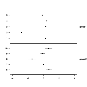
- Horizontal panel plot example and more
- R does not draw error bars out of the box. R has arrows() to create the error bars. Using just arrows(x0, y0, x1, y1, code=3, angle=90, length=.05, col). See
- Building Barplots with Error Bars. Note that the segments() statement is not necessary.
- https://www.rdocumentation.org/packages/graphics/versions/3.4.3/topics/arrows
- Toy example (see this nature paper)
set.seed(301)
x <- rnorm(10)
SE <- rnorm(10)
y <- 1:10

par(mfrow=c(2,1))
par(mar=c(0,4,4,4))
xlim <- c(-4, 4)
plot(x[1:5], 1:5, xlim=xlim, ylim=c(0+.1,6-.1), yaxs="i", xaxt = "n", ylab = "", pch = 16, las=1)
mtext("group 1", 4, las = 1, adj = 0, line = 1) # las=text rotation, adj=alignment, line=spacing
par(mar=c(5,4,0,4))
plot(x[6:10], 6:10, xlim=xlim, ylim=c(5+.1,11-.1), yaxs="i", ylab ="", pch = 16, las=1, xlab="")
arrows(x[6:10]-SE[6:10], 6:10, x[6:10]+SE[6:10], 6:10, code=3, angle=90, length=0)
mtext("group 2", 4, las = 1, adj = 0, line = 1)
text labels on scatterplots: ggrepel package
ggrepel package. Found on Some datasets for teaching data science by Rafael Irizarry.
