Ggplot2
Books
- ggplot2: Elegant Graphics for Data Analysis by Hadley Wickham
- R for Data Science Chapter 28 Graphics for communication
- R Graphics Cookbook, 2nd Edition by Winston Chang. Lots of recipes. For example, the Axes chapter talks how to set/hide tick marks.
- The Hitchhiker's Guide to Ggplot2 in R
- ggplot2 book and its source code. Before I build the (pdf version) of the book, I need to follow this suggestion by running the following in R before calling make.
- Fundamentals of Data Visualization by Claus O. Wilke. The R code is in the Technical Notes section. The book is interesting. It educates how to produce meaningful and easy to read plots. The FAQs says the figure source code is not available.
- Data Visualization for Social Science
- R Graph Essentials Essentials by David Lillis. Chapters 3 and 4.
- Data Visualization: A practical introduction by Kieran Healy
The Grammar of Graphics
- Data: Raw data that we'd like to visualize
- Geometrics: shapes that we use to visualize data
- Aesthetics: Properties of geometries (size, color, etc)
- Scales: Mapping between geometries and aesthetics
Scatterplot aesthetics
- x, y
- shape
- color
- size. It is not always to put 'size' inside aes(). See an example at Legend layout.
- alpha
Tutorials
- https://ggplot2.tidyverse.org/ which gives a link to two chapters in R for Data Science book
- The Complete ggplot2 Tutorial from http://r-statistics.co
- A curated list of awesome ggplot2 tutorials, packages etc.
- https://www.lynda.com/RStudio-tutorials/Data-Visualization-R-ggplot2/672258-2.html
- https://uc-r.github.io/ggplot_intro from UC Business Analytics R Programming Guide
- R graphics with ggplot2 workshop notes
Help
> library(ggplot2)
Need help? Try Stackoverflow: https://stackoverflow.com/tags/ggplot2
Extensions
http://www.ggplot2-exts.org/gallery/
Some examples
- Top 50 ggplot2 Visualizations - The Master List from http://r-statistics.co.
- http://blog.diegovalle.net/2015/01/the-74-most-violent-cities-in-mexico.html
- R Graph Catalog
Examples from 'R for Data Science' book - Aesthetic mappings
ggplot(data = mpg) +
  geom_point(mapping = aes(x = displ, y = hwy))
  # the 'mapping' is the 1st argument for all geom_* functions, so we can safely skip it.
# template
ggplot(data = <DATA>) +
  <GEOM_FUNCTION>(mapping = aes(<MAPPINGS>))

# add another variable through color, size, alpha or shape
ggplot(data = mpg) +
  geom_point(aes(x = displ, y = hwy, color = class))

ggplot(data = mpg) +
  geom_point(aes(x = displ, y = hwy, size = class))

ggplot(data = mpg) +
  geom_point(aes(x = displ, y = hwy, alpha = class))

ggplot(data = mpg) +
  geom_point(aes(x = displ, y = hwy, shape = class))

ggplot(data = mpg) +
  geom_point(aes(x = displ, y = hwy), color = "blue")

# add another variable through facets
ggplot(data = mpg) +
  geom_point(aes(x = displ, y = hwy)) +
  facet_wrap(~ class, nrow = 2)

# add another 2 variables through facets
ggplot(data = mpg) +
  geom_point(aes(x = displ, y = hwy)) +
  facet_grid(drv ~ cyl)
Examples from 'R for Data Science' book - Geometric objects, lines and smoothers
# Points
ggplot(data = mpg) +
  geom_point(aes(x = displ, y = hwy))

# Smoothed
ggplot(data = mpg) +
  geom_smooth(aes(x = displ, y = hwy))

# Points + smoother, add transparency to points, remove se
ggplot(data = mpg, mapping = aes(x = displ, y = hwy)) +
  geom_point(alpha=1/10) +
  geom_smooth(se=FALSE)

# Colored points + smoother
ggplot(data = mpg, aes(x = displ, y = hwy)) +
  geom_point(aes(color = class)) +
  geom_smooth()
Examples from 'R for Data Science' book - Transformation
# y axis = counts
# bar plot
ggplot(data = diamonds) +
  geom_bar(aes(x = cut))
# Or
ggplot(data = diamonds) +
  stat_count(aes(x = cut))

# y axis = proportion
ggplot(data = diamonds) +
  geom_bar(aes(x = cut, y = ..prop.., group = 1))

# bar plot with 2 variables
ggplot(data = diamonds) +
  geom_bar(aes(x = cut, fill = clarity))
facet_wrap and facet_grid to create a panel of plots
- http://www.cookbook-r.com/Graphs/Facets_(ggplot2)/
- Another example Polls v results
Color palette
- R -> Colors
- http://www.cookbook-r.com/Graphs/Colors_(ggplot2)/
- ggplot2 colors : How to change colors automatically and manually?
- ggpubr package which was used by survminer. The colors c("#00AFBB", "#FC4E07") are very similar to the colors used in ggsurvplot(). Colorblind-friendly palette
Color picker
https://github.com/daattali/colourpicker
https://ggplot2.tidyverse.org/reference/aes_colour_fill_alpha.html
Combine colors and shapes in legend
- https://ggplot2-book.org/scales.html#scale-details In order for legends to be merged, they must have the same name.
df <- data.frame(x = 1:3, y = 1:3, z = c("a", "b", "c")) ggplot(df, aes(x, y)) + geom_point(aes(shape = z, colour = z), size=4) - How to Work with Scales in a ggplot2 in R. This solution is better since it allows to change the legend title. Just make sure the title name we put in both scale_* functions are the same.
ggplot(mtcars, aes(x=hp, y=mpg)) +
   geom_point(aes(shape=factor(cyl), colour=factor(cyl))) +
   scale_shape_discrete("Cylinders") +
   scale_colour_discrete("Cylinders")
ggplot2::scale functions and scales packages
- Scales control the mapping from data to aesthetics. They take your data and turn it into something that you can see, like size, colour, position or shape.
- Scales also provide the tools that let you read the plot: the axes and legends.
ggplot2::scale
https://ggplot2-book.org/scales.html
Naming convention: scale_AestheticName_Variabletype
Examples:
- scale_x_discrete
- scale_y_continuous: scale_y_continuous(limits)
- Create your own discrete scale: scale_colour_manual(), scale_fill_manual(values), scale_size_manual(), scale_shape_manual(), scale_linetype_manual(), scale_alpha_manual(), scale_discrete_manual()
- See Figure 12.1: Axis and legend components on the book ggplot2: Elegant Graphics for Data Analysis
# Set x-axis label
scale_x_discrete("Car type")   # or a shortcut xlab() or labs()
scale_x_continuous("Displacement")

# Set legend title
scale_colour_discrete("Drive\ntrain")    # or a shortcut labs()

# Change the default color
scale_color_brewer()

# Change the axis scale
scale_x_sqrt()

# Change breaks and their labels
scale_x_continuous(breaks = c(2000, 4000), labels = c("2k", "4k"))

# Relabel the breaks in a categorical scale
scale_y_discrete(labels = c(a = "apple", b = "banana", c = "carrot"))
</li>
</ul>

=== Emulate ggplot2 default color palette ===
It is just equally spaced hues around the color wheel.
[https://stackoverflow.com/questions/8197559/emulate-ggplot2-default-color-palette Emulate ggplot2 default color palette]

'''Answer 1'''
<syntaxhighlight lang='rsplus'>
gg_color_hue <- function(n) {
  hues = seq(15, 375, length = n + 1)
  hcl(h = hues, l = 65, c = 100)[1:n]
}

n = 4
cols = gg_color_hue(n)

dev.new(width = 4, height = 4)
plot(1:n, pch = 16, cex = 2, col = cols)
</syntaxhighlight>

'''Answer 2''' (better, it shows the color values in HEX). It should be read from left to right and then top to down.

[https://scales.r-lib.org/ scales] package
<syntaxhighlight lang='rsplus'>
library(scales)
show_col(hue_pal()(4))
show_col(hue_pal()(2)) # (salmon, iris blue)
           # see https://www.htmlcsscolor.com/ for color names
</syntaxhighlight>

=== transform scales ===
[http://freerangestats.info/blog/2020/04/06/crazy-fox-y-axis How to make that crazy Fox News y axis chart with ggplot2 and scales]

== Class variables ==
"Set1" is a good choice. See [http://www.sthda.com/english/wiki/colors-in-r RColorBrewer::display.brewer.all()]

== Heatmap for single channel ==
https://scales.r-lib.org/
<syntaxhighlight lang='rsplus'>
# White <----> Blue
RColorBrewer::display.brewer.pal(n = 8, name = "Blues")
</syntaxhighlight>

== Heatmap for dual channels ==
http://www.sthda.com/english/wiki/colors-in-r <syntaxhighlight lang='rsplus'>
library(RcolorBrewer)
# Red <----> Blue
display.brewer.pal(n = 8, name = 'RdBu')
# Hexadecimal color specification
brewer.pal(n = 8, name = "RdBu")

plot(1:8, col=brewer_pal(palette = "RdBu")(8), pch=20, cex=4)

# Blue <----> Red
plot(1:8, col=rev(brewer_pal(palette = "RdBu")(8)), pch=20, cex=4)
</syntaxhighlight>

[[File:Twopalette.svg|300px]]

= Themes and background for ggplot2 =
* [https://www.datanovia.com/en/blog/ggplot-theme-background-color-and-grids/ ggplot2 theme background color and grids]

== ggthmr ==
[http://www.shanelynn.ie/themes-and-colours-for-r-ggplots-with-ggthemr/ ggthmr] package

== ggsci ==
https://nanx.me/ggsci/

== Font size ==
[https://statisticsglobe.com/change-font-size-of-ggplot2-plot-in-r-axis-text-main-title-legend Change Font Size of ggplot2 Plot in R (5 Examples) | Axis Text, Main Title & Legend]

== ggthemes package ==
https://cran.r-project.org/web/packages/ggthemes/index.html

= Common plots =
https://ggplot2.tidyverse.org/reference/index.html

== Line plots ==
* http://www.sthda.com/english/wiki/ggplot2-line-plot-quick-start-guide-r-software-and-data-visualization
* [https://observablehq.com/@d3/multi-line-chart Multi-Line Chart] by D3. Download the tarball. The index.html shows the interactive plot on FF but not Chrome or safari. See [https://stackoverflow.com/a/46992592 ES6 module support in Chrome 62/Chrome Canary 64, does not work locally]. Chrome is blocking it because local files cannot have cross origin requests. it should work in chrome if you put it on a server.
** [https://observablehq.com/@bencf/multi-line-chart This] and [https://observablehq.com/@shaswat-du/d3-multi-line-chart this] are examples where  X is a continuous variable.
** Click "..." and compare code.

== Histogram ==
<syntaxhighlight lang='rsplus'>
ggplot(data = txhousing, aes(x = median)) +
  geom_histogram()
</syntaxhighlight>

[http://www.deeplytrivial.com/2020/04/p-is-for-percent.html Histogram vs barplot] from deeply trivial.

== Boxplot with jittering ==
<syntaxhighlight lang='rsplus'>
ggplot(data.frame(Wi), aes(y = Wi)) +
  geom_boxplot()
</syntaxhighlight>

* https://ggplot2.tidyverse.org/reference/geom_jitter.html
* https://stackoverflow.com/a/17560113
* https://www.tutorialgateway.org/r-ggplot2-jitter/

<syntaxhighlight lang='rsplus'>
# df2 is n x 2
ggplot(df2, aes(x=nboot, y=boot)) +
  geom_boxplot(outlier.shape=NA) + #avoid plotting outliers twice
  geom_jitter(aes(color=nboot), position=position_jitter(width=.2, height=0, seed=1)) +
  labs(title="", y = "", x = "nboot")
</syntaxhighlight>

If we omit the '''outlier.shape=NA''' option in geom_boxplot(), we will get the following plot.

[[File:Jitterboxplot.png|300px]]

== Violin plot ==
<syntaxhighlight lang='rsplus'>
library(ggplot2)
ggplot(midwest, aes(state, area)) + geom_violin() + ggforce::geom_sina()
</syntaxhighlight>

[[File:Violinplot.png|250px]]

== Kernel density plot ==
* https://ggplot2.tidyverse.org/reference/geom_density.html
* https://learnr.wordpress.com/2009/03/16/ggplot2-plotting-two-or-more-overlapping-density-plots-on-the-same-graph/
* http://www.cookbook-r.com/Graphs/Plotting_distributions_(ggplot2)/

== Back to back barplot ==
* https://community.rstudio.com/t/back-to-back-barplot/17106
* https://stackoverflow.com/a/55015174 (different scale on positive/negative sides)
* https://learnr.wordpress.com/2009/09/24/ggplot2-back-to-back-bar-charts/  (change negative values to positive values)
* [https://stackoverflow.com/a/33837922 Pyramid plot in R]

== Bivariate analysis with ggpair ==
[https://www.guru99.com/r-pearson-spearman-correlation.html Correlation in R: Pearson & Spearman with Matrix Example ]

== barplot ==
[http://www.brodrigues.co/blog/2020-04-12-basic_ggplot2/ How to basic: bar plots]

== Ordered barplot and facet ==
* [https://juliasilge.com/blog/reorder-within/ Reordering and facetting for ggplot2]
* Chapter2 of [https://github.com/chuvanan/rdatatable-cookbook data.table cookbook] (simpler case)

= Special plots =
== Bump plot: plot ranking over time ==
https://github.com/davidsjoberg/ggbump

= Aesthetics =
* https://ggplot2.tidyverse.org/reference/aes.html
* https://ggplot2.tidyverse.org/articles/ggplot2-specs.html

== group ==
https://ggplot2.tidyverse.org/reference/aes_group_order.html

= GUI =
== ggedit & ggplotgui – interactive ggplot aesthetic and theme editor ==
* https://www.r-statistics.com/2016/11/ggedit-interactive-ggplot-aesthetic-and-theme-editor/
* https://github.com/gertstulp/ggplotgui/. It allows to change text (axis, title, font size), themes, legend, et al. A docker website was set up for the online version.

== esquisse (French, means 'sketch'): creating ggplot2 interactively ==
https://cran.rstudio.com/web/packages/esquisse/index.html

A 'shiny' gadget to create 'ggplot2' charts interactively with drag-and-drop to map your variables. You can quickly visualize your data accordingly to their type, export to 'PNG' or 'PowerPoint', and retrieve the code to reproduce the chart.

The interface introduces basic terms used in ggplot2:
* x, y,
* fill (useful for geom_bar, geom_rect, geom_boxplot, & geom_raster, not useful for scatterplot),
* color (edges for geom_bar, geom_line, geom_point),
* size,
* [http://www.cookbook-r.com/Graphs/Facets_(ggplot2)/ facet], split up your data by one or more variables and plot the subsets of data together.

It does not include all features in ggplot2. At the bottom of the interface,
* Labels & title & caption.
* Plot options. Palette, theme, legend position.
* Data. Remove subset of data.
* Export & code. Copy/save the R code. Export file as PNG or PowerPoint.

== ggcharts ==
https://cran.r-project.org/web/packages/ggcharts/index.html

= plotly =
[[R#plotly|R → plotly]]

= ggconf: Simpler Appearance Modification of 'ggplot2' =
https://github.com/caprice-j/ggconf

= Plotting individual observations and group means =
https://drsimonj.svbtle.com/plotting-individual-observations-and-group-means-with-ggplot2

= subplot =
* https://ikashnitsky.github.io/2017/subplots-in-maps/
* [https://stackoverflow.com/a/20721231 Embedding a subplot]

= Easy way to mix multiple graphs on the same page =
* http://www.cookbook-r.com/Graphs/Multiple_graphs_on_one_page_(ggplot2)/. '''grid''' package is used.
* [https://cran.r-project.org/web/packages/gridExtra/index.html gridExtra] which has lots of reverse imports.
** [https://datascienceplus.com/machine-learning-results-one-plot-to-rule-them-all/ Machine Learning Results in R: one plot to rule them all!]
* [https://cran.rstudio.com/web/packages/egg/ egg] (ggarrange()): Extensions for 'ggplot2', to Align Plots, Plot insets, and Set Panel Sizes. Same author of gridExtra package. egg depends on gridExtra.
** [https://onunicornsandgenes.blog/2019/01/13/showing-a-difference-in-means-between-two-groups/ Showing a difference in means between two groups]
** [https://stackoverflow.com/a/16258375 How can I make consistent-width plots in ggplot (with legends)?]
* [http://www.sthda.com/english/wiki/ggplot2-easy-way-to-mix-multiple-graphs-on-the-same-page Easy Way to Mix Multiple Graphs on The Same Page]. Four packages are included: '''ggpubr''' (ggarrange()), '''cowplot, gridExtra''' and '''grid'''.
** [https://datascienceplus.com/how-to-combine-multiple-ggplot-plots-to-make-publication-ready-plots/ How to combine Multiple ggplot Plots to make Publication-ready Plots]
* [http://www.sharpsightlabs.com/blog/master-small-multiple/ Why you should master small multiple chart] (facet_wrap()), facet_grid())
* [https://hadley.shinyapps.io/cran-downloads/ Download statistics] and enter "gridExtra, cowplot, ggpubr, egg, grid" (the number of downloads is in this order).
* [https://stackoverflow.com/a/39009374 how to add common x and y labels to a grid of plots]. Another solution is on the egg package's [https://cran.rstudio.com/web/packages/egg/vignettes/Ecosystem.html vignette].

= gridExtra =
== Force a regular plot object into a Grob for use in grid.arrange ==
[https://stackoverflow.com/a/33848995 gridGraphics] package

== make one panel blank/create a placeholder ==
https://stackoverflow.com/questions/20552226/make-one-panel-blank-in-ggplot2

= labs =
== x and y labels ==
https://stackoverflow.com/questions/10438752/adding-x-and-y-axis-labels-in-ggplot2 or the '''Labels''' part of the [https://www.rstudio.com/wp-content/uploads/2015/03/ggplot2-cheatsheet.pdf cheatsheet]

You can set the labels with xlab() and ylab(), or make it part of the scale_*.* call.

<pre>
labs(x = "sample size", y = "ngenes (glmnet)")
name-value pairs
See several examples (color, fill, size, ...) from opioid prescribing habits in texas.
Prevent sorting of x labels
See Change the order of a discrete x scale.
The idea is to set the levels of x variable.
junk   # n x 2 table
colnames(junk) <- c("gset", "boot")
junk$gset <- factor(junk$gset, levels = as.character(junk$gset))
ggplot(data = junk, aes(x = gset, y = boot, group = 1)) +
  geom_line() +
  theme(axis.text.x=element_text(color = "black", angle=30, vjust=.8, hjust=0.8))
Legends
Legend title
- labs() function
p <- ggplot(df, aes(x, y)) + geom_point(aes(colour = z))
p + labs(x = "X axis", y = "Y axis", colour = "Colour\nlegend")
- scale_colour_manual()
scale_colour_manual("Treatment", values = c("black", "red")) - scale_color_discrete() and scale_shape_discrete(). See Combine colors and shapes in legend.
df <- data.frame(x = 1:3, y = 1:3, z = c("a", "b", "c"))
ggplot(df, aes(x, y)) + geom_point(aes(shape = z, colour = z), size=5) +
  scale_color_discrete('new title') + scale_shape_discrete('new title')
Layout: move the legend from right to top/bottom of the plot or hide it
gg + theme(legend.position = "top")

gg + theme(legend.position="none")
Guide functions
https://ggplot2-book.org/scales.html#guide-functions The guide functions, guide_colourbar() and guide_legend(), offer additional control over the fine details of the legend.
guide_legend() allows the modification of legends for scales, including fill, color, and shape.
This function can be used in scale_fill_manual(), scale_fill_continuous(), ... functions.
scale_fill_manual(values=c("orange", "blue"),
                  guide=guide_legend(title = "My Legend Title",
                                     nrow=1,
                                     label.position = "top",
                                     keywidth=2.5))
ylim and xlim in ggplot2
https://stackoverflow.com/questions/3606697/how-to-set-limits-for-axes-in-ggplot2-r-plots or the Zooming part of the cheatsheet
Use one of the following
- + scale_x_continuous(limits = c(-5000, 5000))
- + coord_cartesian(xlim = c(-5000, 5000))
- + xlim(-5000, 5000)
ggtitle()
Centered title
See the Legends part of the cheatsheet.
ggtitle("MY TITLE") +
  theme(plot.title = element_text(hjust = 0.5))
Subtitle
ggtitle("My title",
        subtitle = "My subtitle")
margins
https://stackoverflow.com/a/10840417
Time series plot
- How to make a line chart with ggplot2
- Colour palettes. Note some palette options like Accent from the Qualitative category will give a warning message In RColorBrewer::brewer.pal(n, pal) : n too large, allowed maximum for palette Accent is 8.
Multiple lines plot https://stackoverflow.com/questions/14860078/plot-multiple-lines-data-series-each-with-unique-color-in-r
set.seed(45)
nc <- 9
df <- data.frame(x=rep(1:5, nc), val=sample(1:100, 5*nc),
                   variable=rep(paste0("category", 1:nc), each=5))
# plot
# http://colorbrewer2.org/#type=qualitative&scheme=Paired&n=9
ggplot(data = df, aes(x=x, y=val)) +
    geom_line(aes(colour=variable)) +
    scale_colour_manual(values=c("#a6cee3", "#1f78b4", "#b2df8a", "#33a02c", "#fb9a99", "#e31a1c", "#fdbf6f", "#ff7f00", "#cab2d6"))
Versus old fashion
dat <- matrix(runif(40,1,20),ncol=4) # make data
matplot(dat, type = c("b"),pch=1,col = 1:4) #plot
legend("topleft", legend = 1:4, col=1:4, pch=1) # optional legend
Github style calendar plot
- https://mvuorre.github.io/post/2016/2016-03-24-github-waffle-plot/
- https://gist.github.com/marcusvolz/84d69befef8b912a3781478836db9a75 from Create artistic visualisations with your exercise data
geom_bar(), geom_col(), stat_count()
https://ggplot2.tidyverse.org/reference/geom_bar.html
geom_segment()
Line segments, arrows and curves
geom_errorbar(): error bars
- Can ggplot2 do this? https://www.nature.com/articles/nature25173/figures/1
- plotCI() from the plotrix package or geom_errorbar() from ggplot2 package
- http://sape.inf.usi.ch/quick-reference/ggplot2/geom_errorbar
- Vertical error bars
- Horizontal error bars
- Horizontal panel plot example and more
- R does not draw error bars out of the box. R has arrows() to create the error bars. Using just arrows(x0, y0, x1, y1, code=3, angle=90, length=.05, col). See
- Building Barplots with Error Bars. Note that the segments() statement is not necessary.
- https://www.rdocumentation.org/packages/graphics/versions/3.4.3/topics/arrows
- Toy example (see this nature paper)
set.seed(301)
x <- rnorm(10)
SE <- rnorm(10)
y <- 1:10

par(mfrow=c(2,1))
par(mar=c(0,4,4,4))
xlim <- c(-4, 4)
plot(x[1:5], 1:5, xlim=xlim, ylim=c(0+.1,6-.1), yaxs="i", xaxt = "n", ylab = "", pch = 16, las=1)
mtext("group 1", 4, las = 1, adj = 0, line = 1) # las=text rotation, adj=alignment, line=spacing
par(mar=c(5,4,0,4))
plot(x[6:10], 6:10, xlim=xlim, ylim=c(5+.1,11-.1), yaxs="i", ylab ="", pch = 16, las=1, xlab="")
arrows(x[6:10]-SE[6:10], 6:10, x[6:10]+SE[6:10], 6:10, code=3, angle=90, length=0)
mtext("group 2", 4, las = 1, adj = 0, line = 1)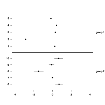
geom_rect()
- https://ggplot2.tidyverse.org/reference/geom_tile.html
- https://plotly.com/ggplot2/geom_rect/, https://ggplot2.tidyverse.org/reference/aes_colour_fill_alpha.html
Note that we can use scale_fill_manual() to change the 'fill' colors (scheme/palette). The 'fill' parameter in geom_rect() is only used to define the discrete variable.
text annotations: ggrepel package
- ggrepel package. Found on Some datasets for teaching data science by Rafael Irizarry.
- Annotations from the chapter Graphics for communication of R for Data Science by Grolemund & Hadley
- ggplot2 texts : Add text annotations to a graph in R software. The functions geom_text() and annotate() can be used to add a text annotation at a particular coordinate/position.
- https://ggplot2-book.org/annotations.html
annotate("text", label="Toyota", x=3, y=100)

geom_text(aes(x, y, label), data, size, vjust, hjust, nudge_x)
Fonts
Adding Custom Fonts to ggplot in R
Save the plots
ggsave() We can specify dpi to increase the resolution. For example,
g1 <- ggplot(data = mydf)
g1
ggsave("myfile.png", g1, height = 7, width = 8, units = "in", dpi = 500)
graphics::smoothScatter
BBC
- bbplot package from github
- BBC Visual and Data Journalism cookbook for R graphics from github
- How the BBC Visual and Data Journalism team works with graphics in R
Add your brand to ggplot graph
You Need to Start Branding Your Graphs. Here's How, with ggplot!
Python
plotnine: A Grammar of Graphics for Python.
plotnine is an implementation of a grammar of graphics in Python, it is based on ggplot2. The grammar allows users to compose plots by explicitly mapping data to the visual objects that make up the plot.
- labs() function
