Ggplot2
Books
- ggplot2: Elegant Graphics for Data Analysis by Hadley Wickham, Chapter 13 Guides: legends and axes
- R for Data Science Chapter 28 Graphics for communication
- R Graphics Cookbook, 2nd Edition by Winston Chang. Lots of recipes. For example, the Axes chapter talks how to set/hide tick marks.
- The Hitchhiker's Guide to Ggplot2 in R
- ggplot2 book and its source code. Before I build the (pdf version) of the book, I need to follow this suggestion by running the following in R before calling make.
- Fundamentals of Data Visualization by Claus O. Wilke. The R code is in the Technical Notes section. The book is interesting. It educates how to produce meaningful and easy to read plots. The FAQs says the figure source code is not available.
- Data Visualization for Social Science
- R Graph Essentials Essentials by David Lillis. Chapters 3 and 4.
- Data Visualization: A practical introduction by Kieran Healy
- ggplot2 Grammar Guide
The Grammar of Graphics
- Data: Raw data that we'd like to visualize
- Geometrics: shapes that we use to visualize data
- Aesthetics: Properties of geometries (size, color, etc)
- Scales: Mapping between geometries and aesthetics
Scatterplot aesthetics
geom_point(). The aesthetics is geom dependent.
- x, y
- shape
- color
- size. It is not always to put 'size' inside aes(). See an example at Legend layout.
- alpha
library(ggplot2)
library(tidyverse)
set.seed(1)
x1 <- rbinom(100, 1, .5) - .5
x2 <- c(rnorm(50, 3, .8)*.1, rnorm(50, 8, .8)*.1)
x3 <- x1*x2*2
# x=1:100, y=x1, x2, x3
tibble(x=1:length(x1), T=x1, S=x2, I=x3) %>%
  tidyr::pivot_longer(-x) %>%
  ggplot(aes(x=x, y=value)) +
  geom_point(aes(color=name))

# Cf
matplot(1:length(x1), cbind(x1, x2, x3), pch=16,
        col=c('cornflowerblue', 'springgreen3', 'salmon'))
Online tutorials
- https://ggplot2.tidyverse.org/ which gives a link to two chapters in R for Data Science book
- The Complete ggplot2 Tutorial from http://r-statistics.co
- A curated list of awesome ggplot2 tutorials, packages etc.
- https://www.lynda.com/RStudio-tutorials/Data-Visualization-R-ggplot2/672258-2.html
- https://uc-r.github.io/ggplot_intro from UC Business Analytics R Programming Guide
- R graphics with ggplot2 workshop notes
- Graphics in R with ggplot2 Aug 2020
- ggplot2 - Essentials from sthda.
- A ggplot2 Tutorial for Beautiful Plotting in R
- Chapter 7 ggplot2 from Introduction to Data Science Data Analysis and Prediction Algorithms with R, Rafael A. Irizarry
- Plotting anything with ggplot2 - ggplot2 workshop part 1 (youtube) by Thomas Lin Pedersen
Help
> library(ggplot2)
Need help? Try Stackoverflow: https://stackoverflow.com/tags/ggplot2
Gallery
- https://www.r-graph-gallery.com/ggplot2-package.html
- http://r-statistics.co/Top50-Ggplot2-Visualizations-MasterList-R-Code.html
- A ggplot2 Tutorial for Beautiful Plotting in R
Some examples
- Top 50 ggplot2 Visualizations - The Master List from http://r-statistics.co.
- http://blog.diegovalle.net/2015/01/the-74-most-violent-cities-in-mexico.html
- R Graph Catalog
Examples from 'R for Data Science' book - Aesthetic mappings
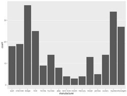
ggplot(data = mpg) +
  geom_point(mapping = aes(x = displ, y = hwy))
  # the 'mapping' is the 1st argument for all geom_* functions, so we can safely skip it.
# template
ggplot(data = <DATA>) +
  <GEOM_FUNCTION>(mapping = aes(<MAPPINGS>))

# add another variable through color, size, alpha or shape
ggplot(data = mpg) +
  geom_point(aes(x = displ, y = hwy, color = class))

ggplot(data = mpg) +
  geom_point(aes(x = displ, y = hwy, size = class))

ggplot(data = mpg) +
  geom_point(aes(x = displ, y = hwy, alpha = class))

ggplot(data = mpg) +
  geom_point(aes(x = displ, y = hwy, shape = class))

ggplot(data = mpg) +
  geom_point(aes(x = displ, y = hwy), color = "blue")

# add another variable through facets
ggplot(data = mpg) +
  geom_point(aes(x = displ, y = hwy)) +
  facet_wrap(~ class, nrow = 2)

# add another 2 variables through facets
ggplot(data = mpg) +
  geom_point(aes(x = displ, y = hwy)) +
  facet_grid(drv ~ cyl)
Examples from 'R for Data Science' book - Geometric objects, lines and smoothers
How to Add a Regression Line to a ggplot?
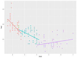
# Points
ggplot(data = mpg) +
  geom_point(aes(x = displ, y = hwy)) # we can add color to aes()

# Line plot
ggplot() +
  geom_line(aes(x, y))  # we can add color to aes()

# Smoothed
# 'size' controls the line width
ggplot(data = mpg) +
  geom_smooth(aes(x = displ, y = hwy), size=1)

# Points + smoother, add transparency to points, remove se
# We add transparency if we need to make smoothed line stands out
#                    and points less significant
# We move aes to the '''mapping''' option in ggplot()
ggplot(data = mpg, mapping = aes(x = displ, y = hwy)) +
  geom_point(alpha=1/10) +
  geom_smooth(se=FALSE)

# Colored points + smoother
ggplot(data = mpg, aes(x = displ, y = hwy)) +
  geom_point(aes(color = class)) +
  geom_smooth()
Examples from 'R for Data Science' book - Transformation, bar plot
# y axis = counts
# bar plot
ggplot(data = diamonds) +
  geom_bar(aes(x = cut))
# Or
ggplot(data = diamonds) +
  stat_count(aes(x = cut))

# y axis = proportion
ggplot(data = diamonds) +
  geom_bar(aes(x = cut, y = ..prop.., group = 1))

# bar plot with 2 variables
ggplot(data = diamonds) +
  geom_bar(aes(x = cut, fill = clarity))
facet_wrap and facet_grid to create a panel of plots
- http://www.cookbook-r.com/Graphs/Facets_(ggplot2)/
- Another example Polls v results
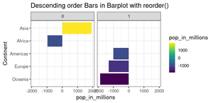
- Ordering bars within their clumps in a bar chart
- The statement facet_grid() can be defined without a data. For example
mylayout <- list(ggplot2::facet_grid(cat_y ~ cat_x)) mytheme <- c(mylayout, list(ggplot2::theme_bw(), ggplot2::ylim(NA, 1))) # we haven't defined cat_y, cat_x variables ggplot() + geom_line() + mylayout - Multiclass predictive modeling for #TidyTuesday NBER papers
Color palette
- R -> Colors
- http://www.cookbook-r.com/Graphs/Colors_(ggplot2)/
- ggplot2 colors : How to change colors automatically and manually?
- ggpubr package which was used by survminer. The colors c("#00AFBB", "#FC4E07") are very similar to the colors used in ggsurvplot(). Colorblind-friendly palette
- Ten simple rules to colorize biological data visualization
- a MEGA thread about all the ways you can choose a palette May 2021
- Top R Color Palettes to Know for Great Data Visualization
Color blind
colorblindcheck: Check Color Palettes for Problems with Color Vision Deficiency
Color picker
https://github.com/daattali/colourpicker
> library(colourpicker)
> plotHelper(colours=5)

Listening on http://127.0.0.1:6023
Color names, Complementary/Inverted colors
- ColorNameR - A tool for transforming coordinates in a color space to common color names using data from the Royal Horticultural Society and the International Union for the Protection of New Varieties of Plants.
- ColorHexa
- https://pinetools.com/invert-color
colorspace package
- https://colorspace.r-forge.r-project.org/ More vignettes than CRAN have.
- Approximating Palettes from Other Packages
- it supports R's base graphics and also ggplot2 (eg scale_fill_discrete_qualitative(palette) , notice the part discrete_quantitative is specific to colorspace package). See my ggplot2 page.
- CRAN colorspace: A Toolbox for Manipulating and Assessing Colors and Palettes
- Some examples. The palette selections are different from scale_fill_XXX(). Note that the number of classes can be arbitrary in scale_fill_discrete_qualitative().
- Note
- why it does not "Set 1"?
- the "Dark 2" colors are not the same as in RColorBrewer.
*paletteer package
- The paletteer package offers direct access to 1759 color palettes, from 50 different packages!
- paletteer, paletteer_d() function for getting discrete palette by package and name.
- *More examples with a gallery
paletteer_d("RColorBrewer::RdBu")
#67001FFF #B2182BFF #D6604DFF #F4A582FF #FDDBC7FF #F7F7F7FF
#D1E5F0FF #92C5DEFF #4393C3FF #2166ACFF #053061FF

paletteer_d("ggsci::uniform_startrek")
#CC0C00FF #5C88DAFF #84BD00FF #FFCD00FF #7C878EFF #00B5E2FF #00AF66FF

ggplot(iris, aes(Sepal.Length, Sepal.Width, color = Species)) +
      geom_point() +
      scale_color_paletteer_d("ggsci::uniform_startrek")
# the next is the same as above
ggplot(iris, aes(Sepal.Length, Sepal.Width, color = Species)) +
     geom_point() +
     scale_color_manual(values = c("setosa" = "#CC0C00FF",
                                   "versicolor" = "#5C88DAFF",
                                   "virginica" = "#84BD00FF"))
ggsci
ggokabeito
ggokabeito: Colorblind-friendly, qualitative 'Okabe-Ito' Scales for ggplot2 and ggraph. It seems to only support up to 9 classes/colors. It will give an error message if we have too many classes; e.g. Error: Insufficient values in manual scale. 15 needed but only 9 provided.)
# Bad
ggplot(mpg, aes(hwy, color = class, fill = class)) +
     geom_density(alpha = .8)

# Bad (single color)
ggplot(mpg, aes(hwy, color = class, fill = class)) +
     geom_density(alpha = .8) +
     scale_fill_brewer(name = "Class") +
     scale_color_brewer(name = "Class")

# Bad
ggplot(mpg, aes(hwy, color = class, fill = class)) +
     geom_density(alpha = .8) +
     scale_fill_brewer(name = "Class", palette ="Set1") +
     scale_color_brewer(name = "Class", palette ="Set1")

# Nice
ggplot(mpg, aes(hwy, color = class, fill = class)) +
     geom_density(alpha = .8) +
     scale_fill_okabe_ito(name = "Class") +
     scale_color_okabe_ito(name = "Class")
Pride palette
Show Pride on Your Plots. gglgbtq package
unikn
- unikn: Enabling corporate design elements in R (with colors and color-related functions). The curve plot is interesting.
- 12 ggplot extensions for snazzier R graphics
https://ggplot2.tidyverse.org/reference/aes_colour_fill_alpha.html
Scatterplot with large number of points: alpha
ggplot(aes(x, y)) +
    geom_point(alpha=.1)
Combine colors and shapes in legend
- https://ggplot2-book.org/scales.html#scale-details In order for legends to be merged, they must have the same name.
df <- data.frame(x = 1:3, y = 1:3, z = c("a", "b", "c")) ggplot(df, aes(x, y)) + geom_point(aes(shape = z, colour = z), size=4) - How to Work with Scales in a ggplot2 in R. This solution is better since it allows to change the legend title. Just make sure the title name we put in both scale_* functions are the same.
ggplot(mtcars, aes(x=hp, y=mpg)) + geom_point(aes(shape=factor(cyl), colour=factor(cyl))) + scale_shape_discrete("Cylinders") + scale_colour_discrete("Cylinders") - GGPLOT Point Shapes Best Tips
ggplot2::scale functions and scales packages
- Scales control the mapping from data to aesthetics. They take your data and turn it into something that you can see, like size, colour, position or shape.
- Scales also provide the tools that let you read the plot: the axes and legends.
- scales 1.2.0
ggplot2::scale - axes/axis, legend
https://ggplot2-book.org/scales.html
Naming convention: scale_AestheticName_NameDataType where
- AestheticName can be x, y, color, fill, size, shape, ...
- NameDataType can be continuous, discrete, manual or gradient.
Examples:
- scale_x_discrete, scale_y_continuous
- Create your own discrete scale:
- scale_colour_manual(),
- scale_fill_manual(values),
- scale_size_manual(),
- scale_shape_manual(),
- scale_linetype_manual(),
- scale_alpha_manual(),
- scale_discrete_manual()
- See Figure 12.1: Axis and legend components on the book ggplot2: Elegant Graphics for Data Analysis
# Set x-axis label scale_x_discrete("Car type") # or a shortcut xlab() or labs() scale_x_continuous("Displacement") # Set legend title scale_colour_discrete("Drive\ntrain") # or a shortcut labs() # Change the default color scale_color_brewer() # Change the axis scale scale_x_sqrt() # Change breaks and their labels scale_x_continuous(breaks = c(2000, 4000), labels = c("2k", "4k")) # Relabel the breaks in a categorical scale scale_y_discrete(labels = c(a = "apple", b = "banana", c = "carrot")) - How to change the color in geom_point or lines in ggplot
ggplot() + geom_point(data = data, aes(x = time, y = y, color = sample),size=4) + scale_color_manual(values = c("A" = "black", "B" = "red")) ggplot(data = data, aes(x = time, y = y, color = sample)) + geom_point(size=4) + geom_line(aes(group = sample)) + scale_color_manual(values = c("A" = "black", "B" = "red")) - See an example at geom_linerange where we have to specify the limits parameter in order to make "8" < "16" < "20"; otherwise it is 16 < 20 < 8.
Browse[2]> order(coordinates$chr)
[1] 3 4 1 2
Browse[2]> coordinates$chr
[1] "20" "8"  "16" "16"
ylim and xlim in ggplot2 in axes
https://stackoverflow.com/questions/3606697/how-to-set-limits-for-axes-in-ggplot2-r-plots or the Zooming part of the cheatsheet
Use one of the following
- + scale_x_continuous(limits = c(-5000, 5000))
- + coord_cartesian(xlim = c(-5000, 5000))
- + xlim(-5000, 5000)
Emulate ggplot2 default color palette
It is just equally spaced hues around the color wheel. Emulate ggplot2 default color palette
Answer 1
gg_color_hue <- function(n) {
  hues = seq(15, 375, length = n + 1)
  hcl(h = hues, l = 65, c = 100)[1:n]
}

n = 4
cols = gg_color_hue(n)

dev.new(width = 4, height = 4)
plot(1:n, pch = 16, cex = 2, col = cols)
Answer 2 (better, it shows the color values in HEX). It should be read from left to right and then top to down.
scales package
library(scales)
show_col(hue_pal()(4)) # ("#F8766D", "#7CAE00", "#00BFC4", "#C77CFF")
                       # (Salmon, Christi, Iris Blue, Heliotrope)
show_col(hue_pal()(3)) # ("#F8766D", "#00BA38", "#619CFF")
                       # (Salmon, Dark Pastel Green, Cornflower Blue)
show_col(hue_pal()(2)) # ("#F8767D", "#00BFC4") = (salmon, iris blue)
           # see https://www.htmlcsscolor.com/ for color names
See also the last example in ggsurv() where the KM plots have 4 strata. The colors can be obtained by scales::hue_pal()(4) with hue_pal()'s default arguments.
R has a function called colorName() to convert a hex code to color name; see roloc package on CRAN.
transform scales
How to make that crazy Fox News y axis chart with ggplot2 and scales
Class variables
"Set1" is a good choice. See RColorBrewer::display.brewer.all()
Red, Green, Blue alternatives
- Red: "maroon"
Heatmap for single channel
How to Make a Heatmap of Customers in R, source code on github. geom_tile() and geom_text() were used. Heatmap in ggplot2 from https://r-charts.com/.
# White <----> Blue
RColorBrewer::display.brewer.pal(n = 8, name = "Blues")
Heatmap for dual channels
http://www.sthda.com/english/wiki/colors-in-r
library(RColorBrewer)
# Red <----> Blue
display.brewer.pal(n = 8, name = 'RdBu')
# Hexadecimal color specification
brewer.pal(n = 8, name = "RdBu")

plot(1:8, col=brewer_pal(palette = "RdBu")(8), pch=20, cex=4)

# Blue <----> Red
plot(1:8, col=rev(brewer_pal(palette = "RdBu")(8)), pch=20, cex=4)

Don't rely on color to explain the data
Don't use very bright or low-contrast colors, accessibility
Create your own scale_fill_FOO and scale_color_FOO
Custom colour palettes for {ggplot2}
Themes and background for ggplot2
Background
- Export plot in .png with transparent background in base R plot.
x = c(1, 2, 3)
op <- par(bg=NA)
plot (x)

dev.copy(png,'myplot.png')
dev.off()
par(op)
- Transparent background with ggplot2
library(ggplot2) data("airquality") p <- ggplot(airquality, aes(Solar.R, Temp)) + geom_point() + geom_smooth() + # set transparency theme( panel.grid.major = element_blank(), panel.grid.minor = element_blank(), panel.background = element_rect(fill = "transparent",colour = NA), plot.background = element_rect(fill = "transparent",colour = NA) ) p ggsave("airquality.png", p, bg = "transparent") - ggplot2 theme background color and grids
ggplot() + geom_bar(aes(x=, fill=y)) +
           theme(panel.background=element_rect(fill='purple')) +
           theme(plot.background=element_blank())

ggplot() + geom_bar(aes(x=, fill=y)) +
           theme(panel.background=element_blank()) +
           theme(plot.background=element_blank()) # minimal background like base R
           # the grid lines are not gone; they are white so it is the same as the background

ggplot() + geom_bar(aes(x=, fill=y)) +
           theme(panel.background=element_blank()) +
           theme(plot.background=element_blank()) +
           theme(panel.grid.major.y = element_line(color="grey"))
           # draw grid line on y-axis only

ggplot() + geom_bar() +
           theme_bw()  # very similar to theme_light()

ggplot() + geom_bar() +
           theme_minimal() # no edge

ggplot() + geom_bar() +
           theme_void() # no grid, no edge

ggplot() + geom_bar() +
           theme_dark()
ggthmr
ggthmr package
Font size
- https://ggplot2.tidyverse.org/reference/theme.html
- Change Font Size of ggplot2 Plot in R (5 Examples) | Axis Text, Main Title & Legend
- What is the default font for ggplot2
- Fonts from Cookbook for R
For example to make the subtitle font size smaller
my_ggp + theme(plot.sybtitle = element_text(size = 8))
# Default font size seems to be 11 for title/subtitle
Remove x and y axis titles
ggplot2 title : main, axis and legend titles
Rotate x-axis labels, change colors
Counter-clockwise
theme(axis.text.x = element_text(angle = 90)
customize ggplot2 axis labels with different colors
Add axis on top or right hand side
- Specify a secondary axis, sec_axis(). This new function was added in ggplot2 2.2.0; see here.
- Create secondary x-axis in ggplot2. dup_axis(name, breaks, labels). Note that ggplot2 uses breaks while base R plot uses at. See R → Include labels on the top axis/margin: axis().
# Bottom x-axis is the quantiles and the top x-axis is the original values Fn <- ecdf(mtcars$mpg) mtcars %>% dplyr::mutate(quantile = Fn(mpg)) %>% ggplot(aes(x= quantile, y= disp)) + geom_point() + scale_x_continuous(name = "quantile of mpg", breaks=c(.25, .5, .75, 1.0), labels = c("0.25", "0.50", "0.75", "1.00"), sec.axis = dup_axis(name = "mpg", breaks = c(.25, .5, .75, 1.0), labels = quantile(mtcars$mpg, c(.25, .5, .75, 1.0)))) - How to add line at top panel border of ggplot2
mtcars %>% ggplot(aes(x= mpg, y= disp)) + geom_point() + annotate(geom = 'segment', y = Inf, yend = Inf, color = 'green', x = -Inf, xend = Inf, size = 4) - ggplot2: Secondary Y axis
- Dual Y axis with R and ggplot2
Remove labels
Plotting with ggplot: : adding titles and axis names
ggthemes package
https://cran.r-project.org/web/packages/ggthemes/index.html
ggplot() + geom_bar() +
           theme_solarized()   # sun color in the background

theme_excel()
theme_wsj()
theme_economist()
theme_fivethirtyeight()
rsthemes
thematic
thematic, Top R tips and news from RStudio Global 2021
Common plots
Scatterplot
Handling overlapping points (slides) and the ebook Fundamentals of Data Visualization by Claus O. Wilke.
Scatterplot with histograms
- How To Make Scatterplot with Marginal Histograms in R?
- ggpubr::ggscatterhist()
- Scatter Plot Matrices
- Example 8.41: Scatterplot with marginal histograms (old fashion, based on layout())
aes(color)
- Discrete colors. ?scale_colour_brewer. How to fix 'continuous value supplied to discrete scale' in with scale_color_brewer. Change ggplot2 Color & Fill Using scale_brewer Functions & RColorBrewer Package in R
ggplot(mpg, aes(x = hwy, y = cty)) +
  geom_point(aes(color = class), palette = "Set2")

ggplot(mpg, aes(x = displ, y = hwy, colour = manufacturer)) +
  geom_point() +
  scale_colour_brewer(palette = "Set3")
- Continuous colors. The default color scale is ?scale_colour_gradient with prespecified 'low' and 'high' colors. ?scale_colour_continuous.
ggplot(mpg, aes(x = displ, y = hwy, color = cty)) + geom_point(size = 2) + scale_color_continuous("City Miles Per Gallon") # scale_color_continuous("City MPG Rating", low = "springgreen3", high = "red") - Colour related aesthetics: colour, fill, and alpha
- how to change the color in geom_point or lines in ggplot.
- color is used outside aes(): the color parameter can be used to specify the color name (eg 'red')
- color is used inside aes(): it is used to specify the category/level of colors. It does not work as expected if we try to specify colors explicitly; e.g. aes(color=c("red", "red", "green")). In this case, the color names becomes a factor.
ggplot() + geom_point(data = data, aes(x = time, y = y, color = sample),size=4) + scale_color_manual(values = c("A" = "black", "B" = "red")) - How to highlight data in ggplot2
Bubble Chart
Ellipse
- ggplot2::stat_ellipse()
- How can a data ellipse be superimposed on a ggplot2 scatterplot?. Hint: use the ellipse package.
Line plots
- http://www.sthda.com/english/wiki/ggplot2-line-plot-quick-start-guide-r-software-and-data-visualization
- Multi-Line Chart by D3. Download the tarball. The index.html shows the interactive plot on FF but not Chrome or safari. See ES6 module support in Chrome 62/Chrome Canary 64, does not work locally. Chrome is blocking it because local files cannot have cross origin requests. it should work in chrome if you put it on a server.
- How to Make Stunning Line Charts in R: A Complete Guide with ggplot2
Ridgeline plots, mountain diagram
- ggridges: Ridgeline plots in ggplot2
- Elegant Visualization of Density Distribution in R Using Ridgeline
- An example from Scientific Reports.
Histogram
Histograms is a special case of bar plots. Instead of drawing each unique individual values as a bar, a histogram groups close data points into bins.
ggplot(data = txhousing, aes(x = median)) +
  geom_histogram()  # adding 'origin =0' if we don't expect negative values.
                    # adding 'bins=10' to adjust the number of bins
                    # adding 'binwidth=10' to adjust the bin width
Histogram vs barplot from deeply trivial.
Boxplot
Be careful that if we added scale_y_continuous(expand = c(0,0), limits = c(0,1)) to the code, it will change the boxplot if some data is outside the range of (0, 1). The console gives a warning message in this case.
Base R method
dim(df) # 112436 x 2
mycol <- c("#F8766D", "#7CAE00", "#00BFC4", "#C77CFF")
# mycol defines colors of 4 levels in df$Method (a factor)
boxplot(df$value ~ df$Method, col = mycol, xlab="Method")
Color fill/scale_fill_XXX
n <- 100
k <- 12
set.seed(1234)
cond <- factor(rep(LETTERS[1:k], each=n))
rating <- rnorm(n*k)
dat <- data.frame(cond = cond, rating = rating)

p <- ggplot(dat, aes(x=cond, y=rating, fill=cond)) +
     geom_boxplot()

p + scale_fill_hue() + labs(title="hue default") # Same as only p
p + scale_fill_hue(l=40, c=35) + labs(title="hue options")
p + scale_fill_brewer(palette="Dark2") + labs(title="Dark2")
p + colorspace::scale_fill_discrete_qualitative(palette = "Dark 3") + labs(title="Dark 3")
p + scale_fill_brewer(palette="Accent") + labs(title="Accent")
p + scale_fill_brewer(palette="Pastel1") + labs(title="Pastel1")
p + scale_fill_brewer(palette="Set1") + labs(title="Set1")
p + scale_fill_brewer(palette="Spectral") + labs(title ="Spectral")
p + scale_fill_brewer(palette="Paired") + labs(title="Paired")
# cbbPalette <- c("#000000", "#E69F00", "#56B4E9", "#009E73", "#F0E442", "#0072B2", "#D55E00", "#CC79A7")
# p + scale_fill_manual(values=cbbPalette)

ColorBrewer palettes RColorBrewer::display.brewer.all() to display all brewer palettes.
Reference from ggplot2. scale_fill_binned, scale_fill_brewer, scale_fill_continuous, scale_fill_date, scale_fill_datetime, scale_fill_discrete, scale_fill_distiller, scale_fill_gradient, scale_fill_gradientc, scale_fill_gradientn, scale_fill_grey, scale_fill_hue, scale_fill_identity, scale_fill_manual, scale_fill_ordinal, scale_fill_steps, scale_fill_steps2, scale_fill_stepsn, scale_fill_viridis_b, scale_fill_viridis_c, scale_fill_viridis_d
Jittering - plot the data on top of the boxplot
- What is a boxplot
- Quick look
# Only 1 variable
ggplot(data.frame(Wi), aes(y = Wi)) +
  geom_boxplot()

# Two variable, one of them is a factor
ggplot() + geom_jitter(mapping = aes(x, y))

# Box plot
ggplot() + geom_boxplot(mapping = aes(x, y))
- geom_jitter()
- geom_jitter can affect both X and Y values.
tibble(x=1:4, y=1:4) %>% ggplot(aes(x, y)) + geom_jitter()
- https://stackoverflow.com/a/17560113
- How to make scatterplot with geom_jitter plot reproducible?
set.seed(1); data %>%
  ggplot() +
  geom_jitter(aes(T.categ, sex, colour = status))
- https://www.tutorialgateway.org/r-ggplot2-jitter/
# df2 is n x 2
ggplot(df2, aes(x=nboot, y=boot)) +
  geom_boxplot(outlier.shape=NA) + #avoid plotting outliers twice
  geom_jitter(aes(color=nboot), position=position_jitter(width=.2, height=0, seed=1)) +
  labs(title="", y = "", x = "nboot")
If we omit the outlier.shape=NA option in geom_boxplot(), we will get the following plot. (Another option is outlier.color = NA).

Groups of boxplots
- How to Make Grouped Boxplot with Jittered Data Points in ggplot2
- How To Make Grouped Boxplots with ggplot2?. Use the fill parameter such as
mydata %>%
  ggplot(aes(x=Factor1, y=Response, fill=factor(Factor2))) +
  geom_boxplot()
Another method is to use ggpubr::ggboxplot().
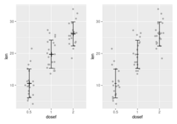
ggboxplot(df, "dose", "len",
           fill = "dose", palette = c("#00AFBB", "#E7B800", "#FC4E07"), add.params=list(size=0.1),
           notch=T, add = "jitter", outlier.shape = NA, shape=16,
           size = 1/.pt, x.text.angle = 30,
           ylab = "Silhouette Values", legend="right",
           ggtheme = theme_pubr(base_size = 8)) +
     theme(plot.title = element_text(size=8,hjust = 0.5),
           text = element_text(size=8),
           title = element_text(size=8),
           rect = element_rect(size = 0.75/.pt),
           line = element_line(size = 0.75/.pt),
           axis.text.x = element_text(size = 7),
           axis.line = element_line(colour = 'black', size = 0.75/.pt),
           legend.title = element_blank(),
           legend.position = c(0,1),
           legend.justification = c(0,1),
           legend.key.size = unit(4,"mm"))
p-values on top of boxplots
- Add P-values and Significance Levels to ggplots
- How to Perform Multiple Paired T-tests in R
- Add Significance Level and Stars to Plot in R
Violin plot and sina plot
sina plot from the ggforce package.
library(ggplot2)
ggplot(midwest, aes(state, area)) + geom_violin() + ggforce::geom_sina()

geom_density: Kernel density plot
- https://ggplot2.tidyverse.org/reference/geom_density.html
ggplot(iris, aes(x = Sepal.Length, fill = Species, col = Species)) + geom_density(alpha = 0.4) - As you can see the default colors are so terrible. A better choice is ggokabeito color scales.
- https://learnr.wordpress.com/2009/03/16/ggplot2-plotting-two-or-more-overlapping-density-plots-on-the-same-graph/
- Your Lopsided Model is Out to Get You
- http://www.cookbook-r.com/Graphs/Plotting_distributions_(ggplot2)/
- Overlay histograms with density plots
library(ggplot2); library(tidyr)
x <- data.frame(v1=rnorm(100), v2=rnorm(100,1,1),
                v3=rnorm(100, 0,2))
data <- pivot_longer(x, cols=1:3)
ggplot(data, aes(x=value, fill=name)) +
  geom_histogram(aes(y=..density..), alpha=.25) +
  stat_density(geom="line", aes(color=name, linetype=name))
ggplot(data, aes(x=value, fill=name, col =name)) +
  geom_density(alpha = .4)
A panel of density plots
- Common xlim for all subplots
ggplot(data = mpg, aes(x = hwy)) + geom_density() + facet_wrap(~ class) - Each subplot has its own xlim
ggplot(data = mpg, aes(x = hwy)) + geom_density() + facet_wrap(~ class, scales = "free_x")- How to Create and Interpret Pairs Plots in R. pairs()
- All vignettes launched by GGally::vig_ggally()
- Kmeans Clustering of Penguins
- Multiple regression lines in ggpairs
- A Brief Introduction to ggpairs
- How to show only the lower triangle in ggpairs?
- How to basic: bar plots
- How to Make Stunning Bar Charts in R
- ggplot2 barplots : Quick start guide - R software and data visualization
- Reorder a variable with ggplot2
- ‘reorder()’ gets an argument ‘decreasing’ which it passes to ‘sort()’ for level creation. 2021-11-23
- How to Reorder bars in barplot with ggplot2 in R. fct_reorder() and reorder().
- ?reorder. This, as relevel(), is a special case of simply calling factor(x, levels = levels(x)[....]).
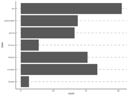
R> bymedian <- with(InsectSprays, reorder(spray, count, median))
# bymedian will replace spray (a factor)
# The data is not changed except the order of levels (a factor)
# In this case, the order is determined by the median of count from each spray level
#   from small to large.

R> InsectSprays[1:3, ]
  count spray
1    10     A
2     7     A
3    20     A
R> bymedian
 [1] A A A A A A A A A A A A B B B B B B B B B B B B C C C C C C C C C C C C D D D D D D D
[44] D D D D D E E E E E E E E E E E E F F F F F F F F F F F F
attr(,"scores")
   A    B    C    D    E    F
14.0 16.5  1.5  5.0  3.0 15.0
Levels: C E D A F B
R> InsectSprays$spray
 [1] A A A A A A A A A A A A B B B B B B B B B B B B C C C C C C C C C C C C D D D D D D D
[44] D D D D D E E E E E E E E E E E E F F F F F F F F F F F F
Levels: A B C D E F
R> boxplot(count ~ bymedian, data = InsectSprays,
         xlab = "Type of spray", ylab = "Insect count",
         main = "InsectSprays data", varwidth = TRUE,
         col = "lightgray")
Scatterplot
tibble(y=sample(6), x=letters[1:6]) %>%
  ggplot(aes(reorder(x, -y), y)) + geom_point(size=4)
- Sorting the x-axis in bargraphs using ggplot2 or this one from Deeply Trivial. reorder(fac, value) was used.
ggplot(df, aes(x=reorder(x, -y), y=y)) + geom_bar(stat = 'identity')

df$order <- 1:nrow(df)
# Assume df$y is a continuous variable and df$fac is a character/factor variable
#   and we want to show factor according to the way they appear in the data
#   (not following R's order even the variable is of type "character" not "factor")
# We like to plot df$fac on the y-axis and df$y on x-axis. Fortunately,
#   ggplot2 will draw barplot vertically or horizontally depending the 2 variables' types
# The reason of using "-order" is to make the 1st name appears on the top
ggplot(df, aes(x=y, y=reorder(fac, -order))) + geom_col()

ggplot(df, aes(x=reorder(x, desc(y)), y=y)), geom_col()
- Predict #TidyTuesday giant pumpkin weights with workflowsets. fct_reorder()
- Reordering and facetting for ggplot2. tidytext::reorder_within() was used.
- Chapter2 of data.table cookbook. reorder(fac, value) was used.
- PCA and UMAP with tidymodels
- A simple example
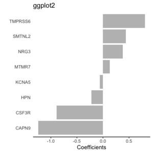
dat <- structure(list(gene = c("CAPN9", "CSF3R", "HPN", "KCNA5", "MTMR7", "NRG3", "SMTNL2", "TMPRSS6"), coef = c(-1.238, -0.892, -0.224, -0.057, 0.133, 0.377, 0.436, 0.804)), row.names = c("4976", "6467", "12355", "13373", "18143", "19010", "23805", "25602"), class = "data.frame") # Base R plot par(mar=c(4,6,4,1)) barplot(dat$coef, names = dat$gene, horiz = T, las=1, main='base R', xlab = "Coefficients") # GGplot2 dat %>% ggplot(aes(y=gene, x=coef)) + geom_col(fill = 'gray') + theme(axis.ticks.y = element_blank()) + theme(panel.background = element_blank(), axis.line.x = element_line(colour = 'black')) + labs(x="Coefficients", y = '', title = "ggplot2")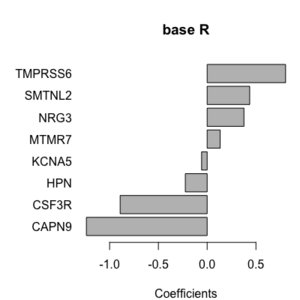 ,
, 
- Grouped, stacked and percent stacked barplot in ggplot2 geom_bar(position = "fill", stat = "identity")
- Powerful Bar Plot for Presentations
- https://community.rstudio.com/t/back-to-back-barplot/17106. Comment: the colors should be opposite but not.
- https://stackoverflow.com/a/55015174 (different scale on positive/negative sides. Cool!)
- https://learnr.wordpress.com/2009/09/24/ggplot2-back-to-back-bar-charts/ (change negative values to positive values, slow to load the page)
- Pyramid plot in R
- How to basic: bar plots. Hint: use geom_col() twice.
- How To Rotate x-axis Text Labels in ggplot2?
- What do hjust and vjust do when making a plot using ggplot? 0 means left-justified 1 means right-justified.
Bivariate analysis with ggpair
Correlation in R: Pearson & Spearman with Matrix Example
GGally::ggpairs
barplot/bar plot
Ordered barplot and facet
Proportion barplot
Back to back barplot
Pyramid Chart
Flip x and y axes
coord_flip()
Rotate x-axis labels
ggplot(mydf) + geom_col(aes(x = model, y=value, fill = method), position="dodge")+
  theme(axis.text.x = element_text(angle = 45, hjust=1))
Starts at zero
Starting bars and histograms at zero in ggplot2
scale_y_continuous(expand = c(0,0), limits = c(0, YourLimit))
Add patterns
- ggpattern package
- ggpartten填充柱状图
Barplot with color gradient
- horizontal barplot with color gradient from top to bottom of the graphic
- ggplot2 heatmap
- scale_fill_gradient(), scale_colour_brewer()/scale_fill_distiller(), scale_fill_viridis(). To reverse the colors, use the direction parameter; see here.
Barplot with only horizontal gridlines
Barplot with text at the end
- Barplot with number of observation
- A Quick How-to on Labelling Bar Graphs in ggplot2
- How to label a barplot bar with positive and negative bars with ggplot2 (Looks good but 2012)
- Examples from publications
- https://twitter.com/simocristea/status/1603055034081505280/photo/1. Draw a panel of barplots with common labels?
Waterfall plot
- Waterfall charts in ggplot2 with waterfalls package
- ggplot2: Waterfall Charts geom_rect()
- Waterfall Charts in Oncology Trials - Ride the Wave. Drug response
- Collected data is compared to the data taken at baseline to determine if drug has some activity or not. Also each patient is assigned in to different categories based on overall response
- Y-axis = % of change from baseline in the tumor size for each patient
- We want to create this plot by grouping different patients based on their overall response category (eg 'Earth Death' or 'Complete Response') and fill the bars of such patients with different colors so it is easy to identify different groups.
- Understanding Waterfall Plots
- A waterfall plot for drug BYL719 and color it based on the mutation status of the CDK13 gene, see Xeva vignette.
Polygon and map plot
https://ggplot2.tidyverse.org/reference/geom_polygon.html
geom_step: Step function
Connect observations: geom_path(), geom_step()
Example: KM curves (without legend)
library(survival)
sf <- survfit(Surv(time, status) ~ x, data = aml)
sf
str(sf) # the first 10 forms one strata and the rest 10 forms the other
ggplot() +
  geom_step(aes(x=c(0, sf$time[1:10]), y=c(1, sf$surv[1:10])),
            col='red') +
  scale_x_continuous('Time', limits = c(0, 161)) +
  scale_y_continuous('Survival probability', limits = c(0, 1)) +
  geom_step(aes(x=c(0, sf$time[11:20]), y=c(1, sf$surv[11:20])),
            col='black')
# cf:  plot(sf, col = c('red', 'black'), mark.time=FALSE)
Same example but with legend (see Construct a manual legend for a complicated plot)
cols <- c("NEW"="#f04546","STD"="#3591d1")
ggplot() +
  geom_step(aes(x=c(0, sf$time[1:10]), y=c(1, sf$surv[1:10]), col='NEW')) +
  scale_x_continuous('Time', limits = c(0, 161)) +
  scale_y_continuous('Survival probability', limits = c(0, 1)) +
  geom_step(aes(x=c(0, sf$time[11:20]), y=c(1, sf$surv[11:20]), col='STD')) +
  scale_colour_manual(name="Treatment", values = cols)
To control the line width, use the size parameter; e.g. geom_step(aes(x, y), size=.5). The default size is .5 (where to find this info?).
To allow different line types, use the linetype parameter. The first level is solid line, the 2nd level is dashed, ... We can change the default line types by using the scale_linetype_manual() function. See Line Types in R: The Ultimate Guide for R Base Plot and GGPLOT.
Coefficients, intervals, errorbars
- Plotting two models with regression coefficients with geom_pointrange() - Vertical intervals: lines, crossbars & errorbars.
- Grouping and staggering estimates with geom_point
Comparing similarities / differences between groups
comparing similarities / differences between groups
Special plots
Dot plot & forest plot
- Wikipedia
- Tutorial: How to read a forest plot
- Dotplot – the single most useful yet largely neglected dataviz type
- ggplot2 dot plot : Quick start guide - R software and data visualization
- foresplot package
- Forest Plot, ordering and summarizing multiple variables
- How to Create a Forest Plot in R. A forest plot (sometimes called a “blobbogram”) is used in a meta-analysis to visualize the results of several studies in one plot.
- Doing Meta-Analysis with R: A Hands-On Guide ebook where the meta package was used.
- survminer::ggforest()*: Draws forest plot for CoxPH model. See Survminer Cheatsheet to Create Easily Survival Plots & Hazard ratio forest plot: ggforest() from survminer
- survivalAnalysis::forest_plot(). Builds upon the 'survminer' package for Kaplan-Meier plots and provides a customizable implementation for forest plots.
- Multi-omics analysis identifies therapeutic vulnerabilities in triple-negative breast cancer subtypes 2021
- forestmodel*: Forest Plots from Regression Models. ggforest (survminer) only selected covariates
- forestploter
Lollipop plot
geom_segment() + geom_point()
- A lollipop plot is basically a barplot, where the bar is transformed in a line and a dot.
- r-charts.com/
- r-graph-gallery.com, Most basic lollipop plot, Lollipop chart with conditional color
library(ggplot2)

# Create data
data <- data.frame(
  x=LETTERS[1:26],
  y=abs(rnorm(26))
)

# Horizontal version
ggplot(data, aes(x=x, y=y)) +
  geom_segment( aes(x=x, xend=x, y=0, yend=y), color="skyblue") +
  geom_point( color="blue", size=4, alpha=0.6) +
  theme_light() +
  coord_flip() +
  theme(
    panel.grid.major.y = element_blank(),
    panel.border = element_blank(),
    axis.ticks.y = element_blank()
  )
Note if we put color argument in geom_segment(), the color shape in the legend will be a solid circle with a cross line (looks funny). So it is better not to have multiple colors for the segment part in the lollipop plot.
- Diverging Dot Plot and Lollipop Charts – Plotting Variance with ggplot2
- How To Make Lollipop Plot in R with ggplot2?
- Color annotation
- Top 50 ggplot2 Visualizations - The Master List (With Full R Code) from r-statistics.co
ggpubr:: ggdotchart()
Correlation Analysis Different
- corrmorant: Flexible Correlation Matrices Based on ggplot2
- Correlation Analysis Different Types of Plots in R
Bump plot: plot ranking over time
https://github.com/davidsjoberg/ggbump
Gauge plots
Sankey diagrams
- Wikipedia
- Some examples by the networkD3 package
Horizon chart
Circos plots
- circlize (not depends on ggplot2)
- NGS -> Circos plot
- Chord diagram in R with circlize
- Beautiful circos plots in R
- Introduction to the circlize package
- Chord diagram from adjacency matrix
- ComplexHeatmap imports it.
Aesthetics
- https://ggplot2.tidyverse.org/reference/aes.html
- https://ggplot2.tidyverse.org/articles/ggplot2-specs.html
- We can create a new aesthetic name in aes(aesthetic = variable) function; for example, the "text2" below. In this case "text2" name will not be shown; only the original variable will be used.
library(plotly)
g <- ggplot(tail(iris), aes(Petal.Length, Sepal.Length, text2=Species)) + geom_point()
ggplotly(g, tooltip = c("Petal.Length", "text2"))
aes_string()
- aes_(). Define aesthetic mappings programmatically.
- How to create a boxplot using ggplot2 with aes_string in R?
group
https://ggplot2.tidyverse.org/reference/aes_group_order.html
- It seems the group parameter in aes() is used for coloring of lines. See How to change the color in geom_point or lines in ggplot.
- geom_line in ggplot2.
- ggplot2 manually specifying colour with geom_line
- ggplot2 line types : How to change line types of a graph in R software?
GUI/Helper packages
ggedit & ggplotgui – interactive ggplot aesthetic and theme editor
- https://www.r-statistics.com/2016/11/ggedit-interactive-ggplot-aesthetic-and-theme-editor/
- https://github.com/gertstulp/ggplotgui/. It allows to change text (axis, title, font size), themes, legend, et al. A docker website was set up for the online version.
esquisse (French, means 'sketch'): creating ggplot2 interactively
https://cran.rstudio.com/web/packages/esquisse/index.html
A 'shiny' gadget to create 'ggplot2' charts interactively with drag-and-drop to map your variables. You can quickly visualize your data accordingly to their type, export to 'PNG' or 'PowerPoint', and retrieve the code to reproduce the chart.
The interface introduces basic terms used in ggplot2:
- x, y,
- fill (useful for geom_bar, geom_rect, geom_boxplot, & geom_raster, not useful for scatterplot),
- color (edges for geom_bar, geom_line, geom_point),
- size,
- facet, split up your data by one or more variables and plot the subsets of data together.
It does not include all features in ggplot2. At the bottom of the interface,
- Labels & title & caption.
- Plot options. Palette, theme, legend position.
- Data. Remove subset of data.
- Export & code. Copy/save the R code. Export file as PNG or PowerPoint.
ggcharts
https://cran.r-project.org/web/packages/ggcharts/index.html
ggeasy
ggx
https://github.com/brandmaier/ggx Create ggplot in natural language
Interactive
plotly
ggiraph
ggiraph: Make 'ggplot2' Graphics Interactive
ggconf: Simpler Appearance Modification of 'ggplot2'
https://github.com/caprice-j/ggconf
Plotting individual observations and group means
https://drsimonj.svbtle.com/plotting-individual-observations-and-group-means-with-ggplot2
subplot
Adding/Inserting an image to ggplot2
Inserting an image to ggplot2: See annotation_custom.
See also ggbernie which uses a different way ggplot2::layer() and a self-defined geom (geometric object).
Easy way to mix/combine multiple graphs on the same page
- http://www.cookbook-r.com/Graphs/Multiple_graphs_on_one_page_(ggplot2)/. grid package is used.
- gridExtra::grid.arrange() which has lots of reverse imports.
- Machine Learning Results in R: one plot to rule them all!
- It is used by the book Orchestrating Single-Cell Analysis with Bioconductor to visualize dimension reduction result among cells from the t-SNE algorithm.
- Easy Way to Mix Multiple Graphs on The Same Page. Four packages are included: ggpubr (ggarrange()), cowplot (plot_grid()), gridExtra and grid.
- cowplot can mix ggplot2 and base graphics (require the gridGraphics package). It can also add 'A', 'B' to each subplot for easy annotation.
- draw_image() from cowplot can embed an image to a plot. See this example.
- How to combine Multiple ggplot Plots to make Publication-ready Plots
- Cannot convert object of class ggsurvplotggsurvlist into a grob ggpubr::ggarrange is just a wrapper around cowplot::plot_grid(). This does not solve the problem. Using survminer::arrange_ggsurvplots() does work.
- unable to use survfit when called from a function. Use surv_fit() instead survfit() with ggsurvplot() when ggsurvplot() is used within another function.
- patchwork. plot_spacer() to create an empty plot.
- Why you should master small multiple chart (facet_wrap()), facet_grid())
- Download statistics and enter "gridExtra, cowplot, ggpubr, egg, grid" (the number of downloads is in this order).
annotation_custom
- https://ggplot2.tidyverse.org/reference/annotation_custom.html
- ggplot2 - Easy Way to Mix Multiple Graphs on The Same Page
- predcurvePlot.R from TreatmentSelection. One issue is the font size is large for the text & labels at the bottom. The 2nd issue is the bottom part of the graph/annotation (marker value scale) can be truncated if the window size is too large. If the window is too small, the bottom part can overlap with the top part.
p <- p + theme(plot.margin = unit(c(1,1,4,1), "lines"))  # hard coding
p <- p + annotation_custom() # axis for marker value scale
p <- p + annotation_custom() # label only
- Similar plot but without using base R graphic. One issue is the text is not below the scale (this can be fixed by par(mar) & mtext(text, side=1, line=4)) and the 2nd issue is the same as ggplot2's approach.
axis(1,at= breaks, label = round(quantile(x1, prob = breaks/100), 1),pos=-0.26) # hard coding
- Another common problem is the plot saved by pdf() or png() can be truncated too. I have a better luck with png() though.
- Similar plot but without using base R graphic. One issue is the text is not below the scale (this can be fixed by par(mar) & mtext(text, side=1, line=4)) and the 2nd issue is the same as ggplot2's approach.
grid
- Create a gradient image grid.raster() or rasterGrob()
redGradient <- matrix(hcl(0, 80, seq(50, 80, 10)), nrow=4, ncol=5)
# interpolated
grid.newpage()
grid.raster(redGradient)
- Recipe for Infographics in R. See example of using rasterGrob() and annotation_custom() to place more images using a custom function.
- How to add a background image to ggplot2 graphs
- How to Add a Background Image in ggplot2 with R
gridExtra
Force a regular plot object into a Grob for use in grid.arrange
gridGraphics package
make one panel blank/create a placeholder
- https://stackoverflow.com/questions/20552226/make-one-panel-blank-in-ggplot2
- patchwork::plot_spacer()
- Can I create an empty ggplot2 plot in R?
# Method 1: Blank
ggplot() + theme_void()
# Method 2: Display N/A
ggplot() +
    theme_void() +
    geom_text(aes(0,0,label='N/A'))
Overall title
multiple ggplots overall title
patchwork
- How to Combine Multiple ggplot2 Plots? Use Patchwork
- Combining Multiple ggplot2 Plots for Scientific Publications
Common legend
Add a common Legend for combined ggplots
library(ggplot2)
library(patchwork)

p1 <- ggplot(df1, aes(x = x, y = y, colour = group)) +
  geom_point(position = position_jitter(w = 0.04, h = 0.02), size = 1.8)
p2 <- ggplot(df2, aes(x = x, y = y, colour = group)) +
  geom_point(position = position_jitter(w = 0.04, h = 0.02), size = 1.8)

# Method 1:
p1 + p2 + theme(legend.position = "bottom") + plot_layout(guides = "collect")
                                          # two legends on the RHS
# Method 2:
p1 + p2 + plot_layout(guides = "collect") # two legends on the RHS
# Method 2:
p1 + theme(legend.position="none") + p2  # legend (based on p2) is on the RHS
# Method 3:
p1 + p2 + theme(legend.position="none")  # legend (based on p1) is in the middle!!
Overall title
Common Main Title for Multiple Plots in Base R & ggplot2 (2 Examples)
egg
- egg (ggarrange()): Extensions for 'ggplot2', to Align Plots, Plot insets, and Set Panel Sizes. Same author of gridExtra package. egg depends on gridExtra.
Common x or y labels
- how to add common x and y labels to a grid of plots. Another solution is on the egg package's vignette.
labs for x and y axes
x and y labels
https://stackoverflow.com/questions/10438752/adding-x-and-y-axis-labels-in-ggplot2 or the Labels part of the cheatsheet
You can set the labels with xlab() and ylab(), or make it part of the scale_*.* call.
labs(x = "sample size", y = "ngenes (glmnet)")

scale_x_discrete(name="sample size")
scale_y_continuous(name="ngenes (glmnet)", limits=c(100, 500))
Change tick mark labels
ggplot2 axis ticks : A guide to customize tick marks and labels
name-value pairs
See several examples (color, fill, size, ...) from opioid prescribing habits in texas.
Prevent sorting of x labels
See Change the order of a discrete x scale.
The idea is to set the levels of x variable.
junk   # n x 2 table
colnames(junk) <- c("gset", "boot")
junk$gset <- factor(junk$gset, levels = as.character(junk$gset))
ggplot(data = junk, aes(x = gset, y = boot, group = 1)) +
  geom_line() +
  theme(axis.text.x=element_text(color = "black", angle=30, vjust=.8, hjust=0.8))
Legends
Legend title
- labs() function
p <- ggplot(df, aes(x, y)) + geom_point(aes(colour = z))
p + labs(x = "X axis", y = "Y axis", colour = "Colour\nlegend")
- scale_colour_manual()
scale_colour_manual("Treatment", values = c("black", "red")) - scale_color_discrete() and scale_shape_discrete(). See Combine colors and shapes in legend.
df <- data.frame(x = 1:3, y = 1:3, z = c("a", "b", "c"))
ggplot(df, aes(x, y)) + geom_point(aes(shape = z, colour = z), size=5) +
  scale_color_discrete('new title') + scale_shape_discrete('new title')
Layout: move the legend from right to top/bottom of the plot or inside the plot or hide it
gg + theme(legend.position = "top")

# Useful in the boxplot case
gg + theme(legend.position="none")

gg + theme(legend.position = c(0.87, 0.25))

# Customize the edge color and background color
gapminder %>%
  ggplot(aes(gdpPercap,lifeExp, color=continent)) +
  geom_point() +
  scale_x_log10()+
  theme(legend.position = c(0.87, 0.25),
        legend.background = element_rect(fill = "white", color = "black"))
Guide functions for finer control
https://ggplot2-book.org/scales.html#guide-functions The guide functions, guide_colourbar() and guide_legend(), offer additional control over the fine details of the legend.
guide_legend() allows the modification of legends for scales, including fill, color, and shape.
This function can be used in scale_fill_manual(), scale_fill_continuous(), ... functions.
scale_fill_manual(values=c("orange", "blue"),
                  guide=guide_legend(title = "My Legend Title",
                                     nrow=1,  # multiple items in one row
                                     label.position = "top", # move the texts on top of the color key
                                     keywidth=2.5)) # increase the color key width
The problem with the default setting is it leaves a lot of white space above and below the legend. To change the position of the entire legend to the bottom of the plot, we use theme().
theme(legend.position = 'bottom')
Legend symbol background
ggplot() + geom_point(aes(x, y, color, size)) +
           theme(legend.key = element_blank())
           # remove the symbol background in legend
Construct a manual legend for a complicated plot
https://stackoverflow.com/a/17149021
Legend size
How to Change Legend Size in ggplot2 (With Examples)
ggtitle()
Centered title
See the Legends part of the cheatsheet.
ggtitle("MY TITLE") +
  theme(plot.title = element_text(hjust = 0.5))
Subtitle
ggtitle("My title",
        subtitle = "My subtitle")
margins
https://stackoverflow.com/a/10840417
Aspect ratio
?coord_fixed
p <- ggplot(mtcars, aes(mpg, wt)) + geom_point()
p + coord_fixed() # plot is compressed horizontally
p  # fill up plot region
Time series plot
- How to make a line chart with ggplot2
- Colour palettes. Note some palette options like Accent from the Qualitative category will give a warning message In RColorBrewer::brewer.pal(n, pal) : n too large, allowed maximum for palette Accent is 8.
Multiple lines plot https://stackoverflow.com/questions/14860078/plot-multiple-lines-data-series-each-with-unique-color-in-r
set.seed(45)
nc <- 9
df <- data.frame(x=rep(1:5, nc), val=sample(1:100, 5*nc),
                   variable=rep(paste0("category", 1:nc), each=5))
# plot
# http://colorbrewer2.org/#type=qualitative&scheme=Paired&n=9
ggplot(data = df, aes(x=x, y=val)) +
    geom_line(aes(colour=variable)) +
    scale_colour_manual(values=c("#a6cee3", "#1f78b4", "#b2df8a", "#33a02c", "#fb9a99", "#e31a1c", "#fdbf6f", "#ff7f00", "#cab2d6"))
Versus old fashion
dat <- matrix(runif(40,1,20),ncol=4) # make data
matplot(dat, type = c("b"),pch=1,col = 1:4) #plot
legend("topleft", legend = 1:4, col=1:4, pch=1) # optional legend
calendR
Calendar plot in R using ggplot2
Github style calendar plot
- https://mvuorre.github.io/post/2016/2016-03-24-github-waffle-plot/
- https://gist.github.com/marcusvolz/84d69befef8b912a3781478836db9a75 from Create artistic visualisations with your exercise data
geom_point()
df <- data.frame(x=1:3, y=1:3, color=c("red", "green", "blue"))
# Use I() to set aes values to the identify of a value from your data table
ggplot(df, aes(x,y, color=I(color))) + geom_point(size=10)
# VS
ggplot(df, aes(x,y, color=color)) + geom_point(size=10) # color is like a class label
groups
- How To Add Regression Line per Group to Scatterplot in ggplot2? geom_smooth()
- Multiple fitted lines in one plot
geom_bar(), geom_col(), stat_count()
https://ggplot2.tidyverse.org/reference/geom_bar.html
geom_col(position = 'dodge')  # same as
geom_bar(stat = 'identity', position = 'dodge')
geom_bar() can not specify the y-axis. To specify y-axis, use geom_col().
ggplot() + geom_col(mapping = aes(x, y))
Add numbers to the plot
Ordered barplot and reorder()
stat_function()
stat_summary()
https://ggplot2.tidyverse.org/reference/stat_summary.html
geom_area()
The Pfizer-Biontech Vaccine May Be A Lot More Effective Than You Think
Square shaped plot
ggplot() + theme(aspect.ratio=1) # do not adjust xlim, ylim

xylim <- range(c(x, y))
ggplot() + coord_fixed(xlim=xylim, ylim=xylim)
geom_line()
See also aes(..., group, ...).
Connect Paired Points with Lines in Scatterplot
- Connect Paired Points with Lines in Scatterplot in ggplot2? geom_line(aes(group = patient)) where the 'patient' variable has 2 same values for the same 'patient'; e.g. patient=0,0,1,1,2,2,3,3.
- How to Connect Paired Points with Lines in Scatterplot in ggplot2 in R?
Use geom_line() to create a square bracket to annotate the plot
Barchart with Significance Tests
geom_segment()
Line segments, arrows and curves. See an example in geom_errorbar section below.
Cf annotate("segment", ...)
geom_errorbar(): error bars
- GGPlot Error Bars using geom_errorbar() and geom_segment()
- Can ggplot2 do this? https://www.nature.com/articles/nature25173/figures/1
- plotCI() from the plotrix package or geom_errorbar() from ggplot2 package
- http://sape.inf.usi.ch/quick-reference/ggplot2/geom_errorbar
- Vertical error bars
- Horizontal error bars
- Horizontal panel plot example and more
- R does not draw error bars out of the box. R has arrows() to create the error bars. Using just arrows(x0, y0, x1, y1, code=3, angle=90, length=.05, col). See
- Building Barplots with Error Bars. Note that the segments() statement is not necessary.
- https://www.rdocumentation.org/packages/graphics/versions/3.4.3/topics/arrows
- Toy example (see this nature paper)
set.seed(301)
x <- rnorm(10)
SE <- rnorm(10)
y <- 1:10

par(mfrow=c(2,1))
par(mar=c(0,4,4,4))
xlim <- c(-4, 4)
plot(x[1:5], 1:5, xlim=xlim, ylim=c(0+.1,6-.1), yaxs="i", xaxt = "n", ylab = "", pch = 16, las=1)
mtext("group 1", 4, las = 1, adj = 0, line = 1) # las=text rotation, adj=alignment, line=spacing
par(mar=c(5,4,0,4))
plot(x[6:10], 6:10, xlim=xlim, ylim=c(5+.1,11-.1), yaxs="i", ylab ="", pch = 16, las=1, xlab="")
arrows(x[6:10]-SE[6:10], 6:10, x[6:10]+SE[6:10], 6:10, code=3, angle=90, length=0)
mtext("group 2", 4, las = 1, adj = 0, line = 1)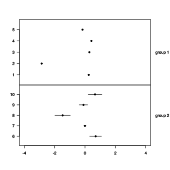
geom_rect(), geom_bar()
- https://ggplot2.tidyverse.org/reference/geom_tile.html
- https://plotly.com/ggplot2/geom_rect/, https://ggplot2.tidyverse.org/reference/aes_colour_fill_alpha.html
Note that we can use scale_fill_manual() to change the 'fill' colors (scheme/palette). The 'fill' parameter in geom_rect() is only used to define the discrete variable.
ggplot(data=) +
  geom_bar(aes(x=, fill=)) +
  scale_fill_manual(values = c("orange", "blue"))
geom_raster() and geom_tile()
- Rectangles. This is useful for creating heatmaps; .e.g DoHeatmap() & an example in Seurat.
- Wordle Words and Expected Value
geom_linerange
- https://ggplot2.tidyverse.org/reference/geom_linerange.html
- A plot of genes on chromosomes. Since ggplot() is inside a function, we need to add print() in order to show the plot.
- See also Given the human gene TP53, retrieve the human chromosomal location of this gene and also retrieve the chromosomal location and RefSeq id of its homolog in mouse from the biomaRt package's vignette.
- Get gene location from gene symbol and ID
- Genomic coordinates to gene lists and vice versa — Annotating gene coordinates and gene lists
- Genomic coordinates of HGNC gene names where org.Hs.eg.db and TxDb.Hsapiens.UCSC.hg19.knownGene are used
- TxDb: Genes, Transcripts, and Genomic Locations which uses a gtf file and the GenomicFeatures package
Circle
Circle in ggplot2 ggplot(data.frame(x = 0, y = 0), aes(x, y)) + geom_point(size = 25, pch = 1)
Annotation
geom_hline(), geom_vline()
geom_hline(yintercept=1000)
geom_vline(xintercept=99)
text annotations, annotate() and geom_text(): ggrepel package
- ggrepel package, ?geom_text_repel. Found on Some datasets for teaching data science by Rafael Irizarry.
p <- ggplot(dat, aes(wt, mpg, label = car)) +
  geom_point(color = "red")

p1 <- p + geom_text() + labs(title = "geom_text()") # Bad

p2 <- p + geom_text_repel(seed=1) + labs(title = "geom_text_repel()") # Good
                                          # Use 'seed' to fix the location of text
Note that we may need to add show.legend = FALSE in geom_text_repel() to get rid of "a" character in the legend. See Remove 'a' from legend when using aesthetics and geom_text
- Annotations from the chapter Graphics for communication of R for Data Science by Grolemund & Hadley
- ggplot2 texts : Add text annotations to a graph in R software. The functions geom_text() and annotate() can be used to add a text annotation at a particular coordinate/position.
- https://ggplot2-book.org/annotations.html
annotate("text", label="Toyota", x=3, y=100) annotate("segment", x = 2.5, xend = 4, y = 15, yend = 25, colour = "blue", size = 2) geom_text(aes(x, y, label), data, size, vjust, hjust, nudge_x) - Text annotations in ggplot2
p + geom_text(aes(x = -115, y = 25, label = "Map of the United States"), stat = "unique") p + geom_label(aes(x = -115, y = 25, label = "Map of the United States"), stat = "unique") # include border around the text - Use the nudge_y parameter to avoid the overlap of the point and the text such as
ggplot() + geom_point() + geom_text(aes(x, y, label), color='red', data, nudge_y=1) - What do hjust and vjust do when making a plot using ggplot? 0 means left-justified 1 means right-justified. This is necessary if we have multiples lines in text. By default, it will center-justified.
- Volcano plots, EnhancedVolcano package
Text wrap
ggplot2 is there an easy way to wrap annotation text?
p <- ggplot(mtcars, aes(x = wt, y = mpg)) + geom_point()

# Solution 1: Not work with Chinese characters
wrapper <- function(x, ...) paste(strwrap(x, ...), collapse = "\n")
# The a label
my_label <- "Some arbitrarily larger text"
# and finally your plot with the label
p + annotate("text", x = 4, y = 25, label = wrapper(my_label, width = 5))

# Solution 2: Not work with Chinese characters
library(RGraphics)
library(ggplot2)
p <- ggplot(mtcars, aes(x = wt, y = mpg)) + geom_point()
grob1 <-  splitTextGrob("Some arbitrarily larger text")
p + annotation_custom(grob = grob1,  xmin = 3, xmax = 4, ymin = 25, ymax = 25)

# Solution 3: stringr::str_wrap()
my_label <- "太極者無極而生。陰陽之母也。動之則分。靜之則合。無過不及。隨曲就伸。人剛我柔謂之走。我順人背謂之黏。"
p <- ggplot() + geom_point() + xlim(0, 400) + ylim(0, 300) # 400x300 e-paper
p + annotate("text", x = 0, y = 200, hjust=0, size=5,
             label = stringr::str_wrap(my_label, width =30)) +
    theme_bw () +
    theme(panel.grid.major = element_blank(),
          panel.grid.minor = element_blank(),
          panel.border = element_blank(),
          axis.title = element_blank(),
          axis.text = element_blank(),
          axis.ticks = element_blank())
ggtext
ggtext: Improved text rendering support for ggplot2
ggforce - Annotate areas with ellipses
Other geoms
Exploring other {ggplot2} geoms
geomtextpath
geomtextpath- Create curved text in ggplot2
Build your own geom
Fonts, icons
- Adding Custom Fonts to ggplot in R
- The {showtext_auto} function from {showtext} supports a large collection of font formats and graphics devices!
- Using different fonts with ggplot2
- How to use Fonts and Icons in ggplot
Lines of best fit
Save the plots -- ggsave()
ggsave(). Note svglite package is required, see R Graphics Cookbook. The svglite package provides more standards-compliant output.
By default the units of width & height is inch no matter what output formats we choose.
(3/24/2022) If I save the plot in the svg format using RStudio GUI (Export -> As as Image...) or by the svg() function, the svg plot can't be converted to a png file by ImageMagick. But if I save the plot by using the ggsave() command, the svg plot can be converted to a png file.
$ convert -resize 100% Rerrorbar.svg tmp.png
convert-im6.q16: non-conforming drawing primitive definition `path' @ error/draw.c/RenderMVGContent/4300.
$ convert -resize 100% Rerrorbar2.svg tmp.png # Works
(1/31/2022) For some reason, the text in legend in svg files generated by ggsave() looks fine in browsers but when I insert it into ppt, the word "Sensitive" becomes "Sensitiv e". However, the svg files generated by svg() command looks fine in browsers AND in ppt.
ggsave() will save a plot with the width/height based on the current graphical device if we don't specify them. That's why after we issue ggsave() it will tell us the image size (inch). So in order to have a fixed width/height, we need to specify them explicitly. See
My experience is ggsave() is better than png() because ggsave() makes the text larger when we save a file with a higher resolution.
...
ggsave("filename.png", object, width=8, height=4)
# vs
png("filename.png", width=1200, height=600)
...
dev.off()
We can specify dpi to increase the resolution if we use the png format (svg is not affected). For example,
g1 <- ggplot(data = mydf)
g1
ggsave("myfile.png", g1, height = 7, width = 8, units = "in", dpi = 500)
I got an error - Error in loadNamespace(name) : there is no package called ‘svglite’. After I install the package, everything works fine.
ggsave("raw-output.bmp", p, width=4, height=3, dpi = 100)
# Will generate 4*100 x 3*100 pixel plot
Note:
- For saving to "png" file, increasing dpi (from 72 to 300) will increase font & point size. dpi/ppi is not an inherent property of an image.
- If we don't specify any parameters and without resizing the graphics device size, then "png" file created by ggsave() will contain much more pixels compared to "svg" file (e.g. 1200 vs 360).
- How ggsave() decides width/height if a svg file was used in an Rmd file? A: 7x7 from my experiment. So the font/point size will be smaller compared to a 4x4 inch output.
- When I created an svg file in Linux with 4x4 inch (width x height), the file is 360 x 360 pixels when I right click the file to get the properties of the file. But macOS cannot return this number nor am I able to find this number from the svg file??
Multiple pages in pdf
https://stackoverflow.com/a/53698682. The key is to save the plot in an object and use the print() function.
pdf("FileName", onefile = TRUE)
for(i in 1:I) {
  p <- ggplot()
  print(p)
}
dev.off()
graphics::smoothScatter
Other tips/FAQs
Tips and tricks for working with images and figures in R Markdown documents
Ten Simple Rules for Better Figures
Ten Simple Rules for Better Figures
Recreating the Storytelling with Data look with ggplot
Recreating the Storytelling with Data look with ggplot
ggplot2 does not appear to work when inside a function
https://stackoverflow.com/a/17126172. Use print() or ggsave(). When you use these functions interactively at the command line, the result is automatically printed, but in source() or inside your own functions you will need an explicit print() statement.
BBC
- bbplot package from github, How to customize ggplot with bbplot
- BBC Visual and Data Journalism cookbook for R graphics from github
- How the BBC Visual and Data Journalism team works with graphics in R
Add your brand to ggplot graph
You Need to Start Branding Your Graphs. Here's How, with ggplot!
Animation and gganimate
- https://gganimate.com/
- Animating Changes in Football Kits using R: rvest, tidyverse, xml2, purrr & magick
- Animated Directional Chord Diagrams tweenr & magick
- x-mas tRees with gganimate, ggplot, plotly and friends
- Create animation in R: learn by examples (gganimate)
- The USMS ePostal Over the Last 20+ Years (gganimate and bar charts)
- R tip: Animations in R from IDG TECHtalk
ggstatsplot
ggstatsplot: ggplot2 Based Plots with Statistical Details
Write your own ggplot2 function: rlang
Some packages depend on ggplot2
dittoSeq from Bicoonductor
Meme
Python
plotnine: A Grammar of Graphics for Python.
plotnine is an implementation of a grammar of graphics in Python, it is based on ggplot2. The grammar allows users to compose plots by explicitly mapping data to the visual objects that make up the plot.


