ROC
Confusion matrix, Sensitivity/Specificity/Accuracy
Wikipedia. Note in wikipedia, it uses positive/negative to represent two classes.
| Predict | ||||
| 1 | 0 | |||
| True | 1 | TP | FN | Sens=TP/(TP+FN)=Recall=TPR FNR=FN/(TP+FN) |
| 0 | FP | TN | Spec=TN/(FP+TN), 1-Spec=FPR | |
| PPV=TP/(TP+FP)=Precision FDR=FP/(TP+FP) =1-PPV |
NPV=TN/(FN+TN) | N = TP + FP + FN + TN | ||
- Sensitivity 敏感度 = TP / (TP + FN) = Recall
- Specificity 特異度 = TN / (TN + FP)
- Accuracy = (TP + TN) / N
- False discovery rate FDR = FP / (TP + FP)
- False negative rate FNR = FN / (TP + FN)
- False positive rate FPR = FP / (FP + TN) = 1 - Spec
- True positive rate = TP / (TP + FN) = Sensitivity
- Positive predictive value (PPV) = TP / # positive calls = TP / (TP + FP) = 1 - FDR = Precision
- Negative predictive value (NPV) = TN / # negative calls = TN / (FN + TN)
- Prevalence 盛行率 = (TP + FN) / N.
- Note that PPV & NPV can also be computed from sensitivity, specificity, and prevalence:
- PPV is directly proportional to the prevalence of the disease or condition..
- For example, in the extreme case if the prevalence =1, then PPV is always 1.
- [math]\displaystyle{ \text{PPV} = \frac{\text{sensitivity} \times \text{prevalence}}{\text{sensitivity} \times \text{prevalence}+(1-\text{specificity}) \times (1-\text{prevalence})} }[/math]
- [math]\displaystyle{ \text{NPV} = \frac{\text{specificity} \times (1-\text{prevalence})}{(1-\text{sensitivity}) \times \text{prevalence}+\text{specificity} \times (1-\text{prevalence})} }[/math]
- Prediction of heart disease and classifiers’ sensitivity analysis Almustafa, 2020
- ConfusionTableR has made it to CRAN 21/07/2021. ConfusionTableR
caret::confusionMatrix
- Precision, Recall, Specificity, Prevalence, Kappa, F1-score check with R by using the caret:: confusionMatrix() function. If there are only two factor levels, the first level will be used as the "positive" result.
- One thing caret::confusionMatrix can't do is ROC/AUC. For this, use pROC::ROC() and the plot function. How to Calculate AUC (Area Under Curve) in R.
False positive rates vs false positive rates
FPR (false positive rate) vs FDR (false discovery rate)
PPA, NPA
- Cf PPV/positive predictive value & NPV/negative predictive value
- Positive percent agreement (PPA) and negative percent agreement (NPA) - Statistical Guidance on Reporting Results from Studies Evaluating Diagnostic Tests - Guidance for Industry and FDA Staff
- The percentage of subjects (or samples) that test positive by one test (TA) that are found positive by a second test (TB); the two tests are indicated with the ordered subscripts, as [math]\displaystyle{ PPA_{TA:TB} }[/math]. The test listed first is treated as the “reference” test (denominator a+b in the formula given below).
- Diagnostic accuracy (sensitivity/specificity) versus agreement (PPA/NPA) statistics
- Positive agreement is the proportion of comparative/reference method positive results in which the test method result is positive.
- Negative agreement is the proportion of comparative/reference method negative results in which the test method result is negative.
- The focus on PPA or NPA depends on the context and the specific objectives of the test evaluation.
- PPA is particularly important when the consequence of a false negative is high. For example, in a disease screening context, a false negative (a sick person being incorrectly identified as healthy) could lead to delayed treatment and worse health outcomes. Therefore, a high PPA (few false negatives) is desirable.
- NPA is crucial when the cost of a false positive is significant. For instance, in a scenario where a positive test result could lead to an invasive follow-up procedure, a false positive (a healthy person being incorrectly identified as sick) could lead to unnecessary risk and anxiety for the patient. In this case, a high NPA (few false positives) is important.
- Paper examples.
- Other evaluation of diagnostic tests: Sensitivity/Specificity, Positive Predictive Value (PPV)/Negative Predictive Value (NPV), Overall Test Accuray, Diagnostic Odds Ratio (DOR), Youden Index (YI), Positive Likelihood Ratio (LR+). See
- Evaluation of binary diagnostic tests accuracy for medical researches 2020,
- Measures of Diagnostic Accuracy: Sensitivity, Specificity, PPV and NPV 2011 where Fig 1 shows the effect of disease prevalence on PPV and NPV.
- Diagnostic test evaluation methodology: A systematic review of methods employed to evaluate diagnostic tests in the absence of gold standard – An update 2019.
- Assume rows are new test and columns are reference.
PPA = TP/x.1 = TP/(TP+FN), NPA = TN/x.2 = TN/(FP+TN)reference + reference - test + TP (a) FP (c) test - FN (b) TN (d) x.1 x.2 - APA (Average positive agreement) and ANA (Average negative agreement). See EVALUATION OF AUTOMATIC CLASS III DESIGNATION FOR Cell-Free DNA BCT and Agreement measures for binary and semi-quantitative data. Note, APA and ANA are not standard terms used in diagnostic test evaluation, and their definitions may vary depending on the context.
- Suppose [math]\displaystyle{ PPA = \frac{a}{a+b} }[/math], then [math]\displaystyle{ APA = \frac{a}{((a+b)+(a+c))/2} = \frac{2x_{11}}{x_{1.}+x_{.1}} = \frac{\mbox{n. of concordant positives}}{\mbox{n. of concordant positives} + \frac{\mbox{n. of disconcordant calls}}{2}} }[/math].
- Suppose [math]\displaystyle{ NPA = \frac{d}{c+d} }[/math], then [math]\displaystyle{ ANA = \frac{d}{((d+b)+(d+c))/2} = \frac{2x_{22}}{x_{2.}+x_{.2}} = \frac{\mbox{n. of concordant negatives}}{\mbox{n. of concordant negatives} + \frac{\mbox{n. of disconcordant calls}}{2}} }[/math].
- The overall proportion of agreement is the sum of the diagonal entries divided by the total.
- The above two APA and ANA statistics are in the same form as the Harrell's C-index. See Harrell's C-index formula at What is Harrell’s C-index?
Random classifier
- Sensitivity and specificity should be close to 0.5 for a random classifier assuming a balanced class distribution in a binary classification problem.
- However, PPV or NPV is not close to 0.5 for a random classifier. PPV for a random classifier will depend on the class distribution in the dataset and the randomness of the classifier's guesses. It would vary randomly depending on the classifier's random guesses and the class distribution in the dataset.
ROC curve
- Binary case:
- Y = true positive rate = sensitivity,
- X = false positive rate = 1-specificity = 假陽性率
- Area under the curve AUC from the wikipedia: the probability that a classifier will rank a randomly chosen positive instance higher than a randomly chosen negative one (assuming 'positive' ranks higher than 'negative').
- [math]\displaystyle{ A = \int_{\infty}^{-\infty} \mbox{TPR}(T) \mbox{FPR}'(T) \, dT = \int_{-\infty}^{\infty} \int_{-\infty}^{\infty} I(T'\gt T)f_1(T') f_0(T) \, dT' \, dT = P(X_1 \gt X_0) }[/math]
- Interpretation of the AUC. A small toy example (n=12=4+8) was used to calculate the exact probability [math]\displaystyle{ P(X_1 \gt X_0) }[/math] (4*8=32 all combinations).
- It is a discrimination measure which tells us how well we can classify patients in two groups: those with and those without the outcome of interest.
- Since the measure is based on ranks, it is not sensitive to systematic errors in the calibration of the quantitative tests.
- The AUC can be defined as The probability that a randomly selected case will have a higher test result than a randomly selected control.
- Plot of sensitivity/specificity (y-axis) vs cutoff points of the biomarker
- The Mann-Whitney U test statistic (or Wilcoxon or Kruskall-Wallis test statistic) is equivalent to the AUC (Mason, 2002). Verify in R.
library(pROC)
set.seed(123)
group1 <- rnorm(50)
group2 <- rnorm(50, mean=1)

roc_obj <- roc(rep(c(0,1), each=50), c(group1, group2))
# Setting levels: control = 0, case = 1
# Setting direction: controls < cases
auc(roc_obj)
# Area under the curve: 0.8036

wilcox.test(group2, group1)$statistic/(50*50) # notice the group1,group2 order
#      W
# 0.8036
- The p-value of the Mann-Whitney U test can thus safely be used to test whether the AUC differs significantly from 0.5 (AUC of an uninformative test).
- Calculate AUC by hand. AUC is equal to the probability that a true positive is scored greater than a true negative.
- See the uROC() function in <functions.R> from the supplementary of the paper (need access right) Bivariate Marker Measurements and ROC Analysis Wang 2012. Let [math]\displaystyle{ n_1 }[/math] be the number of obs from X1 and [math]\displaystyle{ n_0 }[/math] be the number of obs from X0. X1 and X0 are the predict values for data from group 1 and 0. [math]\displaystyle{ TP_i=Prob(X_1\gt X_{0i})=\sum_j (X_{1j} \gt X_{0i})/n_1, ~ FP_i=Prob(X_0\gt X_{0i}) = \sum_j (X_{0j} \gt X_{0i}) / n_0 }[/math]. We can draw a scatter plot or smooth.spline() of TP(y-axis) vs FP(x-axis) for the ROC curve.
uROC <- function(marker, status)   ### ROC function for univariate marker ###
{
    x <- marker
    bad <-  is.na(status) | is.na(x)
    status <- status[!bad]
    x <- x[!bad]
    if (sum(bad) > 0)
        cat(paste("\n", sum(bad), "records with missing values dropped. \n"))
	no_case <- sum(status==1)
	no_control <- sum(status==0)
	TP <- rep(0, no_control)
	FP <- rep(0, no_control)
	for (i in 1: no_control){
	  TP[i] <- sum(x[status==1]>x[status==0][i])/no_case
	  FP[i] <- sum(x[status==0]>x[status==0][i])/no_control
    }
    list(TP = TP, FP = FP)
}
- How to calculate Area Under the Curve (AUC), or the c-statistic, by hand or by R
- Introduction to the ROCR package. Add threshold labels
- http://freakonometrics.hypotheses.org/9066, http://freakonometrics.hypotheses.org/20002
- Illustrated Guide to ROC and AUC
- ROC Curves in Two Lines of R Code
- Learning Data Science: Understanding ROC Curves
- Gini and AUC. Gini = 2*AUC-1.
- Generally, an AUC value over 0.7 is indicative of a model that can distinguish between the two outcomes well. An AUC of 0.5 tells us that the model is a random classifier, and it cannot distinguish between the two outcomes.
- ROC Day at BARUG
- ROC and AUC, Clearly Explained! StatQuest
- Optimal threshold
- Precision/PPV (proportion of positive results that were correctly classified) replacing the False Positive Rate. Useful for unbalanced data.
partial AUC
- https://onlinelibrary.wiley.com/doi/10.1111/j.1541-0420.2012.01783.x
- pROC: an open-source package for R and S+ to analyze and compare ROC curves
- Partial AUC Estimation and Regression Dodd 2003. [math]\displaystyle{ AUC(t_0,t_1) = \int_{t_0}^{t_1} ROC(t) dt }[/math] where the interval [math]\displaystyle{ (t_0, t_1) }[/math] denotes the false-positive rates of interest.
summary ROC
- The partial area under the summary ROC curve Walter 2005
- On summary ROC curve for dichotomous diagnostic studies: an application to meta-analysis of COVID-19 2022
Weighted ROC
- What is the difference between area under roc and weighted area under roc? Weighted ROC curves are used when you're interested in performance in a certain region of ROC space (e.g. high recall) and was proposed as an improvement over partial AUC (which does exactly this but has some issues)
Adjusted AUC
- 'auc.adjust': R function for optimism-adjusted AUC (internal validation)
- GmAMisc::aucadj(data, fit, B = 200)
Difficult to compute for some models
- Plot ROC curve for Nearest Centroid. For NearestCentroid it is not possible to compute a score. This is simply a limitation of the model.
- k-NN model. class::knn() can output prediction probability.
- predict.randomForest() can output class probabilities. See ROC curve for classification from randomForest
Optimal threshold, Youden's index/Youden's J statistic
- Max of “sensitivity + specificity”. See Epi::ROC() function.
- On optimal biomarker cutoffs accounting for misclassification costs in diagnostic trilemmas with applications to pancreatic cancer Bantis, 2022
- Youden's index
- Youden's index = sensitivity + specificity -1
- Youden's index ranges from 0 to 1 with higher values indicating better overall test performance
- The maximum value of the index may be used as a criterion for selecting the optimum cut-off point when a diagnostic test gives a numeric rather than a dichotomous result.
- rocbc package. Provides inferences and comparisons around the AUC, the Youden index, the sensitivity at a given specificity level (and vice versa), the optimal operating point of the ROC curve (in the Youden sense), and the Youden based cutoff.
ROC Curve AUC for Hypothesis Testing
- Interpreting AUROC in Hypothesis Testing
- Receiver Operating Characteristic Curve in Diagnostic Test Assessment 2010
Challenges, issues
Methodological conduct of prognostic prediction models developed using machine learning in oncology: a systematic review 2022. class imbalance, data pre-processing, and hyperparameter tuning. twitter.
Survival data
'Survival Model Predictive Accuracy and ROC Curves' by Heagerty & Zheng 2005
- Recall Sensitivity= [math]\displaystyle{ P(\hat{p_i} \gt c | Y_i=1) }[/math], Specificity= [math]\displaystyle{ P(\hat{p}_i \le c | Y_i=0 }[/math]), [math]\displaystyle{ Y_i }[/math] is binary outcomes, [math]\displaystyle{ \hat{p}_i }[/math] is a prediction, [math]\displaystyle{ c }[/math] is a criterion for classifying the prediction as positive ([math]\displaystyle{ \hat{p}_i \gt c }[/math]) or negative ([math]\displaystyle{ \hat{p}_i \le c }[/math]).
- For survival data, we need to use a fixed time/horizon (t) to classify the data as either a case or a control. Following Heagerty and Zheng's definition in Survival Model Predictive Accuracy and ROC Curves (Incident/dynamic) 2005, Sensitivity(c, t)= [math]\displaystyle{ P(M_i \gt c | T_i = t) }[/math], Specificity= [math]\displaystyle{ P(M_i \le c | T_i \gt t }[/math]) where M is a marker value or [math]\displaystyle{ Z^T \beta }[/math]. Here sensitivity measures the expected fraction of subjects with a marker greater than c among the subpopulation of individuals who die at time t, while specificity measures the fraction of subjects with a marker less than or equal to c among those who survive beyond time t.
- The AUC measures the probability that the marker value for a randomly selected case exceeds the marker value for a randomly selected control
- ROC curves are useful for comparing the discriminatory capacity of different potential biomarkers.
Precision recall curve
- Precision and recall from wikipedia
- Y-axis: Precision = tp/(tp + fp) = PPV. How accurately the model predicted the positive classes. large is better
- X-axis: Recall = tp/(tp + fn) = Sensitivity, large is better
- The Relationship Between Precision-Recall and ROC Curves. Remember ROC is defined as
- Y-axis: Sensitivity = tp/(tp + fn) = Recall
- X-axis: 1-Specificity = fp/(fp + tn)
- ROC curves are appropriate when the observations are balanced between each class, whereas PR curves are appropriate for imbalanced datasets. When dealing with highly skewed datasets, PR curves can give a more informative picture of an algorithm’s performance.
- The Precision-Recall Plot Is More Informative than the ROC Plot When Evaluating Binary Classifiers on Imbalanced Datasets
F1-score
- F-score/F1-score.
- F1 = 2 * Precision * Recall / (Precision + Recall) = 2 / (1/Precision + 1/Recall) Harmonic mean of precision and recall.
- This means that comparison of the F-score across different problems with differing class ratios is problematic.
- Recall = Sensitivity = true positive rate. Precision = PPV. They are from the two directions of the "1" class in the confusion matrix.
- The F1 score
- How to interpret F1 score (simply explained). It is a popular metric to use for classification models as it provides accurate results for both balanced and imbalanced datasets, and takes into account both the precision and recall ability of the model. F1 score tells you the model’s balanced ability to both capture positive cases (recall) and be accurate with the cases it does capture (precision).
- What is Considered a “Good” F1 Score? It gives an example of F1-score where all the predictions are on one class (baseline model) for comparison purpose.
- An example. confusionMatrix() assumes the rows are predicted and columns are true; that's why I put a transpose on my table object. The 'positive' class seems to be always the 1st row of the 2x2 table. If the levels are not specified, it will assign 'A' to the first row and 'B' to the 2nd row. For this case, we can see accuracy (0.615) is between sensitivity (0.429) and specificity (0.684) and F1-score (0.375) is between precision (0.333) and recall (0.429) . Also F1-score is smaller than sensitivity and specificity.
predicted sensitive resistant ------------------------------- true sensitive 3 4 resistant 6 13 xtab <- matrix(c(3,6,4,13),nr=2) confusionMatrix(t(xtab))$byClass # Sensitivity Specificity Pos Pred Value Neg Pred Value # 0.4285714 0.6842105 0.3333333 0.7647059 # Precision Recall F1 Prevalence # 0.3333333 0.4285714 0.3750000 0.2692308 # Detection Rate Detection Prevalence Balanced Accuracy # 0.1153846 0.3461538 0.5563910 confusionMatrix(t(xtab))$overall # Accuracy Kappa AccuracyLower AccuracyUpper AccuracyNull # 0.6153846 0.1034483 0.4057075 0.7977398 0.7307692 # AccuracyPValue McnemarPValue # 0.9348215 0.7518296 confusionMatrix(t(xtab))$positive # [1] "A" - Using F1 score metric in KNN through caret package
library(caret) library(mlbench) data(Sonar) f1Summary <- function(data, lev = NULL, model = NULL) { # Calculate precision and recall precision <- posPredValue(data$pred, data$obs, positive = lev[1]) recall <- sensitivity(data$pred, data$obs, positive = lev[1]) # Calculate F1 score f1 <- (2 * precision * recall) / (precision + recall) # Return F1 score c(F1 = f1) } # Create a trainControl object that uses the custom summary function trainControl <- trainControl(summaryFunction = f1Summary) # Use the trainControl object when calling the train() function model <- train(Class ~., data = Sonar, method = "rf", trControl = trainControl, metric = "F1") > model Random Forest 208 samples 60 predictor 2 classes: 'M', 'R' No pre-processing Resampling: Bootstrapped (25 reps) Summary of sample sizes: 208, 208, 208, 208, 208, 208, ... Resampling results across tuning parameters: mtry F1 2 0.8416808 31 0.7986326 60 0.7820982 F1 was used to select the optimal model using the largest value. The final value used for the model was mtry = 2. - Examples in papers
PPV/Precision
The relationship between PPV and sensitivity depends on the prevalence of the condition being tested for in the population. If the condition is rare, a test with high sensitivity may still have a low PPV because there will be many false positive results. On the other hand, if the condition is common, a test with high sensitivity is more likely to also have a high PPV.
Here we have a diagnostic test for a rare disease that affects 1 in 1000 people and the test has a sensitivity of 100% and a false positive rate of 5%:
                Test| positive  negative
-----------------------------------------
Disease present     |  1          0

Disease absent      |  50        949
The prevalence of the disease is 1/1000.
Incidence, Prevalence
https://www.health.ny.gov/diseases/chronic/basicstat.htm
Jaccard index
- https://en.wikipedia.org/wiki/Jaccard_index
- Clear Example of Jaccard Similarity // Visual Explanation of What is the Jaccard Index? (video). Jaccard similarity = TP / (TP + FP + FN)
Calculate area under curve by hand (using trapezoid), relation to concordance measure and the Wilcoxon–Mann–Whitney test
- https://stats.stackexchange.com/a/146174
- The meaning and use of the area under a receiver operating characteristic (ROC) curve J A Hanley, B J McNeil 1982
genefilter package and rowpAUCs function
- rowpAUCs function in genefilter package. The aim is to find potential biomarkers whose expression level is able to distinguish between two groups.
# source("http://www.bioconductor.org/biocLite.R")
# biocLite("genefilter")
library(Biobase) # sample.ExpressionSet data
data(sample.ExpressionSet)

library(genefilter)
r2 = rowpAUCs(sample.ExpressionSet, "sex", p=0.1)
plot(r2[1]) # first gene, asking specificity = .9

r2 = rowpAUCs(sample.ExpressionSet, "sex", p=1.0)
plot(r2[1]) # it won't show pAUC

r2 = rowpAUCs(sample.ExpressionSet, "sex", p=.999)
plot(r2[1]) # pAUC is very close to AUC now
Use and Misuse of the Receiver Operating Characteristic Curve in Risk Prediction
- http://circ.ahajournals.org/content/115/7/928
- Calibration: the Achilles heel of predictive analytics 2019
Comparison of two AUCs
- Testing for improvement in prediction model performance by Pepe et al 2013.
- Statistical Assessments of AUC. This is using the pROC::roc.test function.
- prioritylasso. It is using roc(), auc(), roc.test(), plot.roc() from the pROC package. The calculation based on the training data is biased so we need to report the one based on test data.
DeLong test for comparing two ROC curves
- Comparing AUCs of Machine Learning Models with DeLong’s Test
- Misuse of DeLong test to compare AUCs for nested models
- What is the DeLong test for comparing AUCs?
- R语言,ROC曲线,deLong test. pROC::roc.test() was used.
- Daim::deLong.test()
Some R packages
- Some R Packages for ROC Curves
- ROCR 2005
- pROC 2010. get AUC and plot multiple ROC curves together at the same time
- PRROC 2014
- plotROC 2014
- precrec 2015
- ROCit 2019
- ROC from Bioconductor
- caret
- ROC animation
pROC
- https://cran.r-project.org/web/packages/pROC/index.html
- response: a factor, numeric or character vector of responses (true class), typically encoded with 0 (controls) and 1 (cases).
- Pay attention to the message printed on screen after calling roc(). It will show which one is control and which one is case.
- pROC: display and analyze ROC curves in R and S+
- ROC Curve and AUC in Machine learning and R pROC Package. Pay attention to the legacy.axes parameter.
library(pROC)
data(aSAH)
str(aSAH[,c('outcome', "s100b")])
# 'data.frame':	113 obs. of  2 variables:
#  $ outcome: Factor w/ 2 levels "Good","Poor": 1 1 1 1 2 2 1 2 1 1 ...
#  $ s100b  : num  0.13 0.14 0.1 0.04 0.13 0.1 0.47 0.16 0.18 0.1 ...
roc.s100b <- roc(aSAH$outcome, aSAH$s100b)

roc(aSAH$outcome, aSAH$s100b,
  plot=TRUE,
  auc=TRUE,  # already the default
  col="green",
  lwd =4,
  legacy.axes=TRUE,
  main="ROC Curves")
# Data: aSAH$s100b in 72 controls (aSAH$outcome Good) < 41 cases (aSAH$outcome Poor).
# Area under the curve: 0.7314

auc(roc.s100b)
# Area under the curve: 0.7314

auc(aSAH$outcome, aSAH$s100b)
# Area under the curve: 0.7314
Note: in pROC::roc() or auc(), the response is on the 1st argument while in caret::confusionMatrix(), truth/reference is on the 2nd argument.
If we flipped the outcomes, it won't affect AUC.
aSAH$outcome2 <- factor(ifelse(aSAH$outcome == "Good", "Poor", "Good"),
                        levels=c("Good", "Poor"))
roc(aSAH$outcome2, aSAH$s100b)
# Data: aSAH$s100b in 41 controls (aSAH$outcome2 Good) > 72 cases (aSAH$outcome2 Poor).
# Area under the curve: 0.7314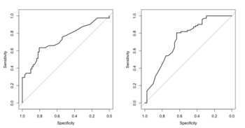
- Plot multiple ROC curves in one plot.
roc1 <- roc()
roc2 <- roc()
roc3 <- roc()
plot(roc1)
lines(roc2, col="red")
lines(roc3, col="blue")
Another solution is to use pROC::ggroc(). The annotation was taken care automatically.
rocobj <- roc(aSAH$outcome, aSAH$s100b) rocobj2 <- roc(aSAH$outcome, aSAH$wfns) g2 <- ggroc(list(s100b=rocobj, wfns=rocobj2, ndka=roc(aSAH$outcome, aSAH$ndka))) # 3 curves - Plot a panel of ROC plots by using facet_wrap().
- How to add AUC to a multiple ROC graph with pROC's ggroc. ggroc() is part of pROC package.
- See Annotating text on individual facet in ggplot2
- See facet_wrap on how to change the labels in each plots.

ROCR
- https://cran.r-project.org/web/packages/ROCR/,
- Vignette. The vignette shows the package has a way to take the output from multiple prediction (eg 10-fold CV) and create a plot with 10 curves or 1 curve by averaging multiple curves.
- A small introduction to the ROCR package
- Measure Model Performance in R Using ROCR Package
- ROC for Decision Trees – where did the data come from?. NB: 1) Change the double quote sign when we do copy-and-paste, 2) the result is biased since it does not use CV or a test data. The right way is to use a newdata in predict.rpart() function. When the newdata is omitted, fitted values are used.
Cross-validation ROC
- ROC cross-validation caret::train(, metric = "ROC")
- Feature selection + cross-validation, but how to make ROC-curves in R. Small samples within the cross-validation may lead to underestimated AUC as the ROC curve with all data will tend to be smoother and less underestimated by the trapezoidal rule.
library(pROC) data(aSAH) k <- 10 n <- dim(aSAH)[1] set.seed(1) indices <- sample(rep(1:k, ceiling(n/k))[1:n]) all.response <- all.predictor <- aucs <- c() for (i in 1:k) { test = aSAH[indices==i,] learn = aSAH[indices!=i,] model <- glm(as.numeric(outcome)-1 ~ s100b + ndka + as.numeric(wfns), data = learn, family=binomial(link = "logit")) model.pred <- predict(model, newdata=test) aucs <- c(aucs, roc(test$outcome, model.pred)$auc) all.response <- c(all.response, test$outcome) all.predictor <- c(all.predictor, model.pred) } roc(all.response, all.predictor) # Setting levels: control = 1, case = 2 # Setting direction: controls < cases # # Call: # roc.default(response = all.response, predictor = all.predictor) # # Data: all.predictor in 72 controls (all.response 1) < 41 cases (all.response 2). # Area under the curve: 0.8279 mean(aucs) # [1] 0.8484921 - ROC curve from training data in caret
- Plot ROC curve from Cross-Validation (training) data in R
- How to represent ROC curve when using Cross-Validation. the standard way to do it is to find the AUC per fold, then the mean AUC would be your performance +/- sd(AUC)/sqrt(5). Your mean AUC of all the folds should be close to if you found all the out-of-fold probabilities and lined them up and found a grand AUC.
- How to easily make a ROC curve in R
- Appropriate way to get Cross Validated AUC
- cvAUC (Cross-validated Area Under the ROC Curve) package as linked from Some R Packages for ROC Curves
- How do you generate ROC curves for leave-one-out cross validation? If the classifier outputs probabilities, then combining all the test point outputs for a single ROC curve is appropriate. If not, then scale the output of the classifier in a manner that would make it directly comparable across classifiers.
- ROC cross-validation using the caret package (from U. of Sydney).
mean ROC curve
ROC with cross-validation for linear regression in R
Assess risk of bias
PROBAST: A Tool to Assess Risk of Bias and Applicability of Prediction Model Studies: Explanation and Elaboration 2019. http://www.probast.org/
Confidence interval of AUC
How to get an AUC confidence interval. pROC package was used.
AUC can be a misleading measure of performance
AUC is high but precision is low (i.e. FDR is high). https://twitter.com/michaelhoffman/status/1398380674206285830?s=09.
Caveats and pitfalls of ROC analysis in clinical microarray research
Caveats and pitfalls of ROC analysis in clinical microarray research (and how to avoid them) Berrar 2011
Limitation in clinical data
Sample size
- Sample size MATTERS - don't ignore it.
- Sample size methods for evaluation of predictive biomarkers 2022
Threshold
Myths about risk thresholds for prediction models
Three myths about risk thresholds for prediction models 2019
Picking a threshold based on model performance/utility
Squeezing the Most Utility from Your Models 2020
Why does my ROC curve look like a V
https://stackoverflow.com/a/42917384
Unbalanced classes
- 8 Tactics to Combat Imbalanced Classes in Your Machine Learning Dataset
- How to Fix k-Fold Cross-Validation for Imbalanced Classification. It teaches you how to split samples in CV by using stratified k-fold cross-validation.
- ROC is especially useful for unbalanced data where the 0.5 threshold may not be appropriate.
- Imbalanced data & why you should NOT use ROC curve
- AUC and class imbalance in training/test dataset
- Use Precison/PPV to replace FDR
- Practical Guide to deal with Imbalanced Classification Problems in R
- The Precision-Recall Plot Is More Informative than the ROC Plot When Evaluating Binary Classifiers on Imbalanced Datasets
- Roc animation
- Undersampling By Groups In R. See the ROSE package & its paper in 2014.
- imbalance package
- Chapter 11 Subsampling For Class Imbalances from the caret package documentation
- SMOTE
- Classification Trees for Imbalanced Data: Surface-to-Volume Regularization Zhu, JASA 2021
- The harm of class imbalance corrections for risk prediction models: illustration and simulation using logistic regression 2022
- How to handle Imbalanced Data?
Weights
- Weighted least squares
- Is an WLS estimator unbiased, when wrong weights are used?
- How to Perform Weighted Least Squares Regression in R
- How to determine weights for WLS regression in R?
- Weighted Logistic Regression for Imbalanced Dataset
Metric
- Tour of Evaluation Metrics for Imbalanced Classification. More strategies are available.
- F-score
- tidymodels::f_meas(), Modelling with Tidymodels and Parsnip, Modelling Binary Logistic Regression using Tidymodels Library in R
- caret::train(,metric) from Caret vs. tidymodels — create reusable machine learning workflows
- MLmetrics: Machine Learning Evaluation Metrics
- Classification/evaluation metrics for highly imbalanced data
- What metrics should be used for evaluating a model on an imbalanced data set? (precision + recall or ROC=TPR+FPR)
- Assess Performance of the Classification Model: Matthews correlation coefficient (MCC)
Class comparison problem
- compcodeR: RNAseq data simulation, differential expression analysis and performance comparison of differential expression methods
- Polyester: simulating RNA-seq datasets with differential transcript expression, github, HTML
- Benchmarking RNA-seq differential expression analysis methods using spike-in and simulation data Baik 2020
Reporting
- Transparent Reporting of a multivariable prediction model for Individual Prognosis Or Diagnosis (TRIPOD): The TRIPOD Statement 2015
- Trends in the conduct and reporting of clinical prediction model development and validation: a systematic review Yang 2022
- Appraising the Quality of Development and Reporting in Surgical Prediction Models 2022
Applications
Lessons
- Unbalanced data: kNN or nearest centroid is better than the traditional methods
- Small sample size and large number of predictors: t-test can select predictors while lasso cannot