Heatmap: Difference between revisions
No edit summary |
|||
| Line 1: | Line 1: | ||
= You probably don't understand heatmaps = | |||
* http://www.opiniomics.org/you-probably-dont-understand-heatmaps/ | |||
* Effect of number of genes | |||
= Evaluate the effect of centering & scaling = | = Evaluate the effect of centering & scaling = | ||
== 1-correlation distance == | == 1-correlation distance == | ||
Revision as of 11:07, 7 August 2018
You probably don't understand heatmaps
- http://www.opiniomics.org/you-probably-dont-understand-heatmaps/
- Effect of number of genes
Evaluate the effect of centering & scaling
1-correlation distance
Effect of centering and scaling on clustering of genes and samples in terms of distance. 'Yes' means the distance was changed compared to the baseline where no centering or scaling was applied.
| clustering genes | clustering samples | |
|---|---|---|
| centering on each genes | No | Yes* |
| scaling on each genes | No | Yes* |
- Note: Cor(X, Y) = Cor(X + constant scalar, Y). If the constant is not a scalar, the equation won't hold. Or think about plotting data in a 2 dimension space. If the X data has a constant shift for all observations/genes, then the linear correlation won't be changed.
Euclidean distance
| clustering genes | clustering samples | |
|---|---|---|
| centering on each genes | Yes | No1 |
| scaling on each genes | Yes | Yes2 |
Note
- [math]\displaystyle{ \sum(X_i - Y_i)^2 = \sum(X_i-c_i - (Y_i-c_i))^2 }[/math]
- [math]\displaystyle{ \sum(X_i - Y_i)^2 \neq \sum(X_i/c_i - Y_i/c_i)^2 }[/math]
Supporting R code
1. 1-Corr distance
source("http://www.bioconductor.org/biocLite.R")
biocLite("limma"); biocLite("ALL")

library(limma); library(ALL)
data(ALL)

eset <- ALL[, ALL$mol.biol %in% c("BCR/ABL", "ALL1/AF4")]

f <- factor(as.character(eset$mol.biol))
design <- model.matrix(~f)
fit <- eBayes(lmFit(eset,design))
selected  <- p.adjust(fit$p.value[, 2]) < 0.05
esetSel <- eset [selected, ]   # 165 x 47
heatmap(exprs(esetSel))

esetSel2 <- esetSel[sample(1:nrow(esetSel), 20), sample(1:ncol(esetSel), 10)] # 20 x 10

dist.no <- 1-cor(t(as.matrix(esetSel2)))
dist.mean <- 1-cor(t(sweep(as.matrix(esetSel2), 1L, rowMeans(as.matrix(esetSel2))))) # gene variance has not changed!
dist.median <- 1-cor(t(sweep(as.matrix(esetSel2), 1L, apply(esetSel2, 1, median))))

range(dist.no - dist.mean) # [1] -1.110223e-16  0.000000e+00
range(dist.no - dist.median) # [1] -1.110223e-16  0.000000e+00
range(dist.mean - dist.median) # [1] 0 0
So centering (no matter which measure: mean, median, ...) genes won't affect 1-corr distance of genes.
dist.mean <- 1-cor(t(sweep(as.matrix(esetSel2), 1L, rowMeans(as.matrix(esetSel2)), "/")))
dist.median <- 1-cor(t(sweep(as.matrix(esetSel2), 1L, apply(esetSel2, 1, median), "/")))
range(dist.no - dist.mean) # [1] -8.881784e-16  6.661338e-16
range(dist.no - dist.median) # [1] -6.661338e-16  6.661338e-16
range(dist.mean - dist.median) # [1] -1.110223e-15  1.554312e-15
So scaling after centering (no matter what measures: mean, median,...) won't affect 1-corr distance of genes.
How about centering / scaling genes on array clustering?
dist.no <- 1-cor(as.matrix(esetSel2))
dist.mean <- 1-cor(sweep(as.matrix(esetSel2), 1L, rowMeans(as.matrix(esetSel2)))) # array variance has changed!
dist.median <- 1-cor(sweep(as.matrix(esetSel2), 1L, apply(esetSel2, 1, median)))

range(dist.no - dist.mean) # [1] -1.547086  0.000000
range(dist.no - dist.median) # [1] -1.483427  0.000000
range(dist.mean - dist.median) # [1] -0.5283601  0.6164602

dist.mean <- 1-cor(sweep(as.matrix(esetSel2), 1L, rowMeans(as.matrix(esetSel2)), "/"))
dist.median <- 1-cor(sweep(as.matrix(esetSel2), 1L, apply(esetSel2, 1, median), "/"))
range(dist.no - dist.mean) # [1] -1.477407  0.000000
range(dist.no - dist.median) # [1] -1.349419  0.000000
range(dist.mean - dist.median) # [1] -0.5419534  0.6269875
2. Euclidean distance
dist.no <- dist(as.matrix(esetSel2))
dist.mean <- dist(sweep(as.matrix(esetSel2), 1L, rowMeans(as.matrix(esetSel2))))
dist.median <- dist(sweep(as.matrix(esetSel2), 1L, apply(esetSel2, 1, median)))

range(dist.no - dist.mean) # [1] 7.198864e-05 2.193487e+01
range(dist.no - dist.median) # [1] -0.3715231 21.9320846
range(dist.mean - dist.median) # [1] -0.923717629 -0.000088385
Centering does affect the Euclidean distance.
dist.mean <- dist(sweep(as.matrix(esetSel2), 1L, rowMeans(as.matrix(esetSel2)), "/"))
dist.median <- dist(sweep(as.matrix(esetSel2), 1L, apply(esetSel2, 1, median), "/"))

range(dist.no - dist.mean) # [1]  0.7005071 24.0698991
range(dist.no - dist.median) # [1]  0.636749 24.068920
range(dist.mean - dist.median) # [1] -0.22122869  0.02906131
And scaling affects Euclidean distance too.
How about centering / scaling genes on array clustering?
dist.no <- dist(t(as.matrix(esetSel2)))
dist.mean <- dist(t(sweep(as.matrix(esetSel2), 1L, rowMeans(as.matrix(esetSel2)))))
dist.median <- dist(t(sweep(as.matrix(esetSel2), 1L, apply(esetSel2, 1, median))))

range(dist.no - dist.mean) # 0 0
range(dist.no - dist.median)  # 0 0
range(dist.mean - dist.median) # 0 0

dist.mean <- dist(t(sweep(as.matrix(esetSel2), 1L, rowMeans(as.matrix(esetSel2)), "/")))
dist.median <- dist(t(sweep(as.matrix(esetSel2), 1L, apply(esetSel2, 1, median), "/")))

range(dist.no - dist.mean) # [1] 1.698960 9.383789
range(dist.no - dist.median)  # [1] 1.683028 9.311603
range(dist.mean - dist.median) # [1] -0.09139173  0.02546394
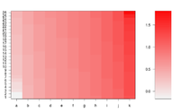
Simple image plot using image() function
https://chitchatr.wordpress.com/2010/07/01/matrix-plots-in-r-a-neat-way-to-display-three-variables/
### Create Matrix plot using colors to fill grid
# Create matrix.   Using random values for this example.
rand <- rnorm(286, 0.8, 0.3)
mat <- matrix(sort(rand), nr=26)
dim(mat)  # Check dimensions

# Create x and y labels
yLabels <- seq(1, 26, 1)
xLabels <- c("a", "b", "c", "d", "e", "f", "g", "h", "i",
"j", "k");

# Set min and max values of rand
 min <- min(rand, na.rm=T)
 max <- max(rand, na.rm=T)

# Red and green range from 0 to 1 while Blue ranges from 1 to 0
 ColorRamp <- rgb(seq(0.95,0.99,length=50),  # Red
                  seq(0.95,0.05,length=50),  # Green
                  seq(0.95,0.05,length=50))  # Blue
 ColorLevels <- seq(min, max, length=length(ColorRamp))

# Set layout.  We are going to include a colorbar next to plot.
layout(matrix(data=c(1,2), nrow=1, ncol=2), widths=c(4,1),
         heights=c(1,1))
#plotting margins.  These seem to work well for me.
par(mar = c(5,5,2.5,1), font = 2)

# Plot it up!
image(1:ncol(mat), 1:nrow(mat), t(mat),
     col=ColorRamp, xlab="Variable", ylab="Time",
     axes=FALSE, zlim=c(min,max),
     main= NA)

# Now annotate the plot
box()
axis(side = 1, at=seq(1,length(xLabels),1), labels=xLabels,
      cex.axis=1.0)
axis(side = 2, at=seq(1,length(yLabels),1), labels=yLabels, las= 1,
      cex.axis=1)

# Add colorbar to second plot region
par(mar = c(3,2.5,2.5,2))
 image(1, ColorLevels,
      matrix(data=ColorLevels, ncol=length(ColorLevels),nrow=1),
      col=ColorRamp,xlab="",ylab="",xaxt="n", las = 1)
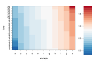
If we define ColorRamp variable using the following way, we will get the 2nd plot.
require(RColorBrewer) # get brewer.pal()
ColorRamp <- colorRampPalette( rev(brewer.pal(9, "RdBu")) )(25)
Note that
- colorRampPalette() is an R's built-in function. It interpolate a set of given colors to create new color palettes. The return is a function that takes an integer argument (the required number of colors) and returns a character vector of colors (see rgb()) interpolating the given sequence (similar to heat.colors() or terrain.colors()).
# An example of showing 50 shades of grey in R
greys <- grep("^grey", colours(), value = TRUE)
length(greys)
# [1] 102
shadesOfGrey <- colorRampPalette(c("grey0", "grey100"))
shadesOfGrey(2)
# [1] "#000000" "#FFFFFF"
# And 50 shades of grey?
fiftyGreys <- shadesOfGrey(50)
mat <- matrix(rep(1:50, each = 50))
image(mat, axes = FALSE, col = fiftyGreys)
box()
- (For dual channel data) brewer.pal(9, "RdBu") creates a diverging palette based on "RdBu" with 9 colors. See help(brewer.pal, package="RColorBrewer") for a list of palette name. The meaning of the palette name can be found on colorbrew2.org website.
- (For single channel data) brewer.pal(9, "Blues") is good. See an example.
gplots package
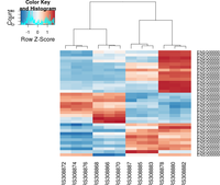
The following example is extracted from DESeq2 package.
## ----loadDESeq2, echo=FALSE----------------------------------------------
# in order to print version number below
library("DESeq2")

## ----loadExonsByGene, echo=FALSE-----------------------------------------
library("parathyroidSE")
library("GenomicFeatures")
data(exonsByGene)

## ----locateFiles, echo=FALSE---------------------------------------------
bamDir <- system.file("extdata",package="parathyroidSE",mustWork=TRUE)
fls <- list.files(bamDir, pattern="bam$",full=TRUE)


## ----bamfilepaired-------------------------------------------------------
library( "Rsamtools" )
bamLst <- BamFileList( fls, yieldSize=100000 )


## ----sumOver-------------------------------------------------------------
library( "GenomicAlignments" )
se <- summarizeOverlaps( exonsByGene, bamLst,
                         mode="Union",
                         singleEnd=FALSE,
                         ignore.strand=TRUE,
                         fragments=TRUE )

## ----libraries-----------------------------------------------------------
library( "DESeq2" )
library( "parathyroidSE" )

## ----loadEcs-------------------------------------------------------------
data( "parathyroidGenesSE" )
se <- parathyroidGenesSE
colnames(se) <- se$run

## ----fromSE--------------------------------------------------------------
ddsFull <- DESeqDataSet( se, design = ~ patient + treatment )

## ----collapse------------------------------------------------------------
ddsCollapsed <- collapseReplicates( ddsFull,
                                    groupby = ddsFull$sample,
                                    run = ddsFull$run )

## ----subsetCols----------------------------------------------------------
dds <- ddsCollapsed[ , ddsCollapsed$time == "48h" ]

## ----subsetRows, echo=FALSE----------------------------------------------
idx <- which(rowSums(counts(dds)) > 0)[1:4000]
dds <- dds[idx,]

## ----runDESeq, cache=TRUE------------------------------------------------
dds <- DESeq(dds)

rld <- rlog( dds)

library( "genefilter" )
topVarGenes <- head( order( rowVars( assay(rld) ), decreasing=TRUE ), 35 )

## ----beginner_geneHeatmap, fig.width=9, fig.height=9---------------------
library(RColorBrewer)
library(gplots)
heatmap.2( assay(rld)[ topVarGenes, ], scale="row",
           trace="none", dendrogram="column",
           col = colorRampPalette( rev(brewer.pal(9, "RdBu")) )(255))
Self-defined distance/linkage method
heatmap.2(..., hclustfun = function(x) hclust(x,method = 'ward.D2'), ...)
Change breaks in scale
https://stackoverflow.com/questions/17820143/how-to-change-heatmap-2-color-range-in-r
Con: it'll be difficult to interpret the heatmap
Color labels
https://stackoverflow.com/questions/13206335/color-labels-text-in-r-heatmap
Output from heatmap.2 examples
ggplot2 package
- https://learnr.wordpress.com/2010/01/26/ggplot2-quick-heatmap-plotting/
- http://www.kim-herzig.de/2014/06/19/heat-maps-with-ggplot2/
- http://is-r.tumblr.com/post/32387034930/simplest-possible-heatmap-with-ggplot2
- http://smartdatawithr.com/en/creating-heatmaps/#more-875 data values are shown in cells!
NMF package
aheatmap() function.
- http://nmf.r-forge.r-project.org/aheatmap.html
- http://www.gettinggeneticsdone.com/2015/04/r-user-group-recap-heatmaps-and-using.html
ComplexHeatmap
- Groups of heatmaps
- The color argument can contain a mapping function or a vector of colors. The circlize package (from the same package author) can be used.
Pros
- Annotation of classes for a new variable.
Correlation matrix
The following code will guarantee the heatmap has a diagonal in the direction of top-left and bottom-right. The row dendrogram will be flipped automatically. There is no need to use cluster_rows = rev(mydend).
mcor <- cor(t(lograt))
colnames(mcor) <- rownames(mcor) <- 1:ncol(mcor)
mydend <- as.dendrogram(hclust(as.dist(1-mcor)))
Heatmap( mcor, cluster_columns = mydend, cluster_rows = mydend,
     row_dend_reorder = FALSE, column_dend_reorder = FALSE,
     row_names_gp = gpar(fontsize = 6),
     column_names_gp = gpar(fontsize = 6),
     column_title = "", name = "value")
pheatmap
(what is special?)
fheatmap
(archived)
corrplot
This package is used for visualization of correlation matrix. See its vignette and Visualize correlation matrix using correlogram.
Interactive heatmaps
d3heatmap
The package let you
- Highlight rows/columns by clicking axis labels
- Click and drag over colormap to zoom in (click on colormap to zoom out)
- Optional clustering and dendrograms, courtesy of base::heatmap
heatmaply
- http://moderndata.plot.ly/interactive-heat-maps-for-r/
- heatmaply: an R package for creating interactive cluster heatmaps for online publishing Bioinformatics 2017.
This package extends the plotly engine to heatmaps, allowing you to inspect certain values of the data matrix by hovering the mouse over a cell. You can also zoom into a region of the heatmap by drawing a rectangle over an area of your choice.
Installing this package requires to compile some dependent package.
The return object is heatmaply is 'plotly' and 'htmlwidget'. It does not return the ordering of rows/columns. It can not control whether to do clustering (d3heatmap package is better at this).
canvasXpress
- https://cran.r-project.org/web/packages/canvasXpress/index.html
- https://canvasxpress.org/html/heatmap-9.html
Dendrogram
Color labels
library(RColorBrewer)
# matrix contains genomics-style data where columns are samples
#   (if otherwise remove the transposition below)
# labels is a factor variable going along the columns of matrix
plotHclustColors <- function(matrix,labels,...) {
  colnames(matrix) <- labels
  d <- dist(t(matrix))
  hc <- hclust(d, method = "ward.D2")
  labelColors <- brewer.pal(nlevels(labels),"Set1")
  colLab <- function(n) {
      if (is.leaf(n)) {
      a <- attributes(n)
      labCol <- labelColors[which(levels(labels) == a$label)]
      attr(n, "nodePar") <- c(a$nodePar, lab.col=labCol)
      }
      n
  }
  clusDendro <- dendrapply(as.dendrogram(hc), colLab)
  # I change cex because there are lots of samples
  op <- par(mar=c(5,3,1,.5)+.1, cex=.3)
  plot(clusDendro,...)
  par(op)
}

plotHclustColors(genedata, pheno)
Dendrogram with covariates
https://web.stanford.edu/~hastie/TALKS/barossa.pdf#page=41
dendextend package
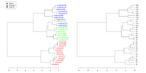
Simplified from dendextend's vignette.
library(dendextend)

set.seed(1234)
iris <- datasets::iris[sample(150, 30), ] # subset for better view
iris2 <- iris[, -5] # data
species_labels <- iris[, 5] # group for coloring

hc_iris <- hclust(dist(iris2), method = "complete")
iris_species <- levels(species_labels)

dend <- as.dendrogram(hc_iris)
colorCodes <- c("red", "green", "blue")
labels_colors(dend) <- colorCodes[as.numeric(species_labels)][order.dendrogram(dend)]

labels(dend) <- paste0(as.character(species_labels)[order.dendrogram(dend)],
                           "(", labels(dend), ")")
# We hang the dendrogram a bit:
dend <- hang.dendrogram(dend, hang_height=0.1)
dend <- set(dend, "labels_cex", 1.0)

png("~/Downloads/iris_dextend.png", width = 1200, height = 600)
par(mfrow=c(1,2), mar = c(3,3,1,7))
plot(dend, main = "", horiz =  TRUE)
legend("topleft", legend = iris_species, fill = colorCodes)

par(mar=c(3,1,1,5))
plot(as.dendrogram(hc_iris),horiz=TRUE)
dev.off()
Colors
A quick introduction to using color in density plots
http://sharpsightlabs.com/blog/quick-intro-color-density-plot/
display.brewer.pal() and brewer.pal() functions
While brewer.pal() will return colors (in hex) for a certain palette, display.brew.pal() can display the colors on a graphical device.
library(RColorBrewer)
display.brewer.pal(11, "BrBG") # Alternative colors used in correlation matrix

display.brewer.pal(9, "Set1") # Up to 9 classes are allowed
Papers
Healthcare Access and Quality Index - Lancet
http://www.thelancet.com/pdfs/journals/lancet/PIIS0140-6736(17)30818-8.pdf


