Heatmap
Clustering
R
- Task View
- Overview of clustering methods in R
- Partitional Clustering in R: The Essential.
- K-means,
- K-medoids clustering or PAM (Partitioning Around Medoids),
- CLARA (Clustering Large Applications), which is an extension to PAM adapted for large data sets. According to Wikibooks: since CLARA adopts a sampling approach, the quality of its clustering results depends greatly on the size of the sample. When the sample size is small, CLARA’s efficiency in clustering large data sets comes at the cost of clustering quality.
Books
k-means clustering
- Assumptions, a post from varianceexplained.org.
- UTILIZING K-MEANS TO EXTRACT COLOURS FROM YOUR FAVOURITE IMAGES
- k-Means 101: An introductory guide to k-Means clustering in R. Interactive 3D plot. Elbow plot.
k-medoids/Partitioning Around Medoids (PAM)
- https://en.wikipedia.org/wiki/K-medoids. Because k-medoids minimizes a sum of pairwise dissimilarities instead of a sum of squared Euclidean distances, it is more robust to noise and outliers than k-means.
- ?cluster::pam
Number of clusters: Intraclass Correlation/ Intra Cluster Correlation (ICC)
- https://en.wikipedia.org/wiki/Intraclass_correlation
- ICC was used by Integrating gene expression and GO classification for PCA by preclustering by Hann et al 2010
Figures of merit (FOM) plot
maanova::fom(), Validating clustering for gene expression data by Yeung 2001.
mbkmeans
- https://bioconductor.org/packages/release/bioc/html/mbkmeans.html Proposed by Sculley 2010. Useful for scRNA-Seq data. talk by Hicks 2021.
Kmeans++
- Wikipedia. It is an algorithm for choosing the initial values/centroids (or "seeds") for the k-means clustering algorithm.
- flexclust package
- https://tanaylab.github.io/tglkmeans/. tglkmeans() is optimized for speed and memory.
Fuzzy K-means
fclust: An R Package for Fuzzy Clustering. fclust::FKM().
Hierarchical clustering
For the kth cluster, define the Error Sum of Squares as [math]\displaystyle{ ESS_m = }[/math] sum of squared deviations (squared Euclidean distance) from the cluster centroid. [math]\displaystyle{ ESS_m = \sum_{l=1}^{n_m}\sum_{k=1}^p (x_{ml,k} - \bar{x}_{m,k})^2 }[/math] in which [math]\displaystyle{ \bar{x}_{m,k} = (1/n_m) \sum_{l=1}^{n_m} x_{ml,k} }[/math] the mean of the mth cluster for the k-th variable, [math]\displaystyle{ x_{ml,k} }[/math] being the score on the kth variable [math]\displaystyle{ (k=1,\dots,p) }[/math] for the l-th object [math]\displaystyle{ (l=1,\dots,n_m) }[/math] in the mth cluster [math]\displaystyle{ (m=1,\dots,g) }[/math].
If there are C clusters, define the Total Error Sum of Squares as Sum of Squares as [math]\displaystyle{ ESS = \sum_m ESS_m, m=1,\dots,C }[/math]
Consider the union of every possible pair of clusters.
Combine the 2 clusters whose combination combination results in the smallest increase in ESS.
Comments:
- The default linkage is "complete" in R.
- Ward's method tends to join clusters with a small number of observations, and it is strongly biased toward producing clusters with the same shape and with roughly the same number of observations.
- It is also very sensitive to outliers. See Milligan (1980).
Take pomeroy data (7129 x 90) for an example:
library(gplots)

lr = read.table("C:/ArrayTools/Sample datasets/Pomeroy/Pomeroy -Project/NORMALIZEDLOGINTENSITY.txt")
lr = as.matrix(lr)
method = "average" # method <- "complete"; method <- "ward.D2"; method <- "single"
hclust1 <- function(x) hclust(x, method= method)
heatmap.2(lr, col=bluered(75), hclustfun = hclust1, distfun = dist,
              density.info="density", scale = "none",
              key=FALSE, symkey=FALSE, trace="none",
              main = method)
It seems average method will create a waterfall like dendrogram. Ward method will produce a tight clusters. Complete linkage produces a more 中庸 result.


K-Means vs hierarchical clustering
K-Means vs hierarchical clustering. Hierarchical clustering is usually preferable, as it is both more flexible and has fewer hidden assumptions about the distribution of the underlying data.
Comparing different linkage methods
- Hierarchical clustering and linkage explained in simplest way. Single, Complete, Average, Centroid.
- Comparing different hierarchical linkage methods on toy datasets
- A Comparison of Hierarchical Methods for Clustering Functional Data Ferreira & Hitchcock 2009. Rand index. Ward’s method was usually the best, while average linkage performed best in some special situations, in particular, when the number of clusters is over specified (page 5 of the PDF).
- Comparison of hierarchical cluster analysis methods by cophenetic correlation 2013
- Choosing the right linkage method for hierarchical clustering
Wards agglomeration/linkage method
- Ward's minimum variance method
- Murtagh, F., & Legendre, P. (2014). http://adn.biol.umontreal.ca/~numericalecology/Reprints/Murtagh_Legendre_J_Class_2014.pdf Ward’s hierarchical agglomerative clustering method: which algorithms implement Ward’s criterion?. Journal of Classification, 31(3), 274-295.
- IAML19.5 Single-link, complete-link, Ward's method. For Ward's method, we compute the centroid of the merged data. We calculate the deviations from each observations to the centroid and take the sum of this squared deviation.
- It is based on the notion that clusters of multivariate observations should be approximately elliptical in shape. We assume that the data from each of the clusters have been realized in a multivariate distribution. Therefore, it would follow that they would fall into an elliptical shape when plotted in a p-dimensional scatter plot. Basically, it looks at cluster analysis as an analysis of variance problem, instead of using distance metrics or measures of association.
- Agglomertive Hierarchical Clustering using Ward Linkage. We merge two clusters if they have the smallest merging cost/the sum of squares will increase when we merge them.
- Ward’s Hierarchical Agglomerative Clustering Method: Which Algorithms Implement Ward’s Criterion?. In R, only "ward.D2" minimizes the Ward clustering criterion and produces the Ward method.
- Since Ward method is used as the linkage method, the height is not limited to the original scale and can be larger than 2 if 1-Pearson distance is used. See the formula of the distance [math]\displaystyle{ d_{(ij)k} }[/math] in wikipedia page.
Euclidean distance with missing values
- Function `dist` not behaving as expected on vectors with missing values, ?dist. If some columns are excluded in calculating a Euclidean, Manhattan, Canberra or Minkowski distance, the sum is scaled up proportionally to the number of columns used.
x <- matrix(c(1,1,1,1, NA, 3), byrow = T, nr=2)
x
#      [,1] [,2] [,3]
# [1,]    1    1    1
# [2,]    1   NA    3
dist(x) |> c()                  # 2.44949,  NOT 2
sqrt(((1-1)**2 + (1-3)**2)/2*3) # [1] 2.44949
Correlation distance
Clustering using Correlation as Distance Measures in R
# Pairwise correlation between samples (columns)
cols.cor <- cor(mydata, use = "pairwise.complete.obs", method = "pearson")
# Pairwise correlation between rows (genes)
rows.cor <- cor(t(mydata), use = "pairwise.complete.obs", method = "pearson")

## Row- and column-wise clustering using correlation
hclust.col <- hclust(as.dist(1-cols.cor))
hclust.row <- hclust(as.dist(1-rows.cor))


# Plot the heatmap
library("gplots")
heatmap.2(mydata, scale = "row", col = bluered(100),
          trace = "none", density.info = "none",
          Colv = as.dendrogram(hclust.col),
          Rowv = as.dendrogram(hclust.row)
          )
Get the ordering
set.seed(123)
dat <- matrix(rnorm(20), ncol=2)

# perform hierarchical clustering
hc <- hclust(dist(dat))

# plot dendrogram
plot(hc)

# get ordering of leaves
ord <- order.dendrogram(as.dendrogram(hc))
# OR an easy way
ord <- hc$order
ord
# [1]  8  3  6  5 10  1  9  7  2  4
# Same as seen on the dendrogram nodes

cutree and cluster number
- The cutree() function in R assigns cluster numbers based on the structure of the dendrogram, but it doesn't have a fixed rule like "the leftmost group is always Cluster 1." The numbering is essentially arbitrary and depends on how the internal hclust object is structured.
- Some useful notes (hc = hclust() object)
- hc$labels - the original labels of samples
hc <- hclust(dist(USArrests), "ave")
identical(hc$labels, rownames(USArrests)) # TRUE
- hc$order - the permutation of the original observations suitable for plotting. hc$labels[hc$order[1]] correctly returns the label of the leftmost sample on the dendrogram.
hc <- hclust(dist(USArrests), "ave")
hc$labels[hc$order] # same as we see on dendrogram plot
plot(hc)
- cutree(hc,k)[hc$order] will return a vector of cluster numbers for the samples, with the numbers ordered to match the left-to-right appearance of the samples on the dendrogram. For example,
hc <- hclust(dist(USArrests), "ave")
unname(cutree(hc, k=4)[hc$order])
#  [1] 4 4 1 1 1 1 1 1 1 1 1 1 1 1 1 1 2 2 2 2 2 2 2 2 2 2 2 2 2 2
# [31] 3 3 3 3 3 3 3 3 3 3 3 3 3 3 3 3 3 3 3 3
unname(cutree(hc, k=4)[hc$order]) |> unique()
#  4  1  2  3
# OR
rle(cutree(hc, k=4)[hc$order])$values |> unname()
Dendrogram
Beautiful dendrogram visualizations in R
dendextend* package
- Introduction
- Features:
- Adjusting a tree’s graphical parameters: You can use the dendextend package to adjust the color, size, type, and other graphical parameters of a dendrogram’s branches, nodes, and labels1.
- Comparing dendrograms: The dendextend package provides several advanced methods for visually and ** statistically comparing different dendrograms to one another1.
- Manipulating dendrograms: The dendextend package provides utility functions for manipulating dendrogram objects, allowing you to change their color, shape, and content2.
- Paper
- dendextend::plot(, horiz=TRUE) allows to rotate a dendrogram with tips on RHS.
- plot_horiz.dendrogram() allows to rotate a dendrogram with tips on LHS.
- The package has a function tanglegram() to compare two trees of hierarchical clusterings. See this post and its vignette.
- Add colored bars
Simplified from dendextend's vignette or Label and color leaf dendrogram.
library(dendextend)

set.seed(1234)
iris <- datasets::iris[sample(150, 30), ] # subset for better view
iris2 <- iris[, -5] # data
species_labels <- iris[, 5] # group for coloring

hc_iris <- hclust(dist(iris2), method = "complete")
iris_species <- levels(species_labels)

dend <- as.dendrogram(hc_iris)
colorCodes <- c("red", "green", "blue")
labels_colors(dend) <- colorCodes[as.numeric(species_labels)][order.dendrogram(dend)]

labels(dend) <- paste0(as.character(species_labels)[order.dendrogram(dend)],
                           "(", labels(dend), ")")
# We hang the dendrogram a bit:
dend <- hang.dendrogram(dend, hang_height=0.1)
dend <- set(dend, "labels_cex", 1.0)

png("~/Downloads/iris_dextend.png", width = 1200, height = 600)
par(mfrow=c(1,2), mar = c(3,3,1,7))
plot(dend, main = "", horiz =  TRUE)
legend("topleft", legend = iris_species, fill = colorCodes)

par(mar=c(3,1,1,5))
plot(as.dendrogram(hc_iris),horiz=TRUE)
dev.off()

Flip/rotate branches
- rotate() function from dendextend package.
hc <- hclust(dist(USArrests[c(1, 6, 13, 20, 23), ]), "ave")
plot(hc, main = "Original tree")
plot(rotate(hc, c(2:5, 1)), main = "Rotates the left most leaf \n
into the right side of the tree")
# Or
plot(rotate(hc, c("Maryland", "Colorado", "Alabama", "Illinois", "Minnesota")), main="Rotated")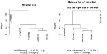
- https://www.biostars.org/p/279775/

Color labels
- https://www.r-graph-gallery.com/dendrogram/
- 7+ ways to plot dendrograms in R
- dendrapply(). Cons: 1. do not print the sample ID (solution: dendextend package), 2. not interactive.
library(RColorBrewer)
# matrix contains genomics-style data where columns are samples
#   (if otherwise remove the transposition below)
# labels is a factor variable going along the columns of matrix
# cex: use a smaller number if the number of sample is large
plotHclustColors <- function(matrix,labels, distance="eucl", method="ward.D2", palette="Set1", cex=.3, ...) {
     #colnames(matrix) <- labels
     if (distance == "eucl") {
        d <- dist(t(matrix))
     } else if (distance == "corr") {
       d <- as.dist(1-cor(matrix))
     }
     hc <- hclust(d, method = method)
     labels <- factor(labels)
     if (nlevels(labels) == 2) {
       labelColors <- brewer.pal(3, palette)[1:2]
     } else {
       labelColors <- brewer.pal(nlevels(labels), palette)
     }
     colLab <- function(n) {
         if (is.leaf(n)) {
             a <- attributes(n)
             labCol <- labelColors[which(levels(labels) == a$label)]
             attr(n, "nodePar") <- c(a$nodePar, lab.col=labCol)
         }
         n
     }
     clusDendro <- dendrapply(as.dendrogram(hc), colLab)
     # I change cex because there are lots of samples
     op <- par(mar=c(5,3,1,.5)+.1)
     plot(clusDendro,...)
     par(op)
}

genedata <- matrix(rnorm(100*20), nc=20)
colnames(genedata) <- paste0("S", 1:20)
pheno <- rep(c(1,2), each =10)

plotHclustColors(genedata, pheno, cex=.8)
Dendrogram with covariates
- Using the ComplexHeatmap package and a dummy matrix.
- https://web.stanford.edu/~hastie/TALKS/barossa.pdf#page=41

Density based clustering
http://www.r-exercises.com/2017/06/10/density-based-clustering-exercises/
Biclustering
- s4vd: Biclustering via Sparse Singular Value Decomposition Incorporating Stability Selection and the original 2011 paper.
- https://cran.r-project.org/web/packages/biclust/index.html
- Introduction to BiclustGUI
Optimal number of clusters
- Cluster analysis -> Evaluation and assessment
- Determining the number of clusters in a data set
- https://datascienceplus.com/finding-optimal-number-of-clusters/
- 10 Tips for Choosing the Optimal Number of Clusters
- Determining Optimal Clusters
- Elbow method
- Silhouette method
- Gap statistic
- 10 Tips for Choosing the Optimal Number of Clusters
- Christian Hennig - Assessing the quality of a clustering
Silhouette score/width
- https://en.wikipedia.org/wiki/Silhouette_(clustering)
- A clustering with an average silhouette width of over 0.7 is considered to be "strong", a value over 0.5 "reasonable", and over 0.25 "weak".
- However, with an increasing dimensionality of the data, it becomes difficult to achieve such high values because of the curse of dimensionality, as the distances become more similar.
- The silhouette score is specialized for measuring cluster quality when the clusters are convex-shaped, and may not perform well if the data clusters have irregular shapes or are of varying sizes.
- Some magic numbers to interpret the silhouette values; redirected from How to tell if data is "clustered" enough for clustering algorithms to produce meaningful results?
- 0.71-1.0: A strong structure has been found
- 0.51-0.70: A reasonable structure has been found
- 0.26-0.50: The structure is weak and could be artificial. Try additional methods of data analysis.
- < 0.25: No substantial structure has been found
- Silhouettes: A graphical aid to the interpretation and validation of cluster analysis Rousseeuw 1987
- This silhouette shows which objects lie well within their cluster, and which ones are merely somewhere in between clusters.
- The entire clustering is displayed by combining the silhouettes into a single plot, allowing an appreciation of the relative quality of the clusters and an overview of the data configuration.
- The average silhouette width provides an evaluation of clustering validity, and might be used to select an ‘appropriate’ number of clusters. The k (number of clusters) that maximizes the average silhouette scores is the best k.
- https://github.com/cran/cluster/blob/master/R/silhouette.R
- A modified example (with code) from ?silhouette

- Cluster Analysis 5th Edition. Everitt et al. page 129. Average silhouette width - the average of the s(i) over the entire data set – can be maximized to provide a more formal criterion for selecting the number of groups.
- The silhouette coefficient tells you how similar is a data point to the points in its own cluster compared to points in other clusters.
- Now the absolute value of the silhouette coefficient does not matter.
- Silhouette Coefficient (python)
- Silhouette Score = (b-a)/max(a,b) where
- a= average intra-cluster distance
- b= (minimum) average inter-cluster distance
- Clustering Validation Statistics: 4 Vital Things Everyone Should Know - Unsupervised Machine Learning
- Observations with a large Si (almost 1) are very well clustered
- A small Si (around 0) means that the observation lies between two clusters
- Observations with a negative Si are probably placed in the wrong cluster.
- Clustering Analysis in R using K-means
- Cluster silhouette plot
- Average silhouette width (one value for the whole data)
- Cluster evaluation
- Selecting the (optimal) number of clusters with silhouette analysis on KMeans clustering (python, scikit). Graphically compare silhouette width for different number of clusters.
- 10 Tips for Choosing the Optimal Number of Clusters
- Silhouette Analysis in K-means Clustering
- KMeans Silhouette Score Explained With Python Example
- Using Silhouette analysis for selecting the number of cluster for K-means clustering.
- Silhouette Method — Better than Elbow Method to find Optimal Clusters
- Selecting optimal number of clusters in KMeans Algorithm (Silhouette Score)
- When ai << bi, Si will be close to 1. This happens when a(i) is very close to its assigned cluster. A large value of bi implies its extremely far from its next closest cluster.
- Mean Silhouette score
- Average SS vs K plot from the ebook 'An R Companion for Introduction to Data Mining'. The ruspini data (originally used by Rousseeuw 1987) is used in the chapter.
- Silhouette width using generalized mean—A flexible method for assessing clustering efficiency Lengyel 2019
- clusterability: quantifies how well two different types of cells are separated from each other
Jaccard similarity/index - cluster stability
- Stable cluster = reproducible under resampling
- Silhouette measures cluster separation/compactness, not stability.
- si = (bi-ai) / max(ai, bi) for a sample i
- ai = average distance from point i to all other points in its own cluster → measures within-cluster cohesion (compactness)
- bi = smallest average distance from point i to points in another cluster → measures separation from the nearest neighboring cluster
- https://en.wikipedia.org/wiki/Jaccard_index
- [math]\displaystyle{ J(A, B) = \frac{|A \cap B|}{|A \cup B|} = \frac{|A \cap B|}{|A| + |B| - |A \cap B|}. }[/math]
- fpc::clusterboot
- fpc::clusterboot evaluates how consistently each cluster is recovered under bootstrap resampling. Stability is measured using the Jaccard similarity between original and resampled cluster memberships.
- For a given cluster C and its matched bootstrap cluster C': J(C, C')=(number of samples shared by both clusters)/(total samples belonging to either cluster) is calculated.
- Matched bootstrap cluster: For each original cluster, find the cluster in the bootstrap sample that overlaps with it the most. Find Cj' such that it maxmizes J(C, Cj')
- After B=100 bootstraps, we calculate the average Jaccard stability over all bootstrap samples for each cluster.
- R
library(fpc)

data(iris)
iris_data <- iris[, -5]

cb <- clusterboot(
  iris_data,
  B = 100,
  clustermethod = kmeansCBI,   # <-- fpc's built-in function
  k = 3,
  seed = 123
)
cb$bootmean  #  [1] 0.9370159 0.8772866 0.8309947
#  | Cluster | Jaccard | Interpretation     |
#  | ------- | ------- | ------------------ |
#  | 1       | 0.954   | Very highly stable |
#  | 2       | 0.939   | Very highly stable |
#  | 3       | 1.000   | Perfectly stable   |

# bootmean[i] = the average Jaccard coefficient between original cluster i
# and its best-matching cluster across all bootstrap resamples.

# For each bootstrap b run:
# 1. Sample the data with replacement
# 2. Recluster
# 3. For each original cluster Ci, find the bootstrap cluster Ci* with maximum
#    overlap/Jaccard index J(Ci, Ci^(b)). Record J(Ci, Ci*).
# 5. bootmean_i = average of those Jaccard values over B runs (default B=100)

cb_hc <- clusterboot(
  iris_data,
  B = 100,
  clustermethod = hclustCBI,
  method = "complete",
  k = 3,
  scaling = FALSE, # default is TRUE in hclustCBI
  seed = 123
)
cb_hc$bootmean # [1] 0.9019055 0.4683334 0.7140351
cb_hc$result$partition

hc <- hclust(dist(iris_data), method = "complete")
partition <- cutree(hc, k = 3)
identical(cb_hc$result$partition, partition)
- Interpreting the results; see ?clusterboot() documentation.
- cb_hc$bootmean = mean Jaccard stability per cluster across bootstrap runs
- > 0.85 highly stable
- 0.75–0.85 stable cluster
- 0.60–0.75 indicating patterns in the data/questionable
- < 0.60 unstable
Cluster size
Silhouette doesn’t penalize this—it can be inflated for tiny, isolated points.
Practical rule of thumb. For most applications:
- < 5 samples → almost never robust
- 5–10 samples → borderline, only if very well separated and reproducible
- ~10–20 samples → potentially robust, but needs validation
- ≥ 20–30 samples → generally considered robust, if silhouette/stability is good
Cluster size is a proxy for stability:
- Small clusters are more sensitive to:
- distance metric choice
- linkage method
- noise / single observations
- In hierarchical clustering, tiny clusters often arise from:
- chaining effects
- outliers being split late
- over-cutting the dendrogram
A cluster is robust if it is:
- Large enough to be reproducible
- Would it reappear if you removed 10–20% of samples?
- Stable across perturbations
- Different linkage methods
- Slightly different distance metrics
- Internally coherent
- Low within-cluster variance
- Externally separated
- High silhouette relative to others
Scree/elbow plot
- Cf scree plot for PCA analysis
- K-Means Clustering in R: Step-by-Step Example. ?factoextra::fviz_nbclust (good integration with different clustering methods and evaluation statistic)
- datacamp
# Use map_dbl to run many models with varying value of k (centers)
tot_withinss <- map_dbl(1:10,  function(k){
  model <- kmeans(x = lineup, centers = k)
  model$tot.withinss
})

# Generate a data frame containing both k and tot_withinss
elbow_df <- data.frame(
  k = 1:10,
  tot_withinss = tot_withinss
)

# Plot the elbow plot
ggplot(elbow_df, aes(x = k, y = tot_withinss)) +
  geom_line() +
  scale_x_continuous(breaks = 1:10)
pvclust
- github and CRAN
- pvclust provides two types of p-values: AU (Approximately Unbiased) p-value and BP (Bootstrap Probability) value. AU p-value, which is computed by multiscale bootstrap resampling, is a better approximation to unbiased p-value than BP value computed by normal bootstrap resampling.
- For a cluster with AU p-value > 0.95, the hypothesis that "the cluster does not exist" is rejected with significance level 0.05; roughly speaking, we can think that these highlighted clusters does not only "seem to exist" caused by sampling error, but may stably be observed if we increase the number of observation.
- Clusters with AU larger than 95% are highlighted by rectangles.
kBET: k-nearest neighbour batch effect test
- Buttner, M., Miao, Z., Wolf, F. A., Teichmann, S. A. & Theis, F. J. A test metric for assessing single-cell RNA-seq batch correction. Nat. Methods 16, 43–49 (2019).
- https://github.com/theislab/kBET
- quantify mixability; how well cells of the same type from different batches were grouped together
Alignment score
- Butler, A., Hoffman, P., Smibert, P., Papalexi, E. & Satija, R. Integrating single-cell transcriptomic data across different conditions, technologies, and species. Nat. Biotechnol. 36, 411–420 (2018).
- quantify mixability; how well cells of the same type from different batches were grouped together
dynamicTreeCut package
dynamicTreeCut: Methods for Detection of Clusters in Hierarchical Clustering Dendrograms. cutreeDynamicTree(). Found in here.
Using logistic regression
Determination of the number of clusters through logistic regression analysis Modak 2023
Compare 2 clustering methods, ARI
- https://en.wikipedia.org/wiki/Rand_index
- The Adjusted Rand index
- The adjusted Rand index (ARI) measures the similarity between two clusterings by comparing all pairs of elements and adjusting for the agreement expected by chance.
- Formula
Suppose you have two partitions of the same 𝑛 objects:- Clustering [math]\displaystyle{ U = {U_1, U_2, \cdots, U_r} }[/math]
- Clustering [math]\displaystyle{ V = {V_1, V_2, \cdots, V_s} }[/math]
Let [math]\displaystyle{ a_i = \sum_j n_{ij} }[/math] (row totals), and [math]\displaystyle{ b_j=\sum_i n_{ij} }[/math] (column totals).
[math]\displaystyle{ \mathrm{ARI} = \frac{ \sum_{ij} \binom{n_{ij}}{2} \;-\; \frac{\sum_i \binom{a_i}{2} \, \sum_j \binom{b_j}{2}}{\binom{n}{2}} }{ \frac{1}{2} \left[ \sum_i \binom{a_i}{2} + \sum_j \binom{b_j}{2} \right] - \frac{\sum_i \binom{a_i}{2} \, \sum_j \binom{b_j}{2}}{\binom{n}{2}} } }[/math]- Numeriator: agreement between clusterings beyond chance.
- Denominator: maximum possible agreement beyond chance.
- Range:
- 1 = perfect agreement
- 0 = random labeling
- <0 = worse than random
- mclust::adjustedRandIndex(). ARI is label-invariant.
library(mclust) # Example cluster assignments (must be aligned on the same proteins) labels_x <- c(1, 1, 2, 2, 3, 3) labels_y <- c("A", "A", "B", "C", "C", "B") adjustedRandIndex(labels_x, labels_y) - clue: package - Cluster Ensembles
- Examples: Effects of normalization on clustering from Normalization by distributional resampling of high throughput single-cell RNA-sequencing data Brown 2021.
Benchmark clustering algorithms
Using clusterlab to benchmark clustering algorithms
Significance analysis
Significance analysis for clustering with single-cell RNA-sequencing data 2023
Power
Statistical power for cluster analysis 2022. It includes several take-home message.
Louvain algorithm: graph-based method
Mahalanobis distance
- The Mahalanobis distance is a measure of the distance between a point P and a distribution D.
- Mahalanobis distance is widely used in cluster analysis and classification techniques.
- Mahalanobis distance can be used to classify a test point as belonging to one of N classes
- Mahalanobis distance and leverage are often used to detect outliers, especially in the development of linear regression models.
- How to Calculate Mahalanobis Distance in R. We can determine if any of the distances are statistically significant by calculating their p-values. The p-value for each distance is calculated as the p-value that corresponds to the Chi-Square statistic of the Mahalanobis distance with k-1 degrees of freedom, where k = number of variables. ?stats::mahalanobis
- Question: low-rank covariance case (high-dimensional data)? Matrix::rankMatrix(var(X)) < nr if nr=nrow(X) < nc=ncol(X).
- Mahalanobis distance: What if S is not invertible? Moore-Penrose generalized inverse/pseudo-inverse is used.
- To calculate mahalanobis distance when the number of observations are less than the dimension.
- What is the best distance measure for high dimensional data?
Dendrogram
as.dendrogram
- ?dendrogram: General Tree Structures
- Not just hierarchical clustering can be represented as a tree. The diana method can also be represented as a tree. See an example here from the ComplexHeatmap package.
- US Arrests: Hierarchical Clustering using DIANA and AGNES
- ?diana, ?agnes
Large dendrograms
Interactive Exploration of Large Dendrograms with Prototypes 2022
You probably don't understand heatmaps
- http://www.opiniomics.org/you-probably-dont-understand-heatmaps/
- Effect of number of genes
Evaluate the effect of centering & scaling
Different distance measures
9 Distance Measures in Data Science
1-correlation distance
Effect of centering and scaling on clustering of genes and samples in terms of distance. 'Yes' means the distance was changed compared to the baseline where no centering or scaling was applied.
| clustering genes | clustering samples | |
|---|---|---|
| centering on each genes | No | Yes* |
| scaling on each genes | No | Yes* |
- Note: Cor(X, Y) = Cor(X + constant scalar, Y). If the constant is not a scalar, the equation won't hold. Or think about plotting data in a 2 dimension space. If the X data has a constant shift for all observations/genes, then the linear correlation won't be changed.
Euclidean distance
| clustering genes | clustering samples | |
|---|---|---|
| centering on each genes | Yes | No1 |
| scaling on each genes | Yes | Yes2 |
Note
- [math]\displaystyle{ \sum(X_i - Y_i)^2 = \sum(X_i-c_i - (Y_i-c_i))^2 }[/math]
- [math]\displaystyle{ \sum(X_i - Y_i)^2 \neq \sum(X_i/c_i - Y_i/c_i)^2 }[/math]
Supporting R code
1. 1-Corr distance
source("http://www.bioconductor.org/biocLite.R")
biocLite("limma"); biocLite("ALL")

library(limma); library(ALL)
data(ALL)

eset <- ALL[, ALL$mol.biol %in% c("BCR/ABL", "ALL1/AF4")]

f <- factor(as.character(eset$mol.biol))
design <- model.matrix(~f)
fit <- eBayes(lmFit(eset,design))
selected  <- p.adjust(fit$p.value[, 2]) < 0.05
esetSel <- eset [selected, ]   # 165 x 47
heatmap(exprs(esetSel))

esetSel2 <- esetSel[sample(1:nrow(esetSel), 20), sample(1:ncol(esetSel), 10)] # 20 x 10

dist.no <- 1-cor(t(as.matrix(esetSel2)))
dist.mean <- 1-cor(t(sweep(as.matrix(esetSel2), 1L, rowMeans(as.matrix(esetSel2))))) # gene variance has not changed!
dist.median <- 1-cor(t(sweep(as.matrix(esetSel2), 1L, apply(esetSel2, 1, median))))

range(dist.no - dist.mean) # [1] -1.110223e-16  0.000000e+00
range(dist.no - dist.median) # [1] -1.110223e-16  0.000000e+00
range(dist.mean - dist.median) # [1] 0 0
So centering (no matter which measure: mean, median, ...) genes won't affect 1-corr distance of genes.
dist.mean <- 1-cor(t(sweep(as.matrix(esetSel2), 1L, rowMeans(as.matrix(esetSel2)), "/")))
dist.median <- 1-cor(t(sweep(as.matrix(esetSel2), 1L, apply(esetSel2, 1, median), "/")))
range(dist.no - dist.mean) # [1] -8.881784e-16  6.661338e-16
range(dist.no - dist.median) # [1] -6.661338e-16  6.661338e-16
range(dist.mean - dist.median) # [1] -1.110223e-15  1.554312e-15
So scaling after centering (no matter what measures: mean, median,...) won't affect 1-corr distance of genes.
How about centering / scaling genes on array clustering?
dist.no <- 1-cor(as.matrix(esetSel2))
dist.mean <- 1-cor(sweep(as.matrix(esetSel2), 1L, rowMeans(as.matrix(esetSel2)))) # array variance has changed!
dist.median <- 1-cor(sweep(as.matrix(esetSel2), 1L, apply(esetSel2, 1, median)))

range(dist.no - dist.mean) # [1] -1.547086  0.000000
range(dist.no - dist.median) # [1] -1.483427  0.000000
range(dist.mean - dist.median) # [1] -0.5283601  0.6164602

dist.mean <- 1-cor(sweep(as.matrix(esetSel2), 1L, rowMeans(as.matrix(esetSel2)), "/"))
dist.median <- 1-cor(sweep(as.matrix(esetSel2), 1L, apply(esetSel2, 1, median), "/"))
range(dist.no - dist.mean) # [1] -1.477407  0.000000
range(dist.no - dist.median) # [1] -1.349419  0.000000
range(dist.mean - dist.median) # [1] -0.5419534  0.6269875
2. Euclidean distance
dist.no <- dist(as.matrix(esetSel2))
dist.mean <- dist(sweep(as.matrix(esetSel2), 1L, rowMeans(as.matrix(esetSel2))))
dist.median <- dist(sweep(as.matrix(esetSel2), 1L, apply(esetSel2, 1, median)))

range(dist.no - dist.mean) # [1] 7.198864e-05 2.193487e+01
range(dist.no - dist.median) # [1] -0.3715231 21.9320846
range(dist.mean - dist.median) # [1] -0.923717629 -0.000088385
Centering does affect the Euclidean distance.
dist.mean <- dist(sweep(as.matrix(esetSel2), 1L, rowMeans(as.matrix(esetSel2)), "/"))
dist.median <- dist(sweep(as.matrix(esetSel2), 1L, apply(esetSel2, 1, median), "/"))

range(dist.no - dist.mean) # [1]  0.7005071 24.0698991
range(dist.no - dist.median) # [1]  0.636749 24.068920
range(dist.mean - dist.median) # [1] -0.22122869  0.02906131
And scaling affects Euclidean distance too.
How about centering / scaling genes on array clustering?
dist.no <- dist(t(as.matrix(esetSel2)))
dist.mean <- dist(t(sweep(as.matrix(esetSel2), 1L, rowMeans(as.matrix(esetSel2)))))
dist.median <- dist(t(sweep(as.matrix(esetSel2), 1L, apply(esetSel2, 1, median))))

range(dist.no - dist.mean) # 0 0
range(dist.no - dist.median)  # 0 0
range(dist.mean - dist.median) # 0 0

dist.mean <- dist(t(sweep(as.matrix(esetSel2), 1L, rowMeans(as.matrix(esetSel2)), "/")))
dist.median <- dist(t(sweep(as.matrix(esetSel2), 1L, apply(esetSel2, 1, median), "/")))

range(dist.no - dist.mean) # [1] 1.698960 9.383789
range(dist.no - dist.median)  # [1] 1.683028 9.311603
range(dist.mean - dist.median) # [1] -0.09139173  0.02546394
Euclidean distance and Pearson correlation relationship
http://analytictech.com/mb876/handouts/distance_and_correlation.htm. In summary, if X and Y are standardized, they will each have a mean of 0 and a standard deviation of 1, then
[math]\displaystyle{ r(X, Y) = 1 - \frac{d^2(X, Y)}{2n} }[/math]
where [math]\displaystyle{ r(X, Y) }[/math] is the Pearson correlation of variables X and Y and [math]\displaystyle{ d^2(X, Y) }[/math] is the squared Euclidean distance of X and Y.
Simple image plot using image() function
image(t(x)) is similar to stats::heatmap(x, Rowv = NA, Colv = NA, scale = "none") except heatmap() can show column/row names while image() won't. The default colors are the same too though not pretty.
https://chitchatr.wordpress.com/2010/07/01/matrix-plots-in-r-a-neat-way-to-display-three-variables/


### Create Matrix plot using colors to fill grid
# Create matrix.   Using random values for this example.
rand <- rnorm(286, 0.8, 0.3)
mat <- matrix(sort(rand), nr=26)
dim(mat)  # Check dimensions

# Create x and y labels
yLabels <- seq(1, 26, 1)
xLabels <- c("a", "b", "c", "d", "e", "f", "g", "h", "i",
"j", "k");

# Set min and max values of rand
 min <- min(rand, na.rm=T)
 max <- max(rand, na.rm=T)

# Red and green range from 0 to 1 while Blue ranges from 1 to 0
 ColorRamp <- rgb(seq(0.95,0.99,length=50),  # Red
                  seq(0.95,0.05,length=50),  # Green
                  seq(0.95,0.05,length=50))  # Blue
 ColorLevels <- seq(min, max, length=length(ColorRamp))

# Set layout.  We are going to include a colorbar next to plot.
layout(matrix(data=c(1,2), nrow=1, ncol=2), widths=c(4,1),
         heights=c(1,1))
#plotting margins.  These seem to work well for me.
par(mar = c(5,5,2.5,1), font = 2)

# Plot it up!
image(1:ncol(mat), 1:nrow(mat), t(mat),
     col=ColorRamp, xlab="Variable", ylab="Time",
     axes=FALSE, zlim=c(min,max),
     main= NA)

# Now annotate the plot
box()
axis(side = 1, at=seq(1,length(xLabels),1), labels=xLabels,
      cex.axis=1.0)
axis(side = 2, at=seq(1,length(yLabels),1), labels=yLabels, las= 1,
      cex.axis=1)

# Add colorbar to second plot region
par(mar = c(3,2.5,2.5,2))
 image(1, ColorLevels,
      matrix(data=ColorLevels, ncol=length(ColorLevels),nrow=1),
      col=ColorRamp,xlab="",ylab="",xaxt="n", las = 1)
If we define ColorRamp variable using the following way, we will get the 2nd plot.
require(RColorBrewer) # get brewer.pal()
ColorRamp <- colorRampPalette( rev(brewer.pal(9, "RdBu")) )(25)
Note that
- colorRampPalette() is an R's built-in function. It interpolate a set of given colors to create new color palettes. The return is a function that takes an integer argument (the required number of colors) and returns a character vector of colors (see rgb()) interpolating the given sequence (similar to heat.colors() or terrain.colors()).
# An example of showing 50 shades of grey in R
greys <- grep("^grey", colours(), value = TRUE)
length(greys)
# [1] 102
shadesOfGrey <- colorRampPalette(c("grey0", "grey100"))
shadesOfGrey(2)
# [1] "#000000" "#FFFFFF"
# And 50 shades of grey?
fiftyGreys <- shadesOfGrey(50)
mat <- matrix(rep(1:50, each = 50))
image(mat, axes = FALSE, col = fiftyGreys)
box()
- (For dual channel data) brewer.pal(9, "RdBu") creates a diverging palette based on "RdBu" with 9 colors. See help(brewer.pal, package="RColorBrewer") for a list of palette name. The meaning of the palette name can be found on colorbrew2.org website. In genomics, we will add rev() such as rev(brewer.pal(9, "RdBu")).
- (For single channel data) brewer.pal(9, "Blues") is good. See an example.
stats::heatmap()
- ?heatmap. It includes parameters for settings
- margins (margins )
- font size (cexRow, cexCol),
- row/column orders (Rowv, Colv)
- scale = c("row", "column", "none").
- Source code of heatmap()
- Hierarchical Clustering in R: The Essentials. Note stats::heatmap() can add color side bars too.
- If we run the heatmap() function line-by-line, we see the side bars were drawn by using par(mar) & image(, axes = FALSE).
- Default par()$mar is (5,4,4,1)+.5
- layout(lmat, widths = lwid, heights = lhei, respect = TRUE)
> lmat
    [,1] [,2] [,3]
[1,]    0    0    5
[2,]    0    0    2
[3,]    4    1    3
# 1 = RowSideColors
# 2 = ColSideColors
# 3 = heatmap
# 4 = Row dendrogram
# 5 = Column dendrogram
> lwid # lhei is the same
[1] 1.0 0.2 4.0
- When it is drawing RowSideColors, par()$mar is changed to (5, 0, 0, .5)
- When it is drawing ColSideColors, par()$mar is changed to (.5, 0, 0, 5)
- When it is drawing the heatmap, par()$mar is changed to (5, 0, 0, 5)
- image() was called 3 times if RowSideColors and ColSideColors are TRUE.
- Bottom & right texts on x-axis & y-axis are drawn by axis()
- When it is drawing the row dendrogram, par()$mar is changed to (5, 0, 0, 0)
- When it is drawing the column dendrogram, par()$mar is changed to (0, 0, 0, 5)
Rowv, Colv: reorder of rows and columns
- ?heatmap, ?heatmap.2.
- Rowv/Colv. Either a dendrogram or a vector of values used to reorder the row dendrogram or NA to suppress any row dendrogram (and reordering) or by default, NULL.
- If either is a vector (of ‘weights’) then the appropriate dendrogram is reordered according to the supplied values subject to the constraints imposed by the dendrogram, by reorder(dd, Rowv), in the row case. If either is missing, as by default, then the ordering of the corresponding dendrogram is by the mean value of the rows/columns, i.e., in the case of rows, Rowv <- rowMeans(x, na.rm = na.rm).
- ?hclust The algorithm used in hclust is to order the subtree so that the tighter cluster is on the left (the last, i.e., most recent, merge of the left subtree is at a lower value than the last merge of the right subtree). Single observations are the tightest clusters possible, and merges involving two observations place them in order by their observation sequence number. (Not clear about the ordering of two single observations?)
- ?reorder.dendrogram. At each node, the branches are ordered in increasing weights where the weight of a branch is defined as f(wj) where f is agglo.FUN and wj is the weight of the j-th sub branch.
reorder(x, wts, agglo.FUN = sum, …)
- Order Rows & Columns of Heatmap in R (2 Examples), How does R heatmap order rows by default?
set.seed(3255434) # Set seed for reproducibility my_mat <- matrix(rnorm(25, 0, 10), nrow = 5) # Create example matrix colnames(my_mat) <- paste0("col", 1:5) # Specify column names rownames(my_mat) <- paste0("row", 1:5) # Specify row names my_mat apply(my_mat, 1, mean) |> round(2) # row1 row2 row3 row4 row5 # 1.24 0.37 5.77 -3.70 -2.74 apply(my_mat, 2, mean) |> round(2) # col1 col2 col3 col4 col5 # -2.64 2.98 -1.21 5.64 -3.83 heatmap(my_mat) # col order is col1 col3 col2 col5 col4 # +-----------+ # | | # +------+ | # | | +----+ # | +---+ | | # | | | | | # 1 3 2 5 4 # -2.6 -1.2 2.9 -3.8 5.6 # heatmap() has applied reorder() by default internally # To obtain the same ordering of hclust(): hclust_rows <- as.dendrogram(hclust(dist(my_mat))) # Calculate hclust dendrograms hclust_cols <- as.dendrogram(hclust(dist(t(my_mat)))) heatmap(my_mat, # Draw heatmap with hclust dendrograms Rowv = hclust_rows, Colv = hclust_cols)$colInd # 4 5 1 2 3 plot(hclust(dist(t(my_mat)))) # col order is col4 col5 col1 col2 col3 # +---------+ # | | # | +-----+ # +----+ | | # | | | +---+ # | | | | | # 4 5 1 2 3 # 5.6 -3.8 -2.6 2.9 -1.2 # order by the tightness # # To obtain the same dendrogram of heatmap(): Colv <- colMeans(my_mat, na.rm = T) plot(reorder(hclust_cols, Colv)) - Heatmap in R: Static and Interactive Visualization

scale parameter
The scale parameter in heatmap() or heatmap.2() only affects the coloring. It does not affect the clustering. In stats::heatmap(, scale="row") by default, but in gplots::heatmap.2(, scale = "none") by default.
When we check the heatmap.2() source code, we see it runs hclust() before calling sweep() if scale = "row". The scaled x was then used to display the carpet by using the image() function.
It looks like many people misunderstand the meaning; see this post Row scaling from ComplexHeatmap. The scale parameter in tidyHeatmap also did the scaling before clustering. However, we can still do that by following this post Can we scale data and trim data for better presentation by specifying our own clustering results in cluster_rows and cluster_columns parameters.
library(gplots)
nr <- 5; nc <- 20
set.seed(1)
x <- matrix(rnorm(nr*nc), nr=nr)
x[1,] <- x[1,]-min(x[1,]) # in order to see the effect of 'scale'

# the following 2 lines prove the scale parameter does not affect clustering
o1 <- heatmap.2(x, scale = "row", main = 'row', trace ='none', col=bluered(75)) # colors are balanced per row, but not column
o2 <- heatmap.2(x, scale = "none", main = 'none', trace ='none', col=bluered(75)) # colors are imbalanced
identical(o1$colInd, o2$colInd) # [1] TRUE
identical(o1$rowInd, o2$rowInd) # [1] TRUE

# the following line proves we'll get a different result if we input a z-score matrix
o3 <- heatmap.2(t(o1$carpet), scale = "none", main = 'o1$carpet', trace ='none', col=bluered(75)) # totally different
Is it important to scale data before clustering
Is it important to scale data before clustering?. So if we are using the correlation as the distance, we don't need to use z-score transformation.
blue-white-red color
- Example
blue_white_red <- colorRampPalette(c("blue", "white", "red"))(100) stats::heatmap(x, Rowv = TRUE, # Cluster rows Colv = TRUE, # Cluster columns scale = "row", col = blue_white_red, # Apply custom color palette main = "Heatmap with Row-Scaled Data" ) - circlize::colorRamp2() vs colorRampPalette()
Comparison of colorRamp2 and colorRampPalette Feature colorRamp2 (circlize) colorRampPalette (grDevices) Purpose Maps continuous values to colors using specified breakpoints Generates a sequence of colors from a given palette Input A vector of numeric breakpoints and corresponding colors A vector of colors Output A function that interpolates colors based on input values A function that generates a color gradient of specified length Interpolation Uses linear interpolation between specified breakpoints Uses interpolation over the full color space Flexibility Allows non-uniform color transitions Produces evenly spaced colors along a gradient Use Case Ideal for visualizing data with defined color thresholds Useful for creating color palettes for plots and heatmaps Example Usage col_fun <- colorRamp2(c(0, 0.5, 1), c("blue", "white", "red"))col_fun <- colorRampPalette(c("blue", "white", "red"))Package circlize grDevices
dev.hold(), dev.flush()
gplots package and heatmap.2()
The following example is extracted from DESeq2 package.

## ----loadDESeq2, echo=FALSE----------------------------------------------
# in order to print version number below
library("DESeq2")

## ----loadExonsByGene, echo=FALSE-----------------------------------------
library("parathyroidSE")
library("GenomicFeatures")
data(exonsByGene)

## ----locateFiles, echo=FALSE---------------------------------------------
bamDir <- system.file("extdata",package="parathyroidSE",mustWork=TRUE)
fls <- list.files(bamDir, pattern="bam$",full=TRUE)


## ----bamfilepaired-------------------------------------------------------
library( "Rsamtools" )
bamLst <- BamFileList( fls, yieldSize=100000 )


## ----sumOver-------------------------------------------------------------
library( "GenomicAlignments" )
se <- summarizeOverlaps( exonsByGene, bamLst,
                         mode="Union",
                         singleEnd=FALSE,
                         ignore.strand=TRUE,
                         fragments=TRUE )

## ----libraries-----------------------------------------------------------
library( "DESeq2" )
library( "parathyroidSE" )

## ----loadEcs-------------------------------------------------------------
data( "parathyroidGenesSE" )
se <- parathyroidGenesSE
colnames(se) <- se$run

## ----fromSE--------------------------------------------------------------
ddsFull <- DESeqDataSet( se, design = ~ patient + treatment )

## ----collapse------------------------------------------------------------
ddsCollapsed <- collapseReplicates( ddsFull,
                                    groupby = ddsFull$sample,
                                    run = ddsFull$run )

## ----subsetCols----------------------------------------------------------
dds <- ddsCollapsed[ , ddsCollapsed$time == "48h" ]

## ----subsetRows, echo=FALSE----------------------------------------------
idx <- which(rowSums(counts(dds)) > 0)[1:4000]
dds <- dds[idx,]

## ----runDESeq, cache=TRUE------------------------------------------------
dds <- DESeq(dds)

rld <- rlog( dds)

library( "genefilter" )
topVarGenes <- head( order( rowVars( assay(rld) ), decreasing=TRUE ), 35 )

## ----beginner_geneHeatmap, fig.width=9, fig.height=9---------------------
library(RColorBrewer)
library(gplots)
heatmap.2( assay(rld)[ topVarGenes, ], scale="row",
           trace="none", dendrogram="column",
           density.info="density",
           key.title = "Expression",
           key.xlab = "Row Z-score",
           col = colorRampPalette( rev(brewer.pal(9, "RdBu")) )(255))
heatmap.2() vs heatmap()
It looks the main difference is heatmap.2() can produce color key on the top-left corner. See Heatmap in R: Static and Interactive Visualization.
Self-defined distance/linkage method
heatmap.2(..., hclustfun = function(x) hclust(x,method = 'ward.D2'), ...)
Rowv, Colv: reorder of rows and columns
Same as the case in heatmap().
Missing data
- If dist() does not have NA, we just need to add na.color='grey' to heatmap.2()
- heatmap由于有太多NA无法聚类原因和解决方法
Change breaks in scale
https://stackoverflow.com/questions/17820143/how-to-change-heatmap-2-color-range-in-r
Con: it'll be difficult to interpret the heatmap
Font size, rotation
See the help page
cexCol=.8   # reduce the label size from 1 to .8
offsetCol=0 # reduce the offset space from .5 to 0
adjRow, adjCol # similar to offSetCol ??
            # 2-element vector giving the (left-right, top-bottom) justification of row/column labels
adjCol=c(1,0)  # align to top; only meaningful if we rotate the labels
adjCol=c(0,1)  # align to bottom; some long text may go inside the figure
adjCol=c(1,1)  # how to explain it?
srtCol=45   # Rotate 45 degrees

keysize=2    # increase the keysize from the default 1.5
key = TRUE   # default
key.xlab=NA  # default is NULL
key.title=NA
Color labels and side bars
https://stackoverflow.com/questions/13206335/color-labels-text-in-r-heatmap. See the options in an example in ?heatmap.2.
- colRow, colCol
- RowSideColors, ColSideColors
## Color the labels to match RowSideColors and ColSideColors
hv <- heatmap.2(x, col=cm.colors(255), scale="column",
          RowSideColors=rc, ColSideColors=cc, margin=c(5, 10),
        xlab="specification variables", ylab= "Car Models",
        main="heatmap(<Mtcars data>, ..., scale=\"column\")",
          tracecol="green", density="density", colRow=rc, colCol=cc,
          srtCol=45, adjCol=c(0.5,1))
Moving colorkey
Dendrogram width and height
# Default
lhei <- c(1.5, 4)
lwid <- c(1.5, 4)
Note these are relative. Recall heatmap.2() makes a 2x2 grid: color key, dendrograms (left & top) and the heatmap (right & bottom).
Modify the margins for column/row names
# Default
margins <- c(5, 5) # (column, row)
Note par(mar) does not work.
White strips (artifacts)
On my Linux (Dell Precision T3500, NVIDIA GF108GL, Quadro 600, 1920x1080), the heatmap shows several white strips when I set a resolution 800x800 (see the plot of 10000 genes shown below). Note if I set a higher resolution 1920x1920, the problem is gone but the color key map will be quite large and the text font will be small.
On MacBook Pro (integrated Intel Iris Pro, 2880x1800), there is no artifact even with 800x800 resolution.

How about saving the plots using
- a different format (eg tiff) or even the lossless compression option - not help
- Cairo package - works. Note that the default background is transparent.
RowSideColors and ColSideColors options
A short tutorial for decent heat maps in R
Legend/annotation
legend("topright",
    legend = unique(dat$GO),
    col = unique(as.numeric(dat$GO)),
    lty= 1,
    lwd = 5,
    cex=.7)

# In practice
par(xpd = FALSE) # default
heatmap.2(, ColSideColors=cc) # add sample dendrogram
par(xpd = NA)
legend(0, .5, ...) # legend is on the LHS
                   # the coordinate is device dependent
Another example from video which makes use of an archived package heatmap.plus.
legend(0.8,1,
       legend=paste(treatment_times,"weeks"),
       fill=treatment_color_options,
       cex=0.5)
legend(0.8,0.9,
       legend=c("Control","Treatment"),
       fill=c('#808080','#FFC0CB'),
       cex=0.5)
heatmap.plus()
How to Make an R Heatmap with Annotations and Legend. ColSideColors can be a matrix (n x 2). So it is possible to draw two side colors on the heatmap. Unfortunately the package was removed from CRAN in 2021-04. The package was used by TCGAbiolinks but now this package uses ComplexHeatmap instead.
devtools::install_version("heatmap.plus", "1.3")
Output from heatmap.2 examples
- ?heatmap.2 based on gplots version 3.1.3
- https://sodocumentation.net/r/topic/4814/heatmap-and-heatmap-2 (only mtcars was used)
ggplot2 package
- https://learnr.wordpress.com/2010/01/26/ggplot2-quick-heatmap-plotting/
- http://www.kim-herzig.de/2014/06/19/heat-maps-with-ggplot2/
- http://is-r.tumblr.com/post/32387034930/simplest-possible-heatmap-with-ggplot2
- http://smartdatawithr.com/en/creating-heatmaps/#more-875 data values are shown in cells!
ggplot2::geom_tile()
# Suppose dat=[x, y1, y2, y3] is a wide matrix
# and we want to make a long matrix like dat=[x, y, val]
library(tidyr)
dat <- dat %>% pivot_longer(!x, names_to = 'y', values_to='val')
ggplot(dat, aes(x, y)) +
  geom_tile(aes(fill = val), colour = "white") +
  scale_fill_gradient2(low = "blue", mid = "white", high = "red") +
  labs(y="Cell Line", fill= "Log GI50")
# white is the border color
# grey = NA by default
# labs(fill) is to change the title
# labs(y) is to change the y-axis label
NMF package
aheatmap() function.
- http://nmf.r-forge.r-project.org/aheatmap.html
- http://www.gettinggeneticsdone.com/2015/04/r-user-group-recap-heatmaps-and-using.html
ComplexHeatmap
- Book, Paper in iMeta 2022.
- Heatmap in R: Static and Interactive Visualization
- The color argument can contain a mapping function or a vector of colors. The circlize package (from the same package author) can be used.
- A simple tutorial for a complex ComplexHeatmap. Bulk RNA-seq study. Data is ready to be used.
- vsd values vs normalized counts in DESeq2. Normalised 'counts' will be positive only, and will follow a negative binomial distribution. Variance stabilised expression levels will follow a distribution more approaching normality - think logged data.
- annotation_label from Chapter 3 Heatmap Annotations
Pros
- Annotation of classes for a new variable.
Simple examples with code

More examples
- https://github.com/jokergoo/ComplexHeatmap
- It seems ComplexHeatmap does not directly depend on ggplot2.
- Complex heatmaps reveal patterns and correlations in multidimensional genomic data
- Check out "Imports Me" or "Depends on Me" or "Suggests Me" packages on Bioconductor
- A simple tutorial for a complex ComplexHeatmap
- https://rnabioco.github.io/practical-data-analysis/articles/class-8.html
- Github https://github.com/search?q=complexHeatmap
Clustering
- Whether to cluster rows or not
Heatmap(mat, cluster_rows = F)
- Whether to show the dendrogram or not
Heatmap(mat, show_column_dend = F)
- Change the default distance method
Heatmap(mat, clustering_distance_rows = function(m) dist(m))
Heatmap(mat, clustering_distance_rows = function(x, y) 1-cor(x, y))
- Change the default agglomeration/linkage method
Heatmap(mat, clustering_method_rows = "complete")
- Change the clustering method in rows or columns
Heatmap(mat, cluster_rows = diana(mat), cluster_columns = agnes(t(mat))) # 小心 # ** if cluster_columns is set as a function, you don't need to transpose the matrix ** Heatmap(mat, cluster_rows = diana, cluster_columns = agnes) # the above is the same as the following # Note, when cluster_rows is set as a function, the argument m is the input mat itself, # while for cluster_columns, m is the transpose of mat. Heatmap(mat, cluster_rows = function(m) as.dendrogram(diana(m)), cluster_columns = function(m) as.dendrogram(agnes(m))) fh = function(x) fastcluster::hclust(dist(x)) Heatmap(mat, cluster_rows = fh, cluster_columns = fh) - Run clustering in each of subgroup
# you might already have a subgroup classification for the matrix rows or columns,
# and you only want to perform clustering for the features in the same subgroup.
group = kmeans(t(mat), centers = 3)$cluster
Heatmap(mat, cluster_columns = cluster_within_group(mat, group))
Render dendrograms
We can add colors to branches of the dendrogram after we cut the tree. See 2.3.3 Render dendrograms
Reorder/rotate branches in dendrograms
- In the Heatmap() function, dendrograms are reordered to make features with larger difference more separated from each others (see reorder.dendrogram()).
- See an interesting example which makes use of the dendsort package. Not really useful.
- 2.3.4 Reorder dendrograms
- Inconsistent clustering with ComplexHeatmap?. Good explanation!
- row_dend_reorder/column_dend_reorder with default value TRUE.
- If we set "row_dend_reorder/column_dend_reorder" to be FALSE, then the orders obtained from hclust() & Heatmap() will be the same. More specifically, the order will be the same for columns and the order will be reversed for rows.
- By default, Heatmap() will create a different order than hclust(). If we like to get the same order as hclust(), we can do:
Heatmap(my_mat, column_dend_reorder = F, row_dend_reorder = F) # OR hclust_rows <- as.dendrogram(hclust(dist(my_mat))) hclust_cols <- as.dendrogram(hclust(dist(t(my_mat))) Heatmap(my_mat, cluster_columns = hclust_cols, column_dend_reorder = F, cluster_rows = hclust_rows, row_dend_reorder = F, name = 'my_mat') - By default, Heatmap() can create the same order as heatmap()/heatmap.2() function for columns but the row orders are reversed (but when I try another data, the statement does not hold).
Heatmap(my_mat) # OR Colv <- colMeans(my_mat, na.rm = T) hclust_cols2 <- reorder(hclust_cols, Colv) Rowv <- rowMeans(my_mat, na.rm = T) hclust_rows2 <- reorder(hclust_rows, Rowv) Heatmap(my_mat, cluster_columns = hclust_cols2, column_dend_reorder = F, cluster_rows = hclust_rows2, row_dend_reorder = F, name = 'my_mat2') # PS. columns order is the same as heatmap(), # but row order is the "reverse" of the order of heatmap() - The order of rows and columns in a heatmap produced by the heatmap function can be different from the order produced by the hclust function because the heatmap function uses additional steps to reorder the dendrogram based on row/column means (Order of rows in heatmap?). This is done through the reorderfun parameter, which takes a function that reorders the dendrogram as much as possible based on row/column means. If you want to use the same order produced by the `hclust` function in your heatmap, you can extract the dendrogram from the `hclust` object and pass it to the Rowv or Colv arguments of the `heatmap` function. You can also set the reorderfun parameter to a function that does not reorder the dendrogram.
- Use dendextend package (see the next section). The 1st plot shows the original heatmap. The 2nd plot shows how to use the result of hclust() in the Heatmap() function. The 3rd plot shows how to rotate branches using the dendextend package.

dendextend package
- See clustering section.
- Examples. See the plots given in the last section for how to use rotate() function to rotate branches. For rows, if we want to use numerical numbers instead of labels in order parameter, we need to count from top to bottom. For columns, we can count from left to right.
# create a dendrogram
hc <- hclust(dist(USArrests), "ave")
dend <- as.dendrogram(hc)

# manipulate the dendrogram using the dendextend package
dend2 <- color_branches(dend, k = 3)

# create a heatmap using the ComplexHeatmap package
Heatmap(USArrests, name = "USArrests", cluster_rows = dend2)
Get the rows/columns order
Use row_order()/column_order(). See 4.12 Get orders and dendrograms
set.seed(123)
dat <- matrix(rnorm(20), ncol=2)
hc <- hclust(dist(dat))
plot(hc)
# get ordering of leaves
ord <- order.dendrogram(as.dendrogram(hc))
ord
# [1]  8  3  6  5 10  1  9  7  2  4

rownames(dat) <- 1:10
Heatmap(dat)
row_order(draw(Heatmap(dat)) )
# [1]  6  3  7  4  2  1  9  5 10  8
# Same order if I read the labels from top to down
# Differ from hclust() b/c reordering
Set the rows/columns order manually
Heatmap(mat, name = "mat",
    row_order = order(as.numeric(gsub("row", "", rownames(mat)))),
    column_order = order(as.numeric(gsub("column", "", colnames(mat)))),
    column_title = "reorder matrix")
Rotate labels
Heatmap(mat, name = "mat", column_names_rot = 45)
Heatmap split
- See 2.7 Heatmap split. One advantage of using this approach instead of the "+" operator is we have only 1 color annotation instead of 2 color annotations separately for each category/group.
- Split by k-means clustering
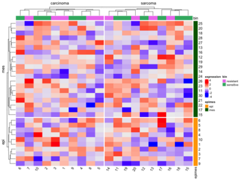
- Split by categorical variables. Below is an example where we want to sort genes within each level of some row class variable (eg. epi and mes). Then we will sort samples within each level of some column class variable (eg tumortype: carcinoma vs sarcoma).
- Split by dendrogram
- Furthermore we can also specify
- Titles for splitting
- Graphic parameters for splitting (create a rectangle bar outside the dendrogram to represent the splits/subgroups)
- Split heatmap annotations

Gaps
A duplication of this figure though the cells do not have rounded corners.

Multiple heatmaps in a plot
See 10 Integrate with other packages. ?plot_grid.
library(cowplot)

h1 <- Heatmap()
h2 <- Heatmap()
h3 <- Heatmap()
plot_grid(grid.grabExpr(draw(h1)),
          grid.grabExpr(draw(h2)),
          grid.grabExpr(draw(h3)), ncol=2)
Colors and legend
- How to make continuous legend symmetric? #82, 2020 To exactly control the break values on the legend, you can set heatmap_legend_param argument in Heatmap() function.
- Use circlize::colorRamp2() to change the color limit including the color specification. PS: NO need to use library()/require() to load the circlize package.
- ComplexHeatmap break values appear different in the plots #361, 2019. pretty(range(x), n=3)
Heatmap( xm, col = colorRamp2(c(min(xm), 0, max(xm)), c("#0404B4", "white", "#B18904")), show_row_names = F, km = 2, column_names_gp = gpar(fontsize = 7), name="Tumors", heatmap_legend_param = list(at = c(min(xm), 0, max(xm)))) pretty(seq(-3, 3, length = 3),n=4) # [1] -4 -2 0 2 4 pretty(seq(-3, 3, length = 3),n=5) # default n=5 # [1] -3 -2 -1 0 1 2 3 - One legend for a list of heatmaps #391, 2019
col_fun = colorRamp2(...)
Heatmap(mat1, col = col_fun, ...) +
Heatmap(mat2, col = col_fun, show_heatmap_legend = FALSE, ...) +
Heatmap(mat3, col = col_fun, show_heatmap_legend = FALSE, ...) +
- Breaks in Color Scales are Wrong #659, 2020. col = colorRamp2(seq(-3, 3, length = 3), c("blue", "#EEEEEE", "red")) does not mean -3, 0, 3 should be the breaks on the legend (although you can manually control it). The color mapping function only defines the colors, while the default break values on the legends are calculated from the input matrix with 3 to 5 break values. In your code, you see 4 and -4 are the border of the legend, actually, all values between 3~4 are mapped to red and all the values between -3~-4 are mapped to blue. In other words, if I use colorRamp2(c(-3, 1, 3), c('blue', 'white', 'red')), it will uniformly distribute data in (-3,1) to c('blue', 'white') and (1,3) to c('white', 'red').
- Hex code #EEEEEE represents bright gray
- Setting a default color schema #834, 2021
- Changing the default background color #698, 2021
Single channel
For single channel data, we can use col = colorRamp2(c(min(ex), max(ex)), c("white", "#0404B4")) option to change the color palette (White-Blue).
cutoffs in circlize::colorRamp2()
- How to make a heatmap in R with complexheatmap. The middle value depends on the data scale and the distribution.
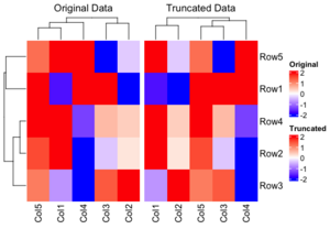
- How to restrict the color ranges? Note that the clustering results are different with these two methods. The 'Original Data' method is superior because it maintains the integrity of the clustering by using the original data, whereas the truncation only influences the heatmap display. This approach allows for a more accurate representation of the data, as the clustering is not compromised by the truncation process.

Wrap legend into rows
- Use the annotation_legend_param option in HeatmapAnnotation(). See Chap 5. Legends
- If your legends are long, you can tell the legends to wrap into multiple rows by using annotation_legend_param in your initial HeatmapAnnotation call.

Row standardization/normalization/scale
- Use cluster_rows and cluster_columns parameters (which can be TRUE/FALSE or hclust/dendrogram). See Heatmap -> Scale and ?Heatmap.
- Visualization with Scaling:
- When you visualize the heatmap, particularly with tools like heatmaply, row scaling (or column scaling) is applied to make the expression values more comparable across genes. The reason for scaling in this context is to make it easier to compare relative expression levels across genes — different genes may have different overall expression levels, so scaling them helps highlight patterns (e.g., up-regulation or down-regulation) more clearly.
- For visualization: You may choose to scale the data by rows or columns to make the color patterns more apparent (because some genes may have a wide range of expression levels).
- For clustering: You generally use raw data without scaling because scaling could distort how clustering algorithms compute the similarity between the rows (genes) or columns (samples).
if (FALSE) {
  library(limma)
  library(edgeR)  # Required for DGEList

  raw_counts <- matrix(
    c(100, 200, 150, 300,
      50, 400, 250, 350,
      500, 600, 550, 700,
      150, 250, 350, 450),
    nrow = 4,
    byrow = FALSE
  )
  rownames(raw_counts) <- c("Gene1", "Gene2", "Gene3", "Gene4")
  colnames(raw_counts) <- c("Sample1", "Sample2", "Sample3", "Sample4")

  # Define the Experimental Design
  # Design matrix: Experimental groups (control, treated)
  group <- factor(c("control", "control", "treated", "treated"))
  design <- model.matrix(~ 0 + group)
  colnames(design) <- levels(group)

  # Create a DGEList Object, Filter and Normalization
  dge <- DGEList(counts = raw_counts)

  keep <- edgeR::filterByExpr(dge, group = group) # remove low-expressed genes for more robust results.
  dge = dge[keep, , keep.lib.size = FALSE]

  dge <- edgeR::calcNormFactors(dge)  # Normalize for library size
      # dge contains lib.size and norm.factors for each sample
      # they use different methods to normalize.
      # dge uses TMM and DESeq2 uses median ratio.

  # Apply voom transformation
  # voom uses variances of the model residuals (observed - fitted)
  voom_data <- voom(dge, design, plot = TRUE)
  voom_expr <- voom_data$E
}
voom_expr <- structure(c(16.9966943817533, 17.9931011170293, 17.5792623673341,
18.5768638712856, 15.6183559348761, 18.605802884533, 17.9288112453195,
18.4134150861349, 17.6070787425032, 17.8698729193728, 17.7444512372316,
18.092093724098, 16.9949257540877, 17.7299728705232, 18.2145767113386,
18.5766893731416), dim = c(4L, 4L), dimnames = list(c("Gene1",
"Gene2", "Gene3", "Gene4"), c("Sample1", "Sample2", "Sample3",
"Sample4")))

x <- voom_expr
scaled_x <- t(scale(t(x)))


library(ComplexHeatmap)
Heatmap(
  x,
  name = "Expression",
  show_row_names = TRUE,
  show_column_names = TRUE,
  col = colorRampPalette(c("blue", "white", "red"))(50),
  row_title = "Genes",
  column_title = "Samples"
)

Heatmap(
  scaled_x,
  name = "Expression",
  show_row_names = TRUE,
  show_column_names = TRUE,
  col = colorRampPalette(c("blue", "white", "red"))(50),
  row_title = "Genes",
  column_title = "Samples"
)
As we can see the clustering results are different (the 2nd one is incorrect since it used scaled data for clustering).
The following are created by stats::heatmap(). The plot on RHS is correct one; the raw data is used for clustering and the row-scaled data is for heatmap visualization only.
The correct way to draw the row-scaled heatmap is the 2nd one below.
- RNAseq: Z score, Intensity, and Resources. For visualization in heatmaps or for other clustering (e.g., k-means, fuzzy) it is useful to use z-scores.


Customize the heatmap body
We can add numbers to each/certain cells. See 2.9 Customize the heatmap body
Cannot show plot on RStudio
- On macOS, RStudio uses Quartz under the hood
- Some packages (including ComplexHeatmap, grid graphics, or PDF/PNG devices) can trigger additional off-screen Quartz devices
- RStudio sometimes fails to close them automatically
- When draw(ht) sends output to the current device, it may go to a hidden off-screen device
- Solution (or write to PDF/PNG and view it)
dev.cur()
# quartz_off_screen
#                 3
while (dev.cur() > 1) dev.off()
ComplexHeatmap::draw(ht)
Save images to files
See
- png and resolution. png(FileName, width=8, height=6, units="in", res=300) is a good try!
- 2.8 Heatmap as raster image
- 2.10 Size of the heatmap. width and height only control the width/height of the heamtap body (the center part). If we want to fix the size of the body, we can use these 2 parameters. This works when I see the plot interactively. Not sure the case if we output the image to a file where I can just specify the width/height in the png() command to control that.
- 4.15 Manually increase space around the plot
png(file="newfile.png", width=8, height=6, units="in", res=300)
ht <- Heatmap(...)
draw(ht)
dev.off()
svg and pdf
For some reason, when I save the image to a file in svg or pdf format I will see borders of each cell. When I try use_raster = TRUE option, it seems to fix the problem on the body heatmap but the column annotation part still has borders.
Extract orders and dendrograms
See Section 2.12
Text alignment
See 3.14 Text annotation and search the keyword just which is useful in rowAnnotation(). Some examples are: just=c("left", "bottom"), just="right", just="center".
Heatmap annotation
3 Heatmap Annotations. Using operators + and %v%' is easier so we can simplify the call to Heatmap().
Heatmap(...) + rowAnnotation() + ...   # add to right
Heatmap(...) %v% HeatmapAnnotation(...) %v% ... # add to bottom

ha = HeatmapAnnotation(...)
Heatmap(..., top_annotation = ha)

ha = rowAnnotation(...)
Heatmap(..., right_annotation = ha)
Example 1: top/bottom annotation and HeatmapAnnotation()
library(ComplexHeatmap); library(circlize)
set.seed(123)
mat = matrix(rnorm(80, 2), 8, 10)
rownames(mat) = paste0("R", 1:8)
colnames(mat) = paste0("C", 1:10)
col_anno = HeatmapAnnotation(
              df = data.frame(anno1 = 1:10,
                              anno2 = sample(letters[1:3], 10, replace = TRUE)),
              col = list(anno2 = c("a" = "red", "b" = "blue", "c" = "green")))
Heatmap(mat,
        col = colorRamp2(c(-1, 0, 1), c("green", "white", "red")),
        top_annotation = col_anno,
        name = "mat",              # legend for the color of the main heatmap
        column_title = "Heatmap")  # top of the whole plot, default is ''
Example 2: left/right annotation and rowAnnotation()
row_anno_df <- data.frame(anno1 = 1:8, anno2 = sample(letters[1:3], 8, replace = TRUE))
row_anno_col <- list(anno2 = c("a" = "red", "b" = "blue", "c" = "green"))
row_anno <- rowAnnotation(
              df = row_anno_df,
              col = row_anno_col)
Heatmap(mat,
        col = colorRamp2(c(-1, 0, 1), c("green", "white", "red")),                          ,
        right_annotation = row_anno,
        name = "mat",
        row_title = "Heatmap")
Heatmap(mat,
        col = colorRamp2(c(-1, 0, 1), c("green", "white", "red")),                          ,
        name = "mat",
        row_title = "Heatmap") + row_anno  # row labels disappear?
Example 3: use colorRamp2() to control colors on continuous variables in annotations
# Same definition of row_anno_df
row_anno_col <- list(anno1 = colorRamp2(c(min(row_anno_df$anno1), max(row_anno_df$anno1)),
                                        c("blue", "red")),
                     anno2 = c("a" = "red", "b" = "blue", "c" = "green"))
row_anno = rowAnnotation(df = row_anno_df,
                         col = row_anno_col)
Heatmap(mat, col = colorRamp2(c(-1, 0, 1), c("green", "white", "red")),
        right_annotation = row_anno,
        name = "mat",
        row_title = "Heatmap")
Hide annotation legend for some variables
HeatmapAnnotation("BRCA1/2"=BRCA,
  show_legend = c("BRCA1/2" = FALSE),
  col=list("BRCA1/2"=BRCA.colors))
Adjust the height of column annotation
If you find the height of the column annotation too large, you can adjust it using the annotation_height parameter in the HeatmapAnnotation function or the re_size function in the ComplexHeatmap R package. Search height and simple_anno_size_adjust in Heatmap Annotations.
# Remember to set the 'simple_anno_size_adjust' parameter
# Default seems to be 1 cm.
column_ha = HeatmapAnnotation(tgi = tgi[ord],
                              bin = bin[ord],
                              col = list(tgi = col_fun,
                                         bin = c("resistant" = "violet",
                                                "sensitive" = "green")),
                              height = unit(.5, "cm"), simple_anno_size_adjust = TRUE)

# Assuming `ha` is your HeatmapAnnotation object
ha = re_size(ha, annotation_height = unit(2, "cm"))
Correlation matrix
The following code will guarantee the heatmap has a diagonal in the direction of top-left and bottom-right. The row dendrogram will be flipped automatically. There is no need to use cluster_rows = rev(mydend).
mcor <- cor(t(lograt))
colnames(mcor) <- rownames(mcor) <- 1:ncol(mcor)
mydend <- as.dendrogram(hclust(as.dist(1-mcor)))
Heatmap( mcor, cluster_columns = mydend, cluster_rows = mydend,
     row_dend_reorder = FALSE, column_dend_reorder = FALSE,
     row_names_gp = gpar(fontsize = 6),
     column_names_gp = gpar(fontsize = 6),
     column_title = "", name = "value")
OncoPrint
- https://jokergoo.github.io/ComplexHeatmap-reference/book/oncoprint.html
- Xeva::plotmRECIST() & Xeva paper
- http://blog.thehyve.nl/blog/downloading-data-from-the-cbioportal-oncoprint-view
InteractiveComplexHeatmap
InteractiveComplexHeatmap. It works.
BiocManager::install("InteractiveComplexHeatmap")
library(InteractiveComplexHeatmap)

ht1 <- Heatmap()
htShiny(ht1)
tidyHeatmap
tidyHeatmap. This is a tidy implementation for heatmap. At the moment it is based on the (great) package 'ComplexHeatmap'.
Note: that ComplexHeatmap is on Bioconductor but tidyHeatmap is on CRAN.
By default, .scale = "row". See ?heatmap.
add_tile() to add a column or row (depending on the data) annotation.
cluster_rows=FALSE if we don't want to cluster rows.
BiocManager::install('tidyHeatmap')
library(tidyHeatmap)

library(tidyr)
mtcars_tidy <-
  mtcars |>
  as_tibble(rownames="Car name") |>
  # Scale
  mutate_at(vars(-`Car name`, -hp, -vs), scale) |>
  # tidyfy
  pivot_longer(cols = -c(`Car name`, hp, vs),
               names_to = "Property",
               values_to = "Value")

# create another variable which will be added next to 'hp'
mtcars_tidy <- mtcars_tidy%>%
  mutate(type = `Car name`)
mtcars_tidy$type <- substr(mtcars_tidy$type, 1, 1)
mtcars_tidy

# NA case. Consider the cell on the top-right corner
mtcars_tidy %>% filter(`Car name` == 'Volvo 142E' & Property == 'am')
mtcars_tidy <- mtcars_tidy %>%                               # Replacing values
               mutate(Value = replace(Value,
                               `Car name` == 'Volvo 142E' & Property == 'am',
                               NA))
mtcars_tidy %>% filter(`Car name` == 'Volvo 142E' & Property == 'am')
# Re-draw data with missing value
mtcars_tidy |>
heatmap(`Car name`, Property, Value,
          palette_value = circlize::colorRamp2(
            seq(-2, 2, length.out = 11),
            rev(RColorBrewer::brewer.pal(11, "RdBu")))) |>
  add_tile(hp) |>
  add_tile(type)


# two tiles on rows
mtcars_heatmap <-
  mtcars_tidy |>
  heatmap(`Car name`, Property, Value,
          palette_value = circlize::colorRamp2(
              seq(-2, 2, length.out = 11),
              rev(RColorBrewer::brewer.pal(11, "RdBu")))) |>
  add_tile(hp) |>
  add_tile(type)
mtcars_heatmap
# Other useful parameters
# heatmap(, cluster_rows = FALSE)
# heatmap(, .scale = F)

# Note add_tile(var) can decide whether the 'var' should go to
# columns or rows - interesting!
# one tile goes to columns and one tile goes to rows.
tidyHeatmap::pasilla |>
    # group_by(location, type) |>
    heatmap(
      .column = sample,
      .row = symbol,
      .value = `count normalised adjusted`
    ) |>
    add_tile(condition) |>
    add_tile(activation)

Cheat sheet
Correlation heatmap
Customizable correlation heatmaps in R using purrr and ggplot2
corrplot
This package is used for visualization of correlation matrix. See its vignette and Visualize correlation matrix using correlogram.
ggcorrplot
https://cran.r-project.org/web/packages/ggcorrplot/index.html
ztable
https://cran.r-project.org/web/packages/ztable/index.html
Heatmap of a table
Heatmap formatting of a table with 'DT'
SubtypeDrug: Prioritization of Candidate Cancer Subtype Specific Drugs
https://cran.r-project.org/web/packages/SubtypeDrug/index.html
pheatmap
- http://wiki.bits.vib.be/index.php/Use_pheatmap_to_draw_heat_maps_in_R
- Making a heatmap in R with the pheatmap package
- Tips:
- The package was used on the book Modern Statistics for Modern Biology
- Examples:
- PDAC data
- ssgsea
- 生信代码:绘制热图和火山图
- This was used by Orchestrating Single-Cell Analysis with Bioconductor
- The pheatmap function in R
What is special?
- the color scheme is grey-blue to orange-red. pheatmap() default options, colorRampPalette in R
- able to include class labels in samples and/or genes
- the color key is thin and placed on the RHS (prettier for publications though it could miss information)
- borders for each cell are included (not necessary)
fheatmap
(archived)
heatmap3
CRAN. An improved heatmap package. Completely compatible with the original R function 'heatmap', and provides more powerful and convenient features.
funkyheatmap
funkyheatmap - Generating Funky Heatmaps for Data Frames
Seurat for scRNA-seq
DoMultiBarHeatmap
- DoMultiBarHeatmap & Package format which called DoHeatmap
- ggplot2::annotation_raster() and ggplot2::annotation_custom()
Dot heatmap
dittoSeq for scRNA-seq
Office/Excel
Apply a Color Scale Based on Values
Heatmap in the terminal
rasterImage
- http://rfunction.com/archives/2666
- rasterImage(). Note that the parameter interpolate by default is TRUE.
library(jpeg)
img<-readJPEG("~/Downloads/IMG_20220620_153515023.jpg")

# need to create a plot first and rasterImage() will overlay it with another image
# bottom-left = (100, 300), top-right = (250, 450)
plot(c(100, 250), c(300, 450), type = "n", xlab = "", ylab = "")

args(rasterImage)
# function (image, xleft, ybottom, xright, ytop, angle = 0, interpolate = TRUE,  ...)
rasterImage(img, 100, 300, 250, 450)

text(100, 350, "ABCD", cex=2, col="yellow",adj=0) # left-bottom align
Interactive heatmaps
d3heatmap
This package has been removed from CRAN and archived on 2020-05-24.
A package generates interactive heatmaps using d3.js and htmlwidgets.
The package let you
- Highlight rows/columns by clicking axis labels
- Click and drag over colormap to zoom in (click on colormap to zoom out)
- Optional clustering and dendrograms, courtesy of base::heatmap
The following screenshots shows 3 features.
- Shows the row/column/value under the mouse cursor
- Zoom in a region (click on the zoom-in image will bring back the original heatmap)
- Highlight a row or a column (click the label of another row will highlight another row. Click the same label again will bring back the original image)


heatmaply
- https://talgalili.github.io/heatmaply/articles/heatmaply.html
- This package extends the plotly engine to heatmaps, allowing you to inspect certain values of the data matrix by hovering the mouse over a cell. You can also zoom into a region of the heatmap by drawing a rectangle over an area of your choice.
- Installing this package requires to compile some dependent package.
- The return object is heatmaply is 'plotly' and 'htmlwidget'. It does not return the ordering of rows/columns. It can not control whether to do clustering (d3heatmap package is better at this).
- Syntax
heatmaply(
  expr,
  xlab = "Samples",
  ylab = "Genes",
  scale = "column", # scale = c("none", "row", "column"),
  main = "Data transformation using 'scale' on each column"
)
- heatmaply: an R package for creating interactive cluster heatmaps for online publishing Bioinformatics 2017.
- Use the 'limits' parameter to specify the data range for the scale. See ?heatmaply
shinyHeatmaply
shinyHeatmaply: Deploy 'heatmaply' using 'shiny'
canvasXpress
- https://cran.r-project.org/web/packages/canvasXpress/index.html
- https://canvasxpress.org/html/heatmap-9.html
InteractiveComplexHeatmap
InteractiveComplexHeatmap, article
Calendar heatmap
Colors
- Top R Color Palettes to Know for Great Data Visualization
- Dos and don’ts for a heatmap color scale
- A quick introduction to using color in density plots
Fold change
data <- pms / pms[, "12.50"] # # fold change vs "12.50" sample
data <- ifelse(data>1, data, -1/data)
heatmap.2(data, ...)
Generate sequential colors & grDevices::colorRampPalette(), color legend
?colorRampPalette. Note that the function returns a function. The following example will output a vector of 5 colors transitioning from blue to red.
palette <- colorRampPalette(c("blue", "red"))
colors <- palette(5)
print(colors)
The following example will create a color legend. We can easily modify the code to make a horizontal color bar.
# increase right margin
par(mar = c(5, 4, 4, 6))

mat <- matrix(1:100) # 100 x 1
image(t(mat), axes = FALSE, col = colorRampPalette(c("blue", "white", "red"))(100))

# Add ticks and labels
axis(4, at = c(0, 0.5, 1), labels = c("-1.0", "0.0", "1.0"), tick = TRUE, las = 1)

require(RColorBrewer)  # brewer.pal
ColorRamp <- colorRampPalette( brewer.pal(9, "Blues") )(25)
# The above will generate 25 colors by interpolating the colors
#   defined by brewer.pal(9, "Blues")
heatmap.2(..., col = ColorRamp)

RColorBrewer::brewer.pal() function
The A – Z Of Rcolorbrewer Palette.
- RColorBrewer can be used in both base plots and ggplot2.
- barplot(c(2,5,7), col = brewer.pal(n = 3, name = "RdBu"))
- ggplot() + geom_XXX + scale_fill_brewer(palette = "Dark2"). ggplot() + geom_point + + scale_color_brewer(palette = "Dark2")
- ColorBrewer contains 3 types of color palettes (The above page contains a list of all names):
- sequential,
- diverging,
- qualitative.
- display.brewer.pal() can display the colors on a graphical device.
- brewer.pal() will return colors (in hex) for a certain palette,
library(RColorBrewer)

display.brewer.all()                          # visualize colors
display.brewer.all(colorblindFriendly = TRUE) # draw a plot

display.brewer.pal(11, "BrBG") # Alternative colors used in correlation matrix

display.brewer.pal(9, "Set1") # Up to 9 classes are allowed

brewer.pal(n, name)
brewer.pal(n = 8, name = "Dark2")  # Qualitative palettes
## [1] "#1B9E77" "#D95F02" "#7570B3" "#E7298A" "#66A61E" "#E6AB02" "#A6761D"
## [8] "#666666"
brewer.pal(n = 8, name = "Greens") # Sequential palettes

brewer.pal(n = 8, name = "RdYlBu") # Diverging palettes
RdYlBu
It means Red-Yellow-Blue. See a full list of names and colors for RColorBrewer palettes Colors in R.
See some examples (R base heatmap, d3heatmap) Heatmap in R: Static and Interactive Visualization using RdYlBu color.
library(RColorBrewer)
display.brewer.pal(5, "RdYlBu")
brewer.pal(n=5, name = "RdYlBu")
# [1] "#D7191C" "#FDAE61" "#FFFFBF" "#ABD9E9" "#2C7BB6"

# If we set n=3, the colors won't be right
display.brewer.pal(3, "RdYlBu")
brewer.pal(n=3, name = "RdYlBu")
# [1] "#FC8D59" "#FFFFBF" "#91BFDB"
pheatmap seems to use a palette very close to RdYlBu. To specify the palette explicitly, see R语言: 从pheatmap无缝迁移至ComplexHeatmap.
Note ComplexHeatmap requires the color to be a function instead of color palette.
library(ComplexHeatmap)
df <- scale(mtcars)
range(df)
# [1] -1.874010  3.211677  # NOT symmetric

col_fun <- circlize::colorRamp2(quantile(df, c(0, .25, .5, .75, 1)),
                     rev(RColorBrewer::brewer.pal(n=5, name = "RdYlBu")))

# Treat the data as symmetric
col_fun <- circlize::colorRamp2(c(-2, qnorm(c(.25, .5, .75)), 2),
                     rev(RColorBrewer::brewer.pal(n=5, name = "RdYlBu")))
Heatmap(df,
        col = col_fun,
        name = "mtcars", #title of legend
        column_title = "Variables", row_title = "Samples",
        row_names_gp = gpar(fontsize = 7) # Text size for row names
        )

viridis: Colorblind-Friendly Color
- https://cran.r-project.org/web/packages/viridis/index.html.
- The vignette contains a comparison of color palettes from base-R, ggplot2, colorbrewer
- The package contains 8 color scales
- For base plots, use the viridis() function to generate a palette
- or ggplot, use scale_color_viridis() and scale_fill_viridis()
viridis(3)
# [1] "#440154FF" "#21908CFF" "#FDE725FF"
#  (purple, green, yellow)

- ggplot2 heatmap
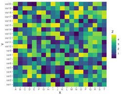


scales package
- https://scales.r-lib.org/. Scales colour palettes are used to power the scales in ggplot2, but you can use them in any plotting system include base R plots.
show_col(hue_pal()(4))      # visualize colors
show_col(viridis_pal()(16)) # visualize colors

viridis_pal()(4)
#> [1] "#440154FF" "#31688EFF" "#35B779FF" "#FDE725FF"

# use in combination with baseR `palette()` to set new defaults
palette(brewer_pal(palette = "Set2")(4))
- Emulate ggplot2 default color palette
Missing data
In the dynamic heatmap tool of BRB-ArrayTools, the missing data is represented by the gray color.
Shades of blue
plot(c(100, 200), c(300, 450), type= "n", xlab = "", ylab = "")
rect(110, 300, 175, 350, col = "navy")
rect(110, 360, 175, 400, col = "powderblue")
rect(110, 410, 175, 450, col = "#4B9CD3")
Online tools
Papers
Double dipping
- Circular analysis
- Selective Inference for Hierarchical Clustering, clusterpval package. twitter 2020
- We pick H0 by looking at the data, then we use the same data to test H0
- Testing framework: Sample 100 random obs from N2(0,I). Run hierarchical clustering to get 3 clusters. Calculate Wald p-values for any two cluster means (3 p-values). All Wald p-values < .0000001. Repeat 2000 datasets. Draw a QQ plot of Wald p-values (vs U(0, 1)). Type I error rate of the Wald test is 97%. If we try sample splitting, the test set still has an inflated type I error rate.
- Computing the conditioning set (clustering): it controls the selective Type I error rate.
- Simulation: compute p-values exactly for average, centroid, and single linkage, and approximate the p-value for complete linkage. Conditional power. Detection probability.
- Data applications: Palmerpenguins data. 3 species. 6 estimated clusters from average linkage HC. Single-cell RNASeq. Reduce to the first 2 PCs. It seems the new method is useful to identifying the number of clusters in a HC analysis.
- Are clusterings of multiple data views independent? 2020. multiviewtest package.
- Beyond Sample Splitting: Valid Inference while 'Double Dipping' (Daniela Witten) 2020
- Eleven grand challenges in single-cell data science by Lähnemann, 2020. Search "double".
- Chapter 6. Double-Dipping in the Data from Statistics Done Wrong by Alex Reinhart 2015. Note the website does not contain the complete book! This site contains the complete book.
- Another case

Healthcare Access and Quality Index - Lancet
http://www.thelancet.com/pdfs/journals/lancet/PIIS0140-6736(17)30818-8.pdf